Maison du Design / Progress 2015
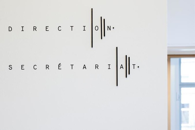
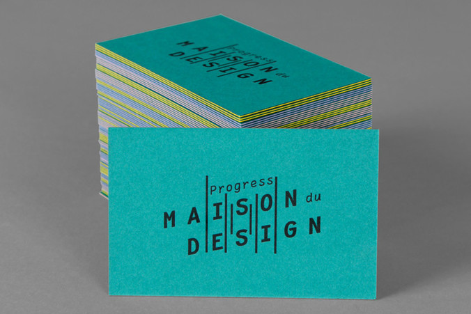
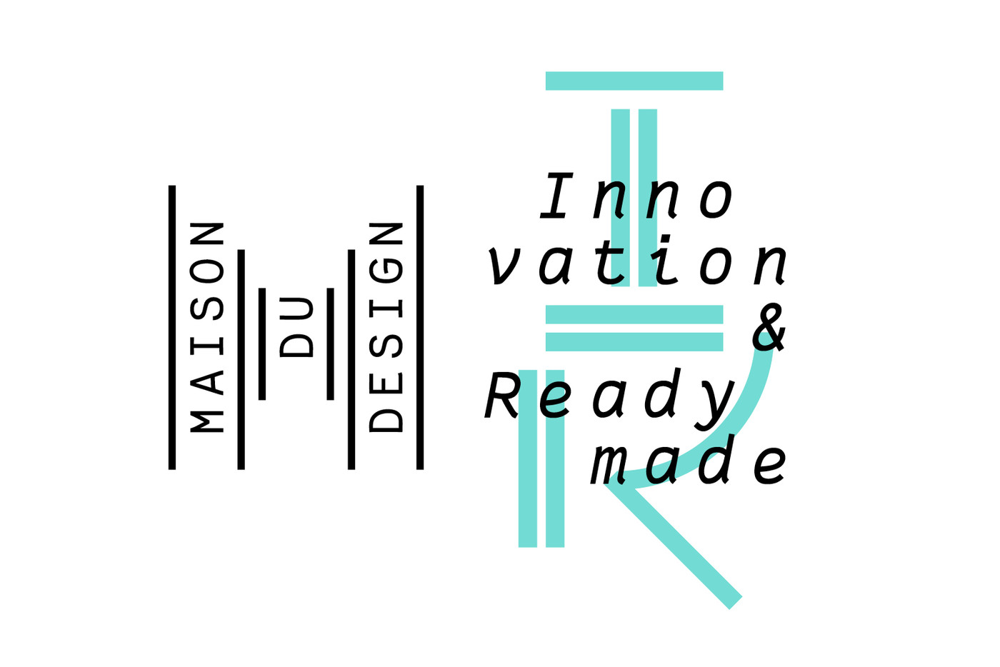
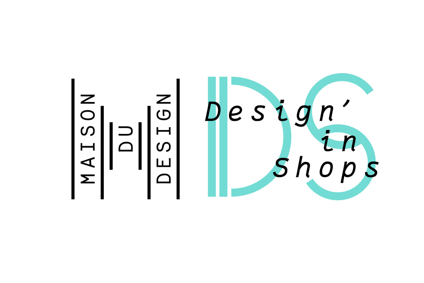
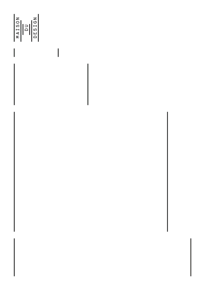
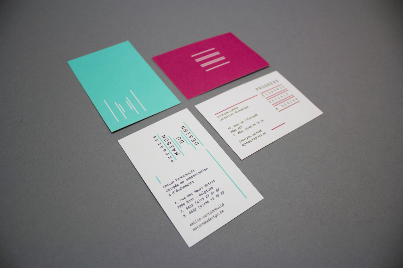
Six simple vertical lines placed into perspective form the typographic sign M standing for Maison du Design.
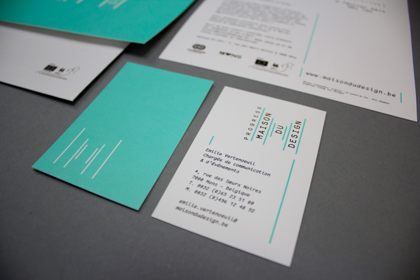
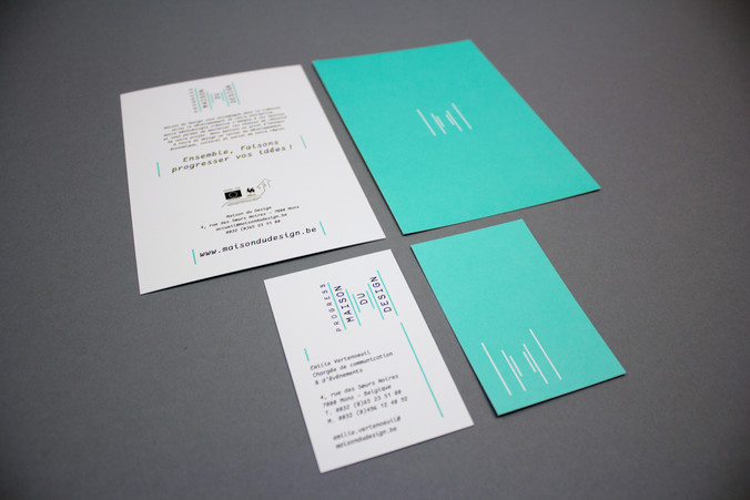
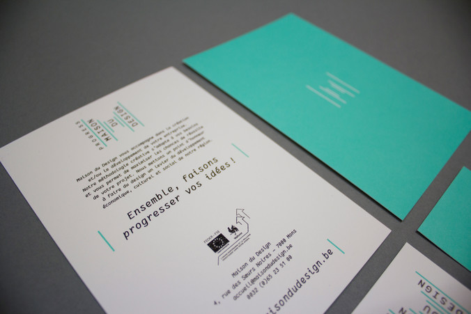
visual identity – responsive website – stationnary / 2pms & black offset / heat embossing / gmund cotton linen cream / 2500 copies
Maison du Design / Progress 2015
The creative process started with Maison du Design, design being more visual, and the new location in Mons (B) hosting the association. The logo design is based on the architectural idea of the building. A renovated historical site and a new extension, all by the architects Matador, link two parallel streets on both sides of the housing block and allow a new breakthrough in the neighbourhood. The perspective through this new way is unmistakable upon arrival in the place. And what better idea than perspectives for this ‘home for design’ dedicated in supporting emerging talents.
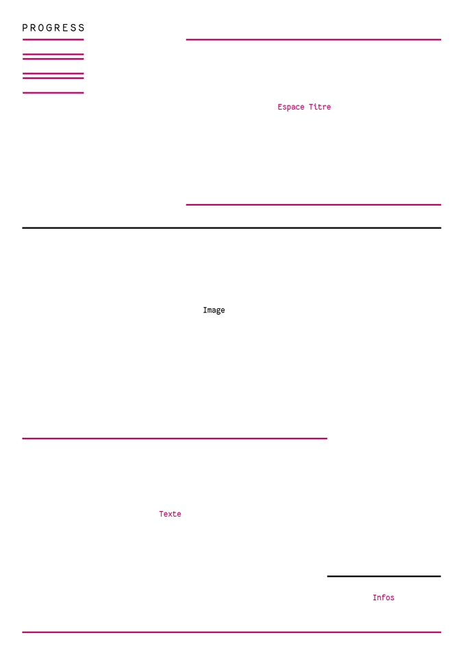
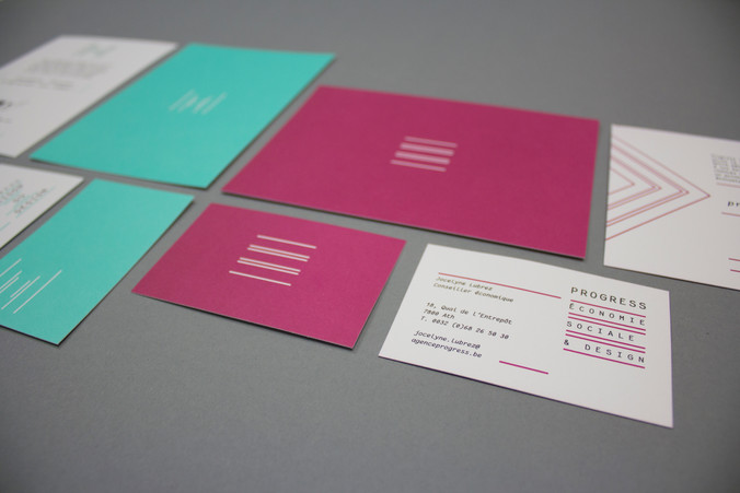
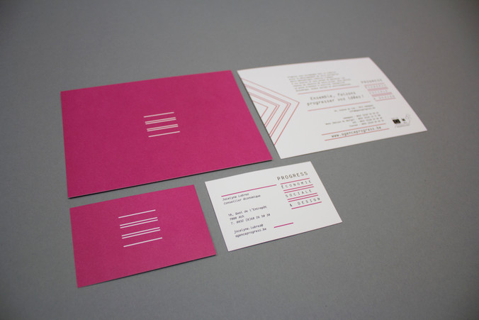
Six simple vertical lines placed into perspective also form the typographic sign M standing for ‘Maison du Design’. The vertical lines of Maison du Design are switched to horizontal to shape Progress visual identity. Parallel lines one on top of the other create the form of a list of the different activities offered by Progress and host its baseline: ‘Économie sociale & Design’.
Heat embossing transforms the two dimensional print into the third dimension, evoking the way design translates drawings into everyday objects. Also the contrast between the fibre structure of the Gmund Cotton paper and the heat embossing technique somehow reflects the relationship a designer managesbetween the roughness of a raw material and a glossy finished aspect of a produced object.
websites:
maisondudesign.be
progress.be
web developer:
bienavous.be