Maison du Design / Progress
commission
2021
2019
identity & website
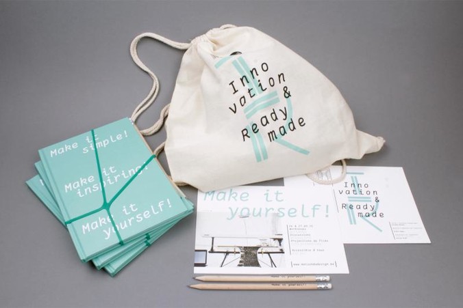
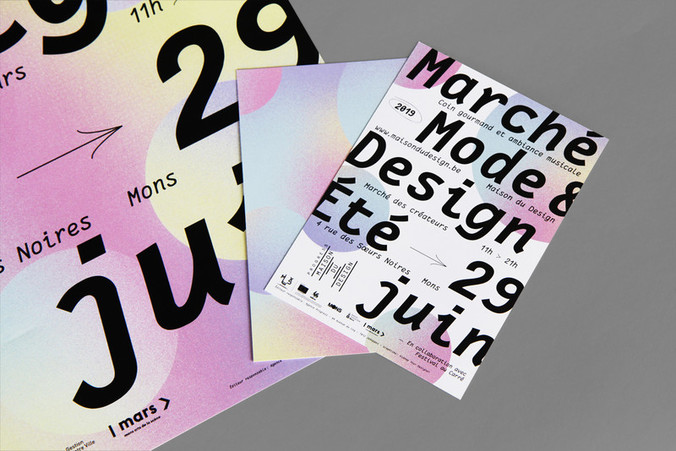
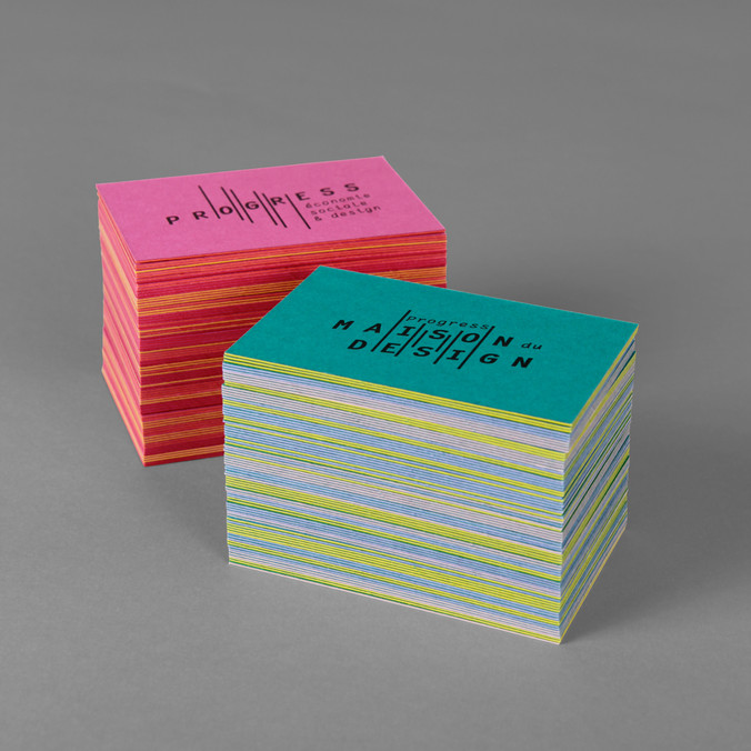
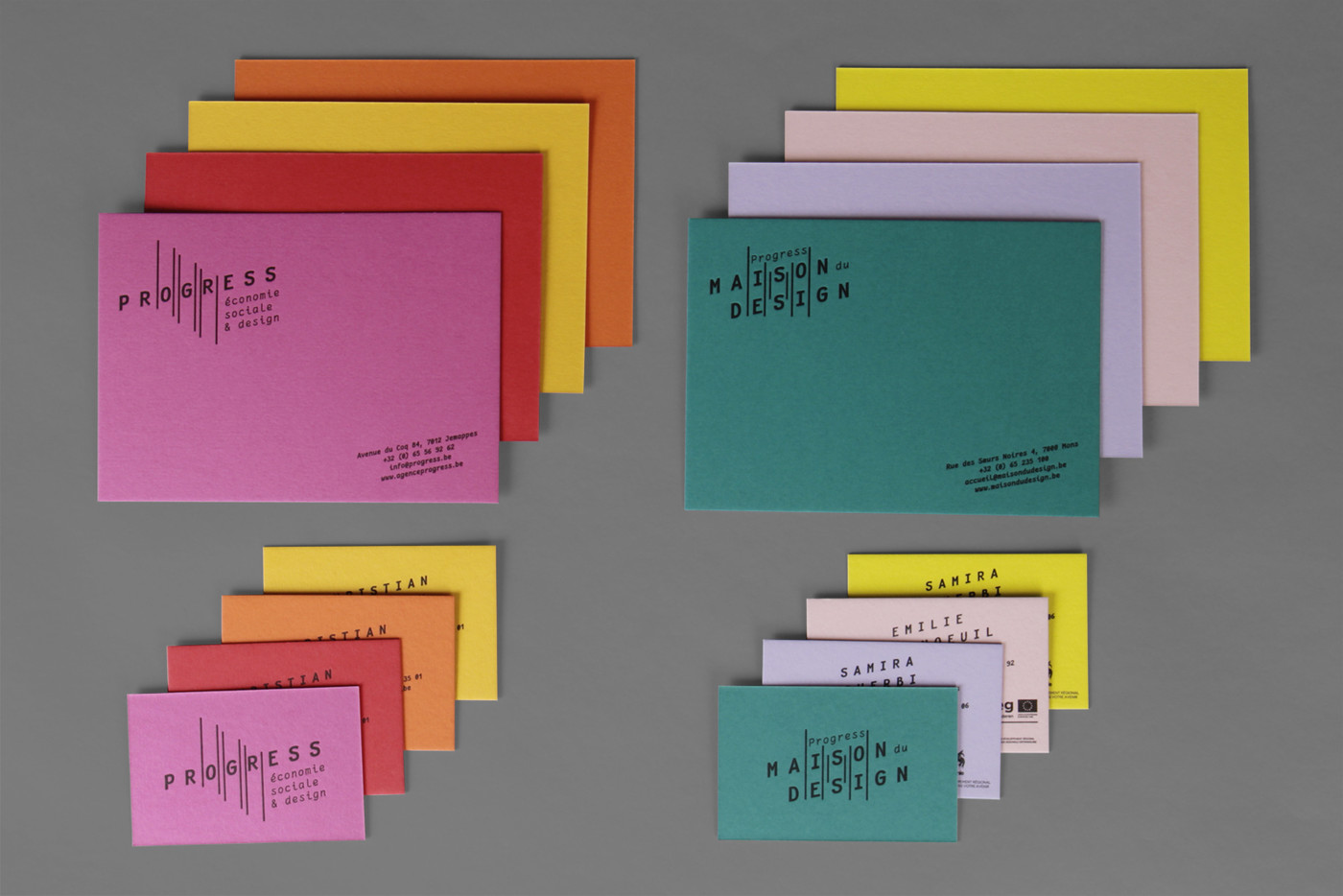
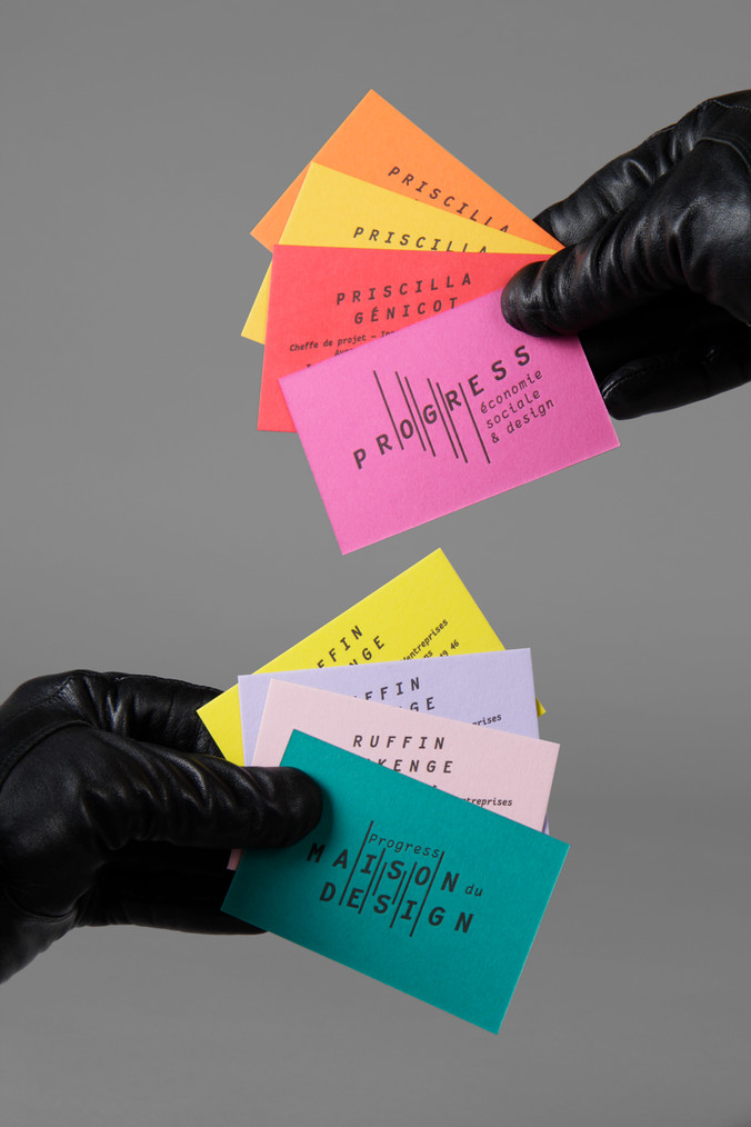
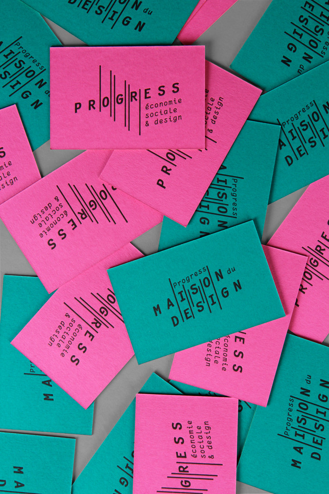
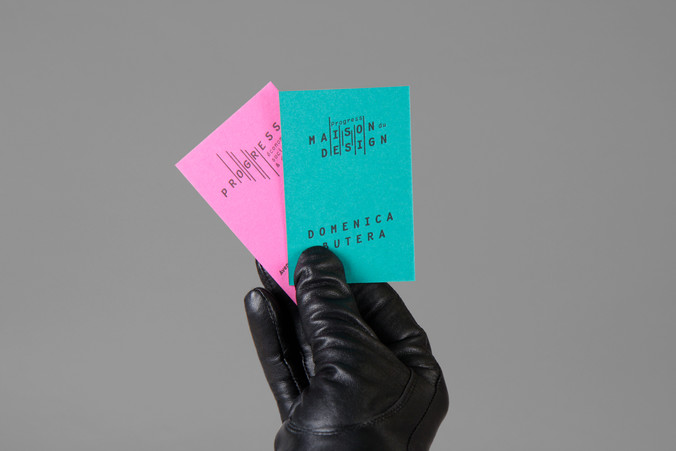
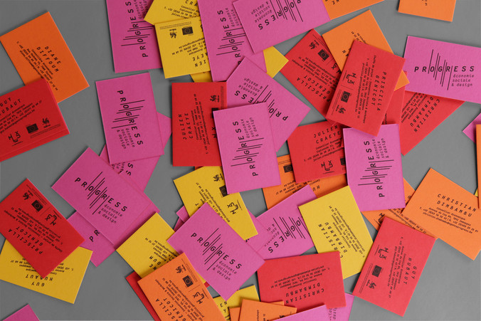
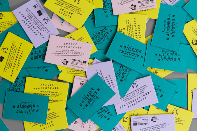
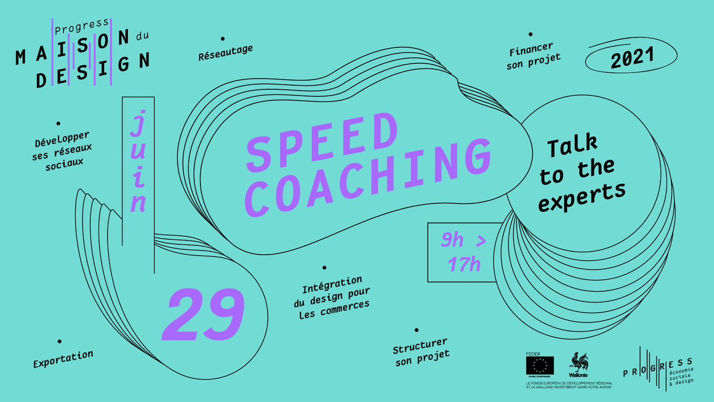
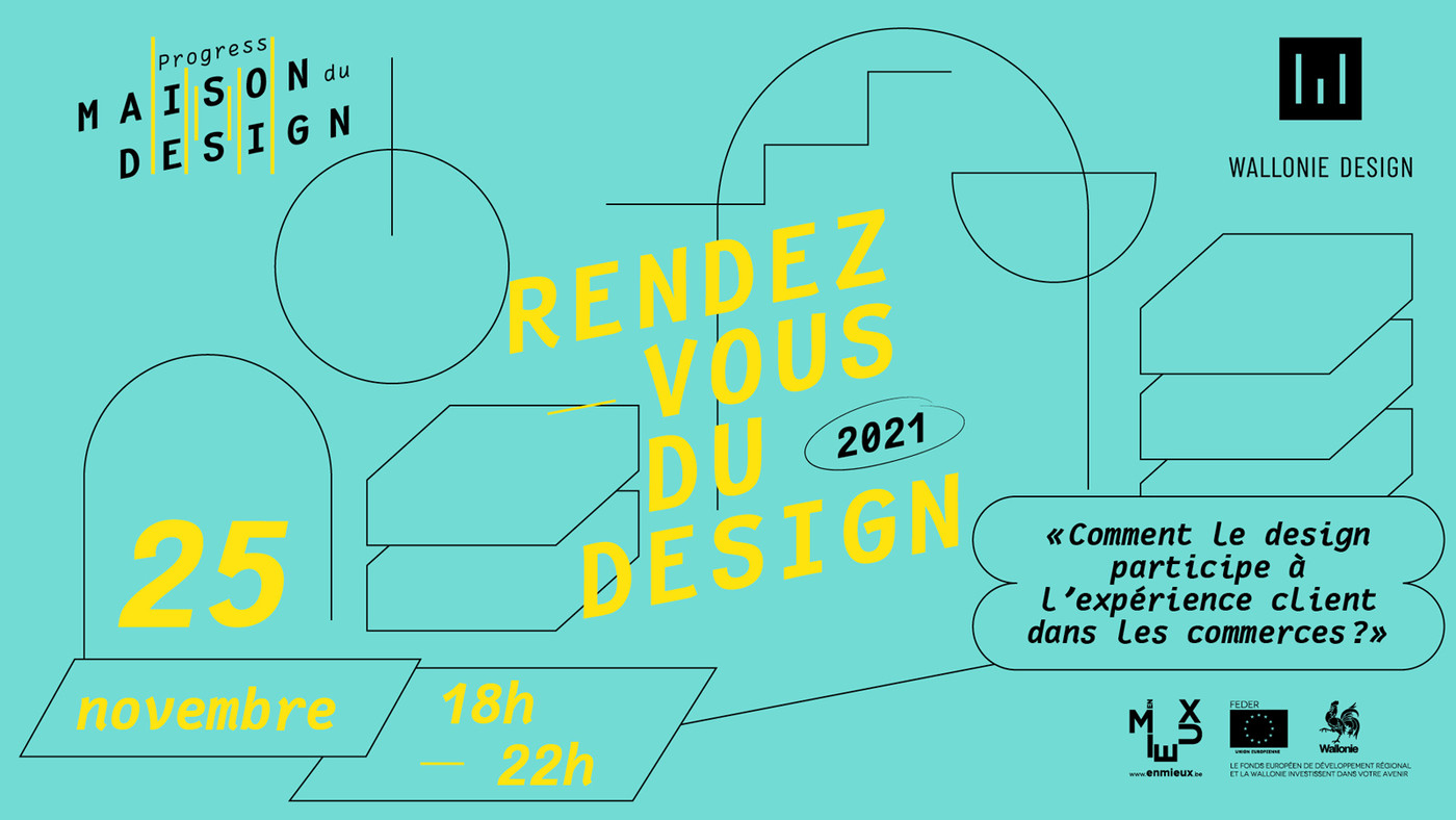
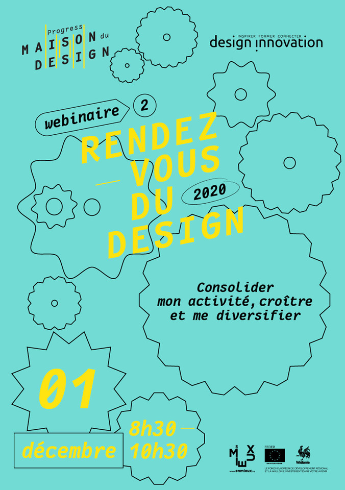
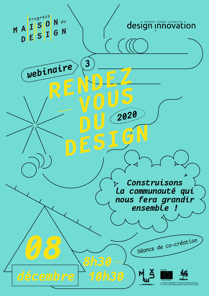
A facelift to improve the use of this two sided graphic identity of Progress & Maison du Design. Coloured papers for the stationary and other fine print technics embellish and emphasis all the communication items coming out of this design centre and hub.
visual identity - business cards / hot stamping / ColorPlan Duplex paper - stationary - social media mixed formats - double responsive websites
Maison du Design / Progress
commission
2021
2019
identity & website
After several years of use of the visual identity created in 2015, we have given it a facelift to improve the use of this two sided graphic identity (Progress / Maison du Design).
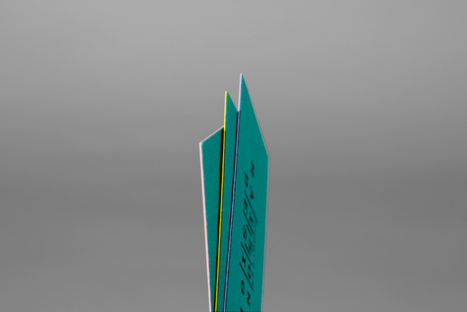
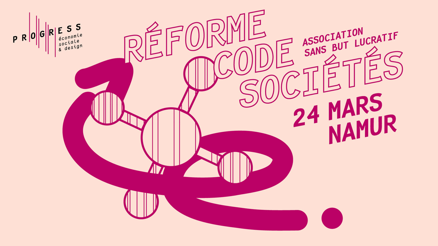
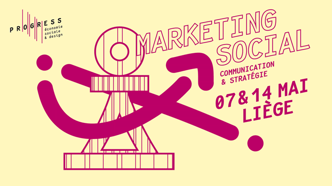
Primarily, the Maison du Design logo's construction concept is based on the architectural shape of the building and its extensions. Indeed, a new passageway between the streets of ‘Trouille’ and ‘Sœurs Noires’ has been created and we have translated this view on arrival on site by a schematisation of the perspective. For a space dedicated to supporting emerging talent, the idea of perspective is also appropriate. Those vertical lines also form the ‘M’ character of the initial.
For the makeover, we decided to keep lines and this concept, maintaining the link with the old communication supports. The ‘Fantasque’ font also is kept but in a slanted and bold version.
For the secondary logo, Progress, the lines are used to resemble a data chart in progression, the typesetting matches the newer layout.
Coloured papers for the stationary and other fine print technics embellish and emphasis all the communication items coming out of this design centre and hub.
websites:
maisondudesign.be
progress.be
web developer:
bienavous.be