Maison du Design — Signage
commission
2015
Signage
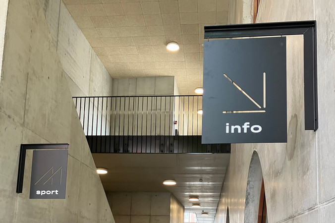
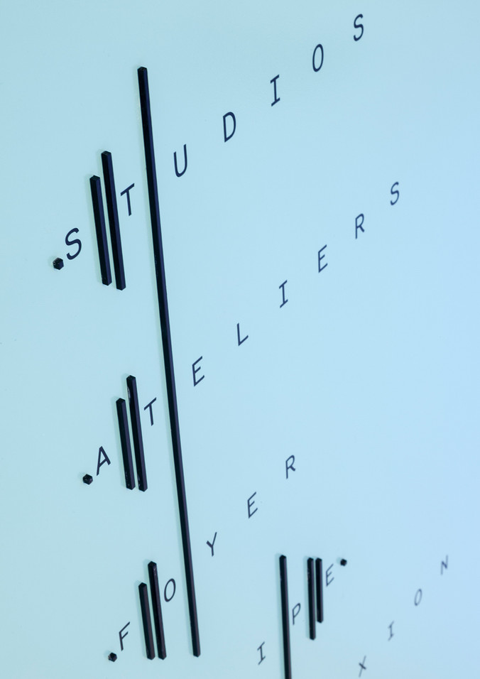
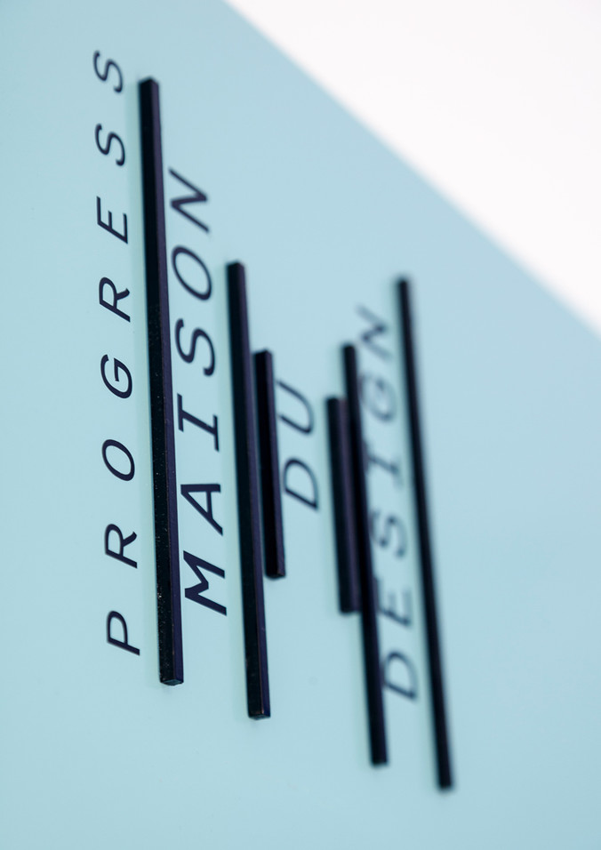
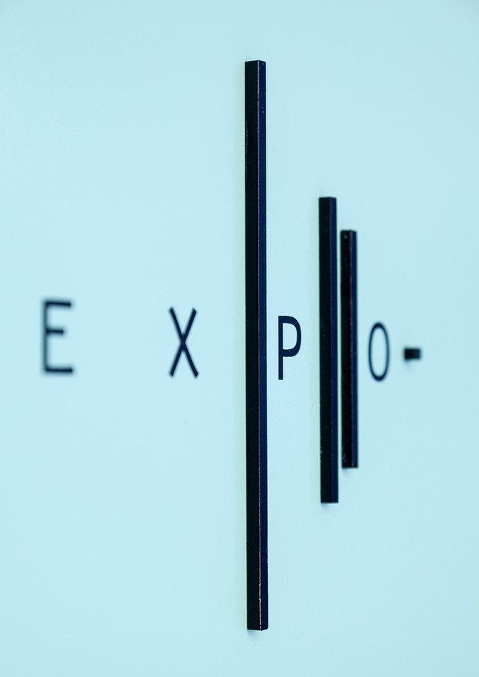
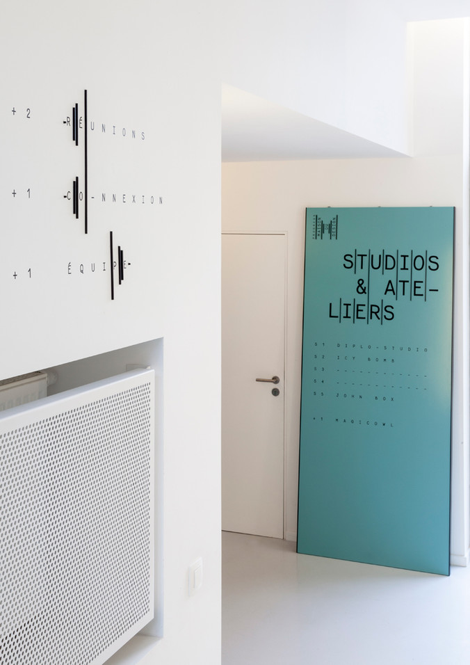
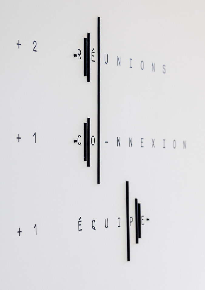
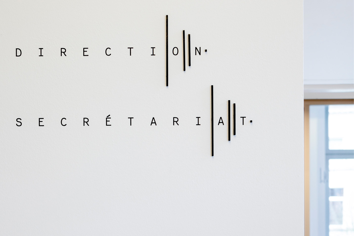
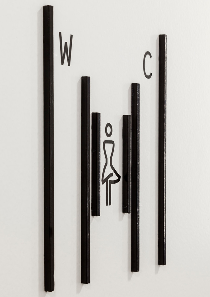
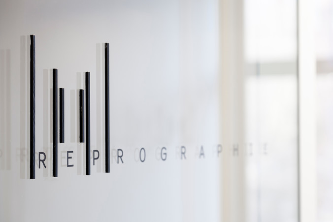
For the signage materiality, we decided to mix flat, two dimensional lettering and the third dimension with the lines made of black square sticks.
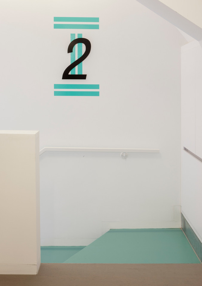
black paint on wood sticks – adhesive letters – turquoise paint on MDF panels




Maison du Design — Signage
commission
2015
Signage
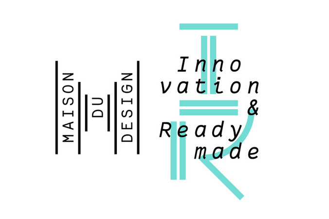
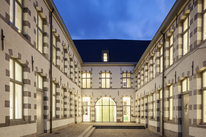
The signage of the new 'Maison du Design' is based on the logo inspired by the building itself. A renovated historical site and a new extension, all by the architects Matador, link two parallel streets on both sides of the housing block and allow a new breakthrough in the neighbourhood. The perspective through this new way is unmistakable upon arrival in the place. The colour also matches the building pathways as well as the visual identity. For the signage materiality, we decided to mix flat, two dimensional lettering and the third dimension with the lines made of black square sticks. For a space dedicated to object designers, it made sense to, somehow, suggest this relationship between image and objects.
Photos © Tim Van De Velde / TVDV Photography
