Ixelles urban plan – Athénée
commission
2017-2022
identity
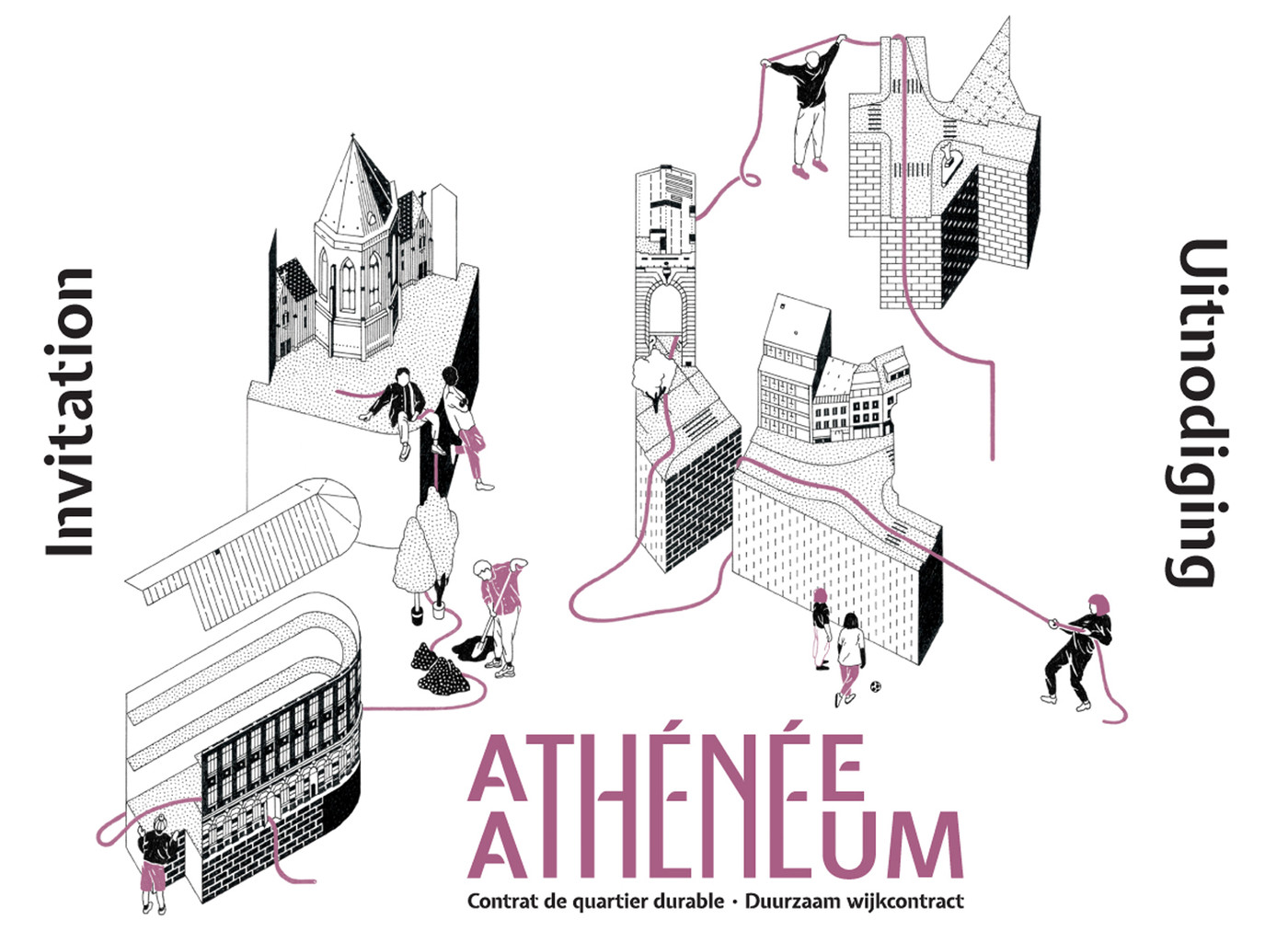
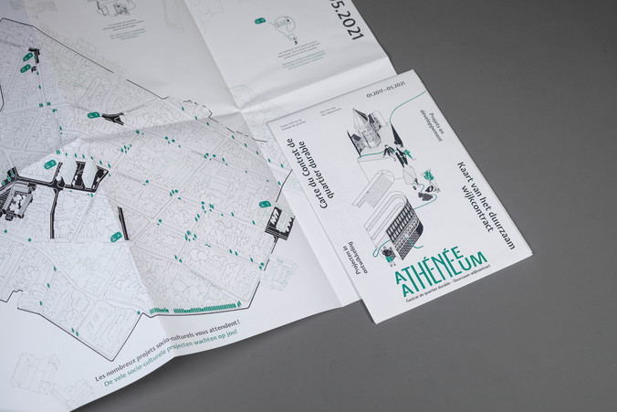
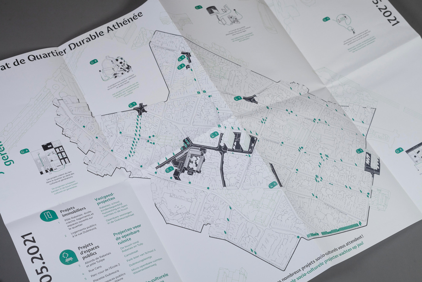
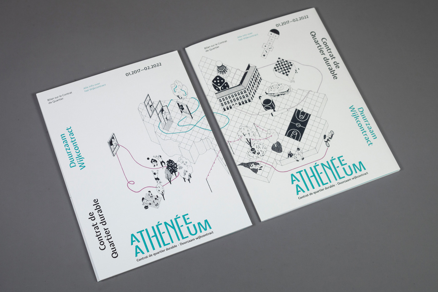
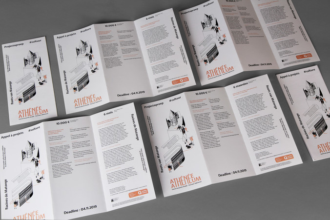
For this urban neighbourhood refurbishment master plan, the city of Ixelles in Brussels, we invited the illustrator Éva Le Roi, a specialist in architectural drawings, to produce the map as well as the main visual.
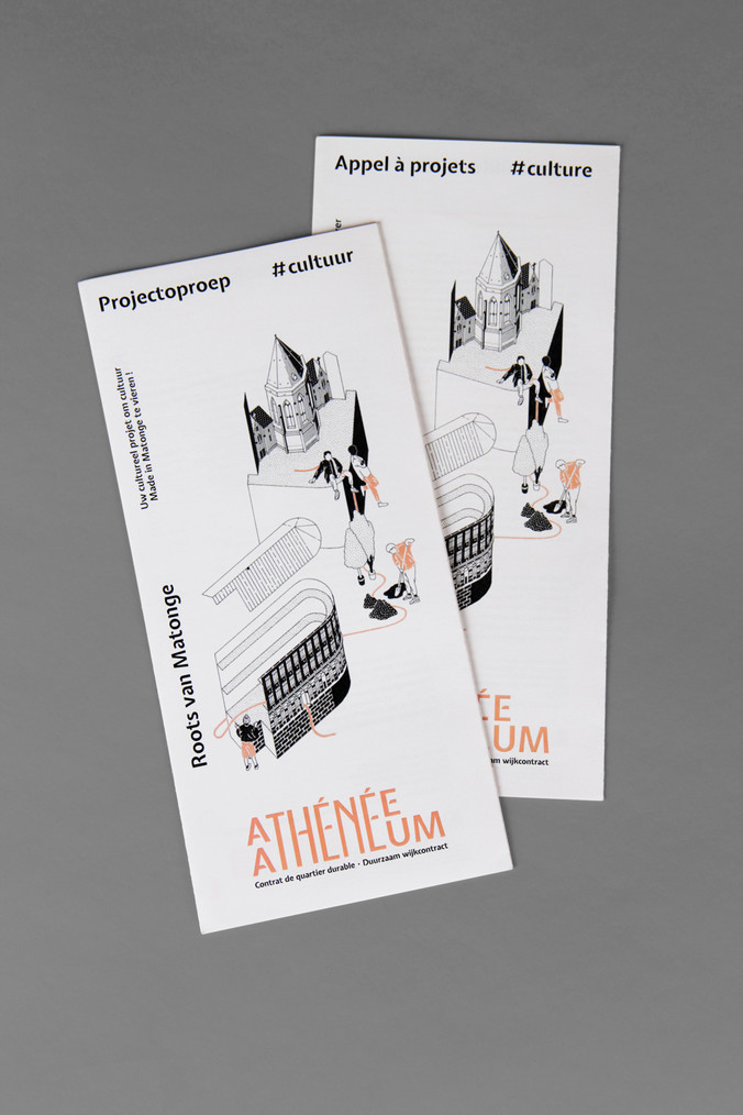
flyer template A6 / US - foldable map A2 closed A5 / 5,500 copies - booklet A5 / 40 pages




Ixelles urban plan – Athénée
commission
2017-2022
identity
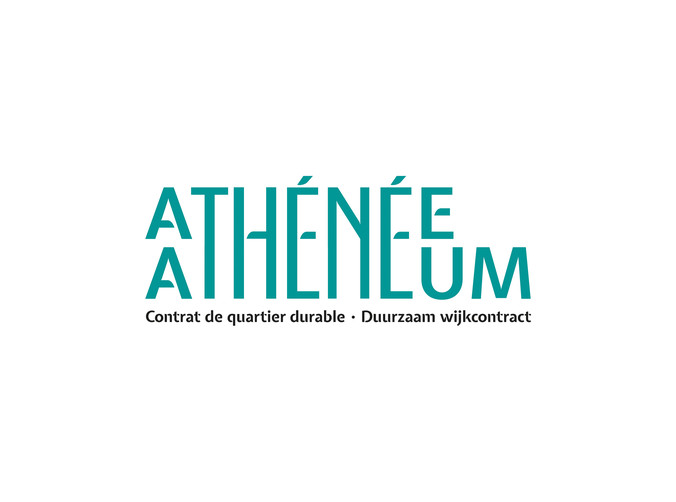
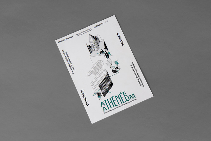
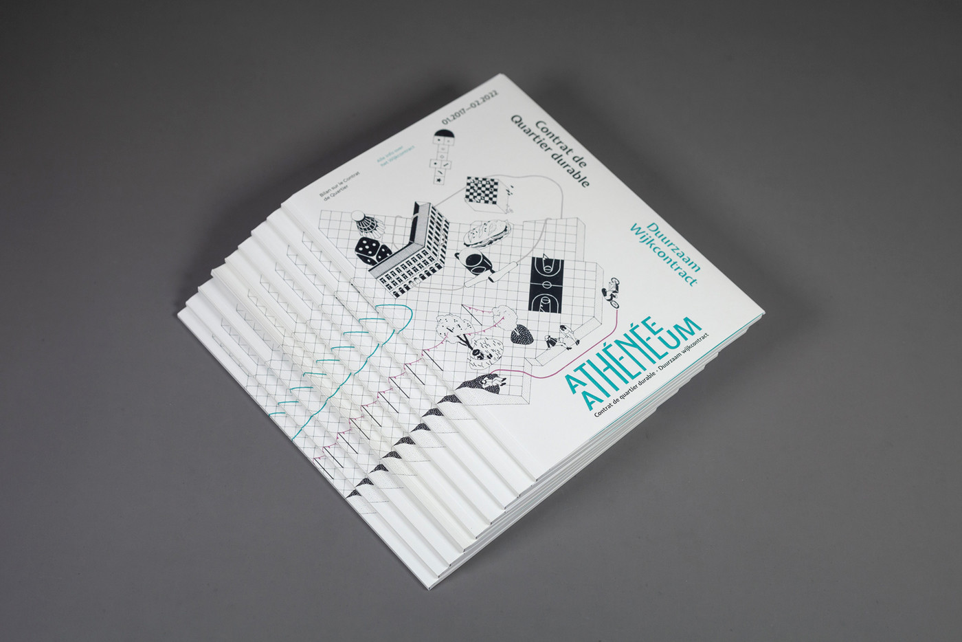
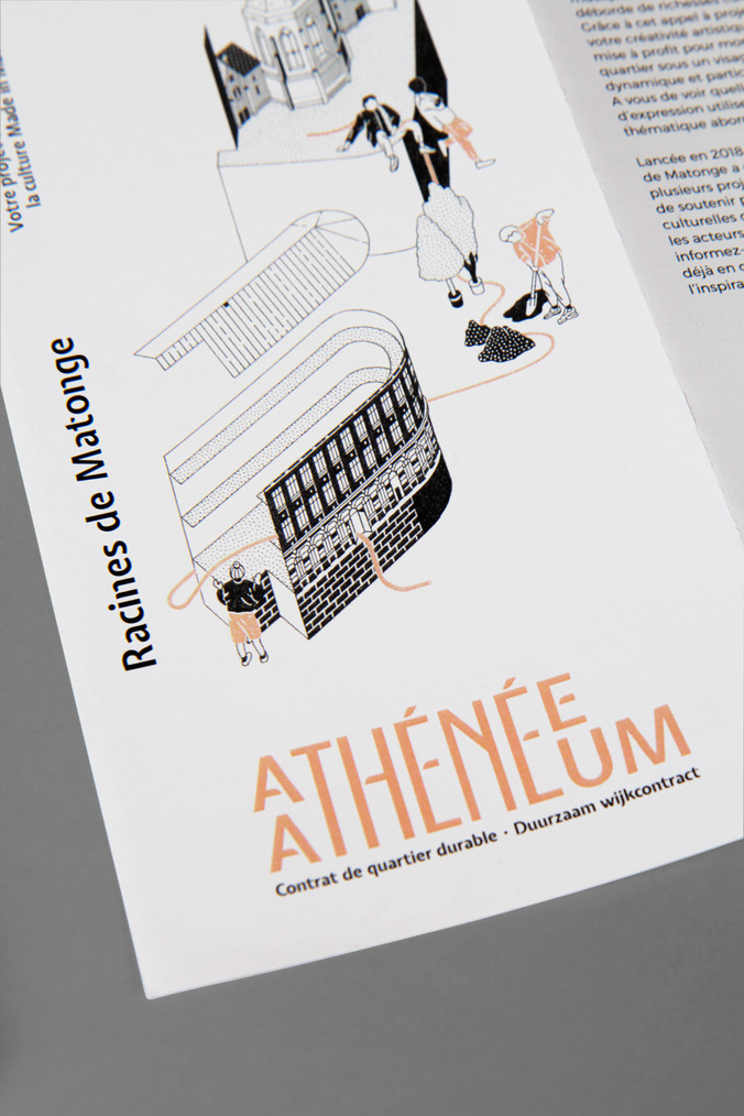
For this urban neighbourhood refurbishment master plan, the city of Ixelles in Brussels commissioned us to set up communication tools at key moments along the 5 year plan. The logo, specifically bilingual, was designed by stretching or doubling letters inspired by the city's visual identity. It comes in 3 possible colours.
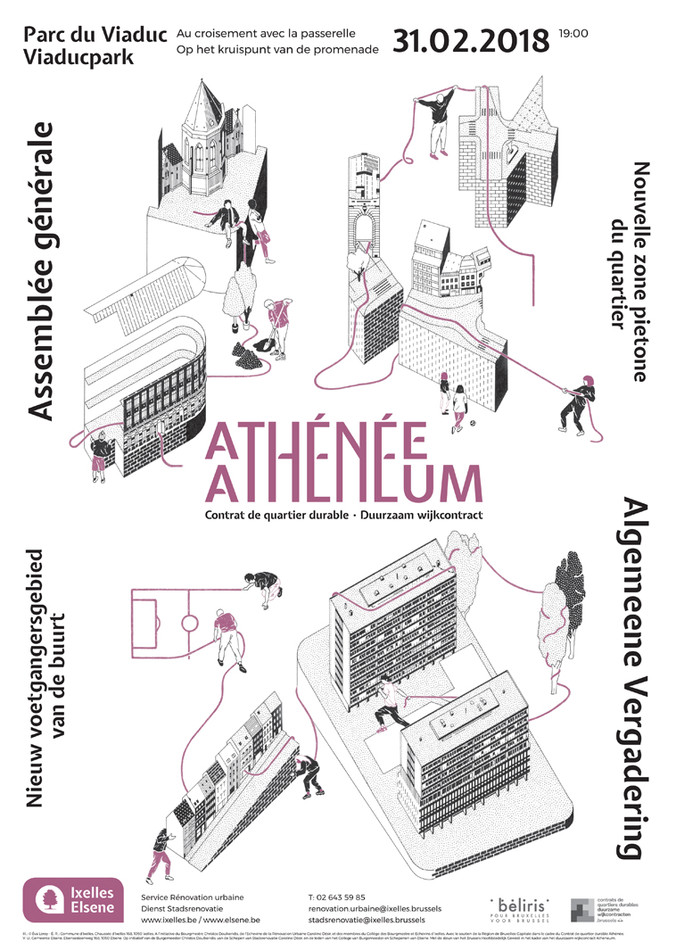
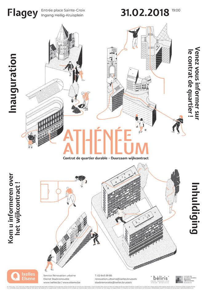
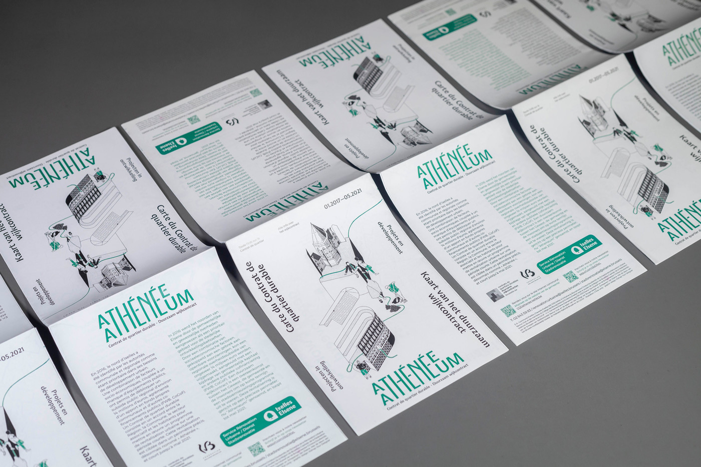
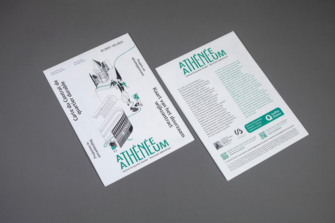
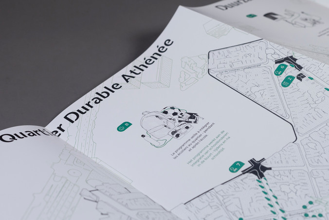
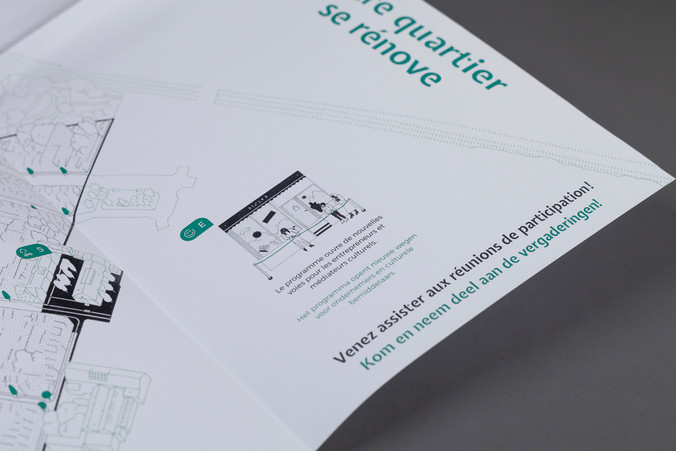
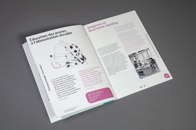
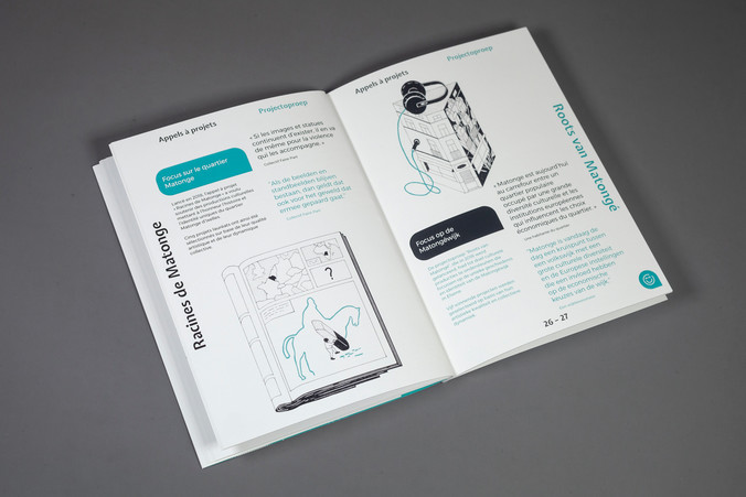
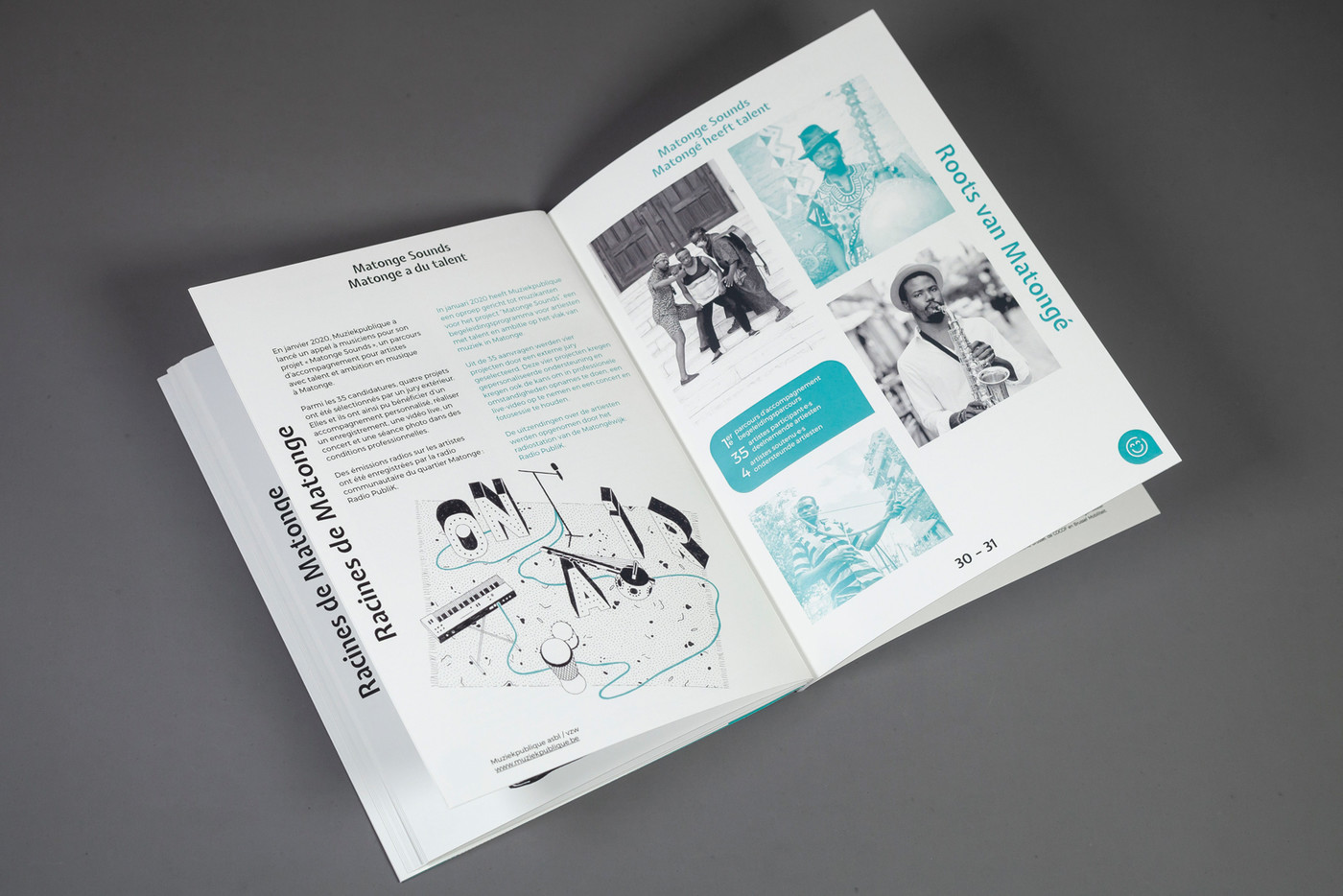
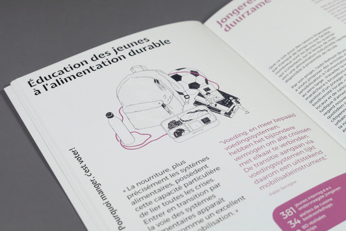
A map was one of the main communication tools. This in mind, we invited the illustrator Éva Le Roi, a specialist in architectural drawings, to produce the map as well as the main visual. For the latter, she created a drawing made up of 3 different aspects of the urban plan. The mix of unrealistic sizes featured in the illustration emphasis the role of each and everyone in the neighbourhood, from citizen, estate agent, or associative member to an elected politician. Many more illustrations in the same style can be found in the appraisal booklet.
The bilingual text layout is spread evenly on all 4 edges of each format and borders the illustration without obscuring it.
