St'art
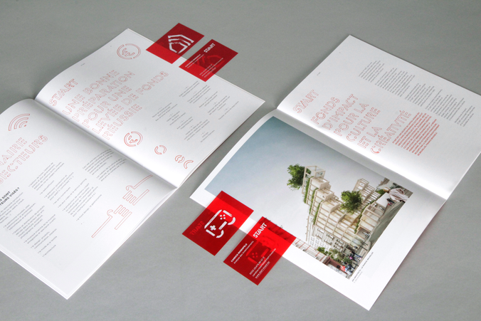
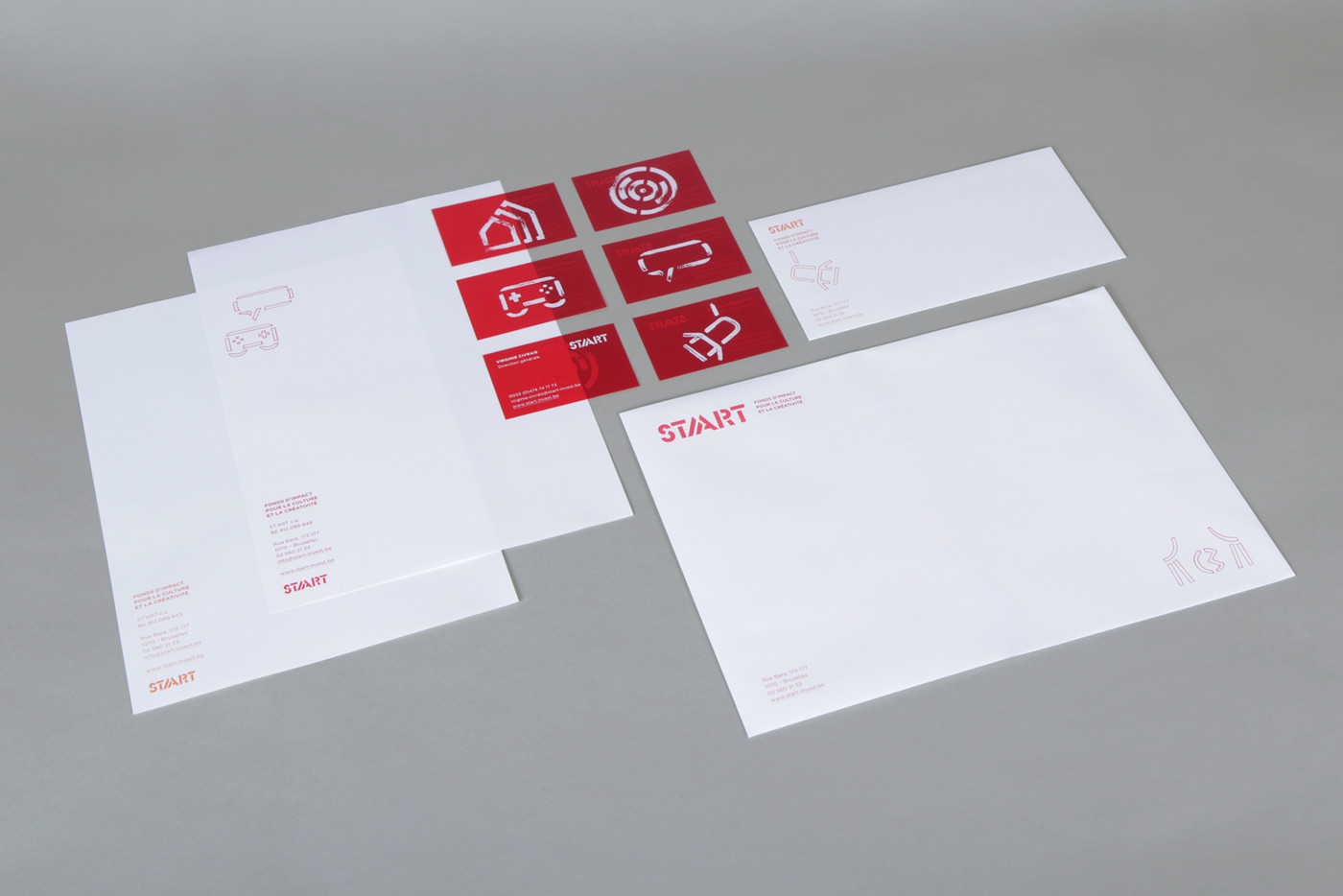
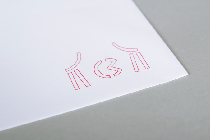
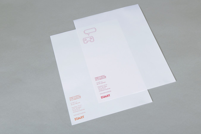
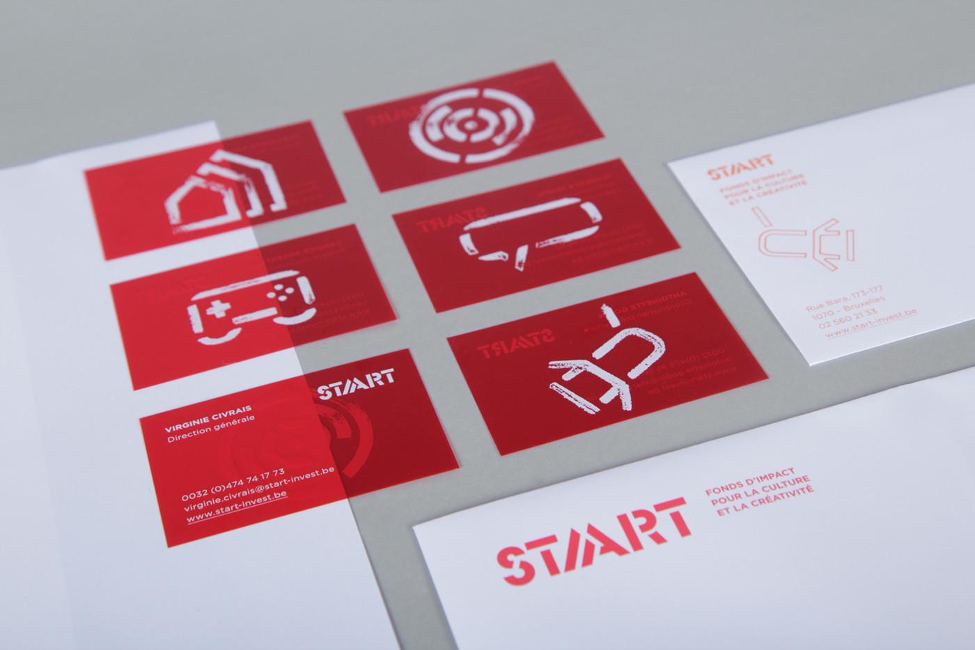
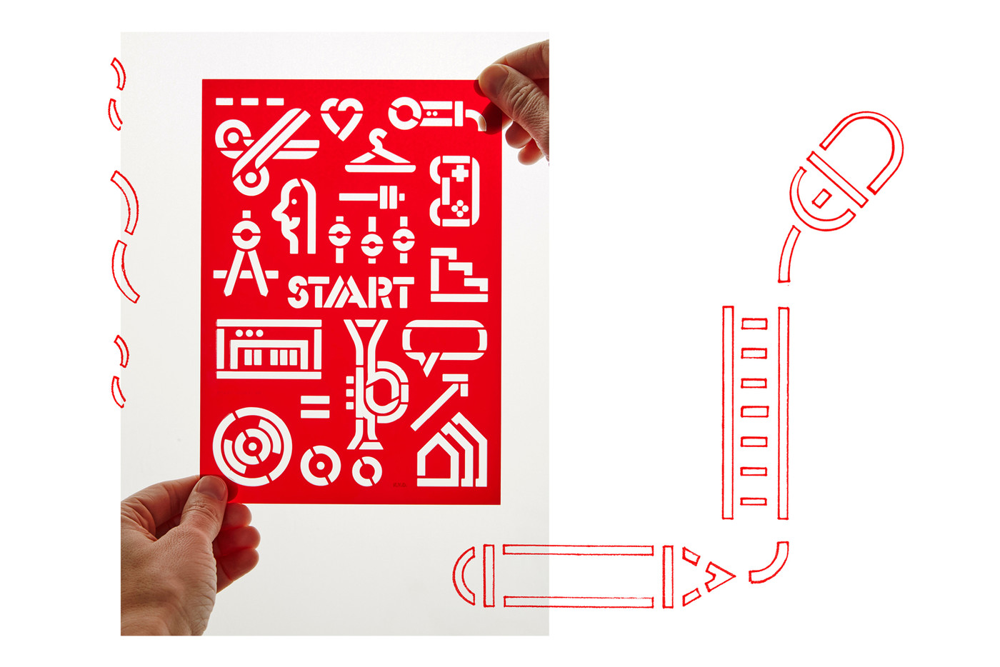
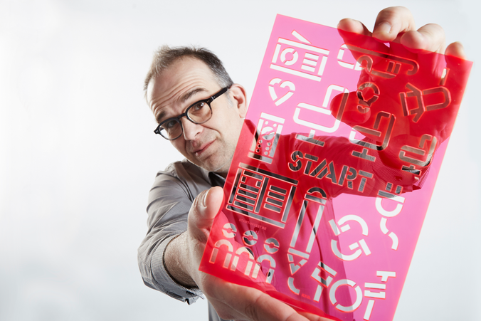
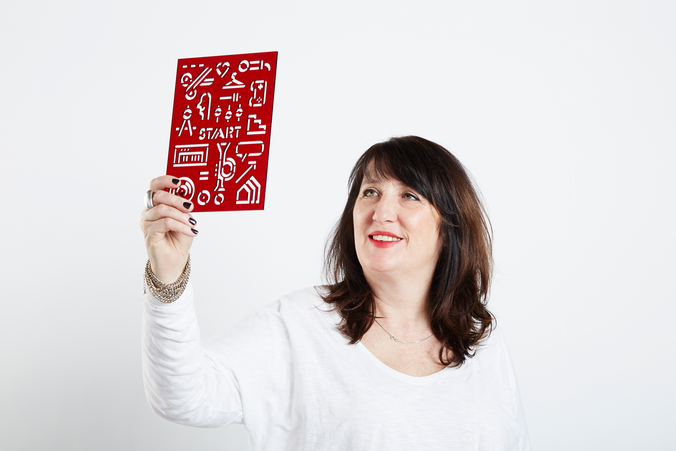
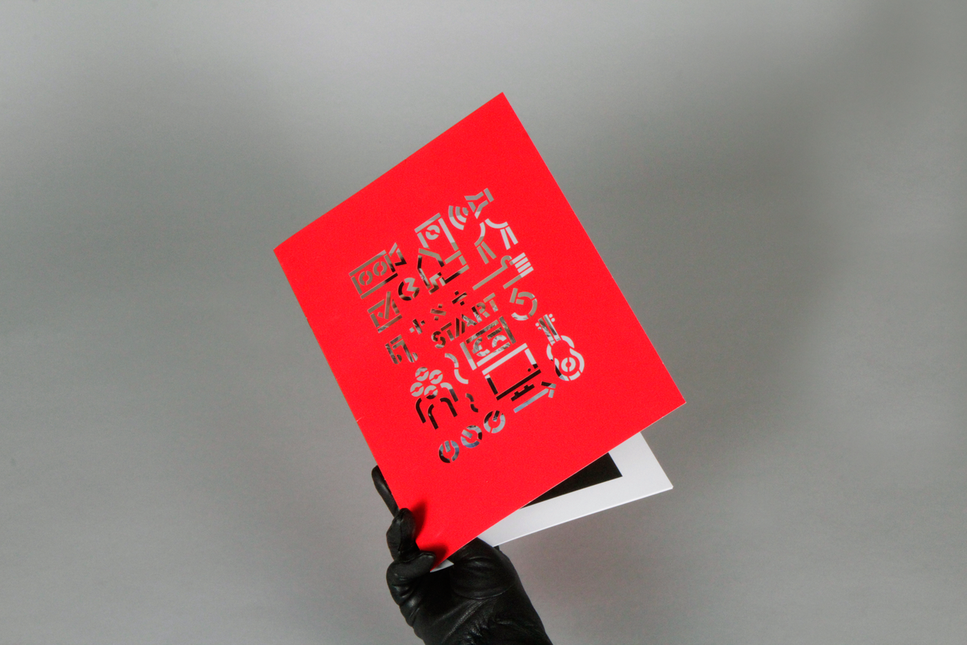
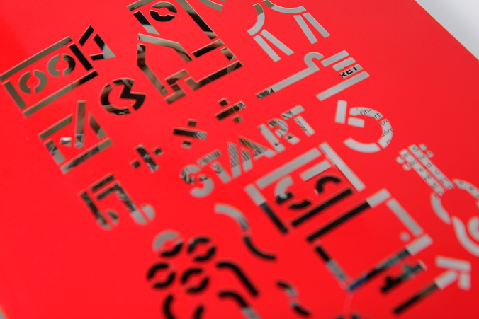
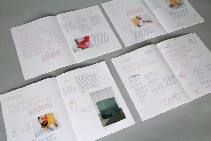
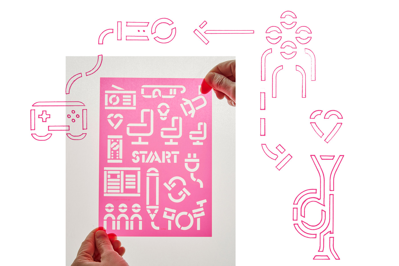
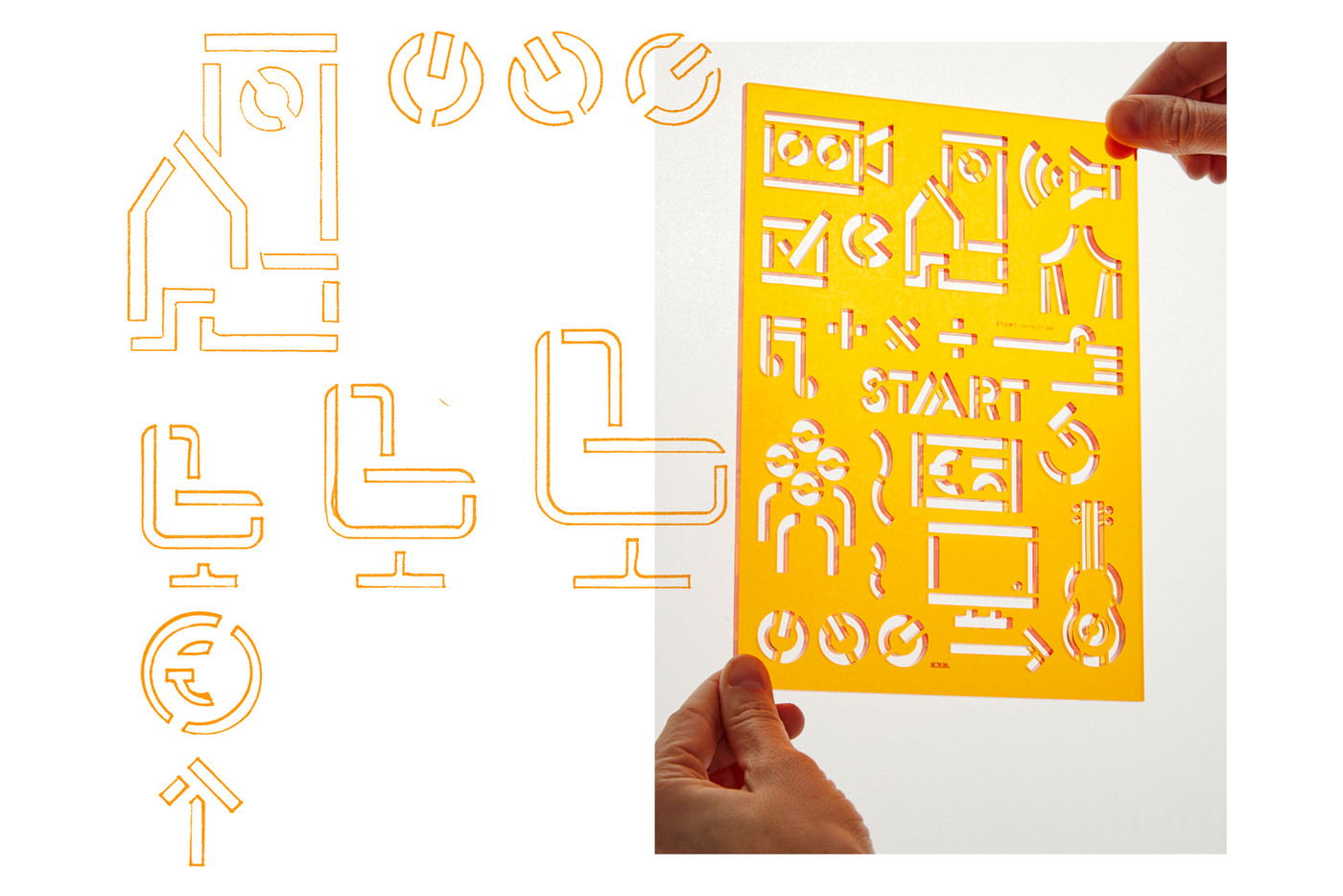
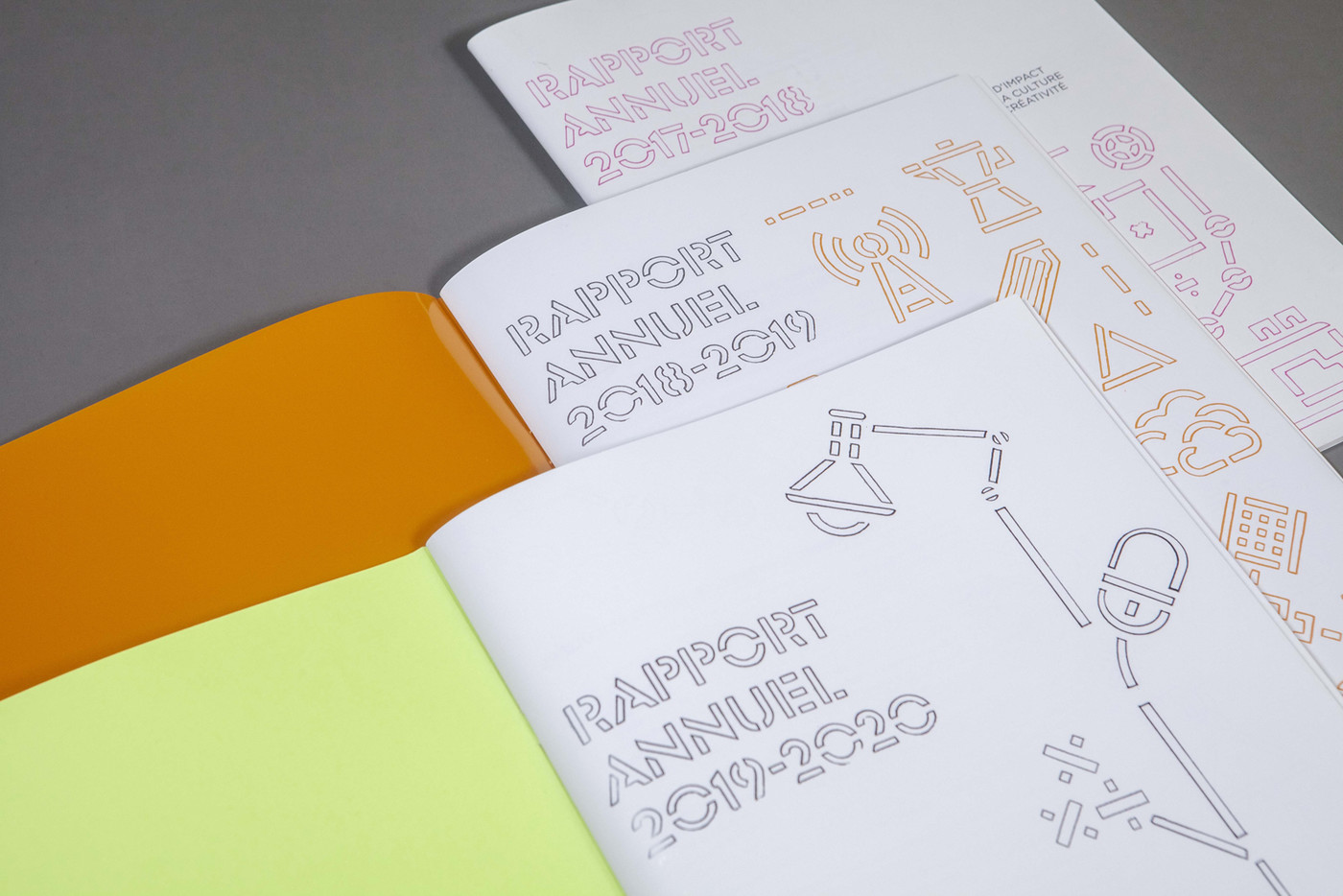
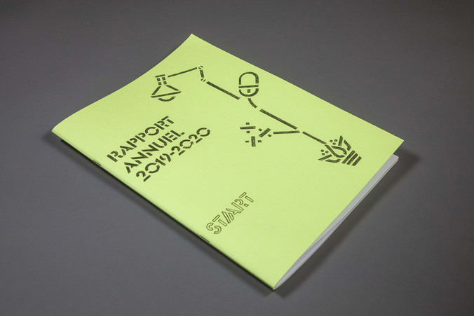
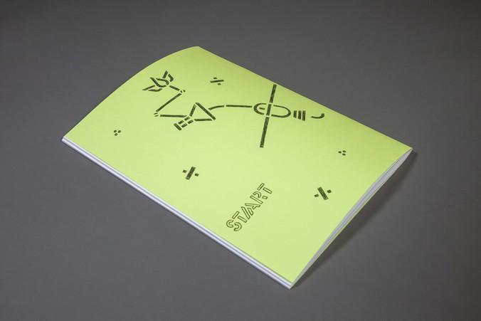
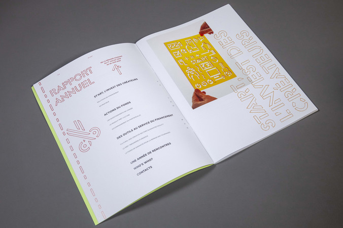
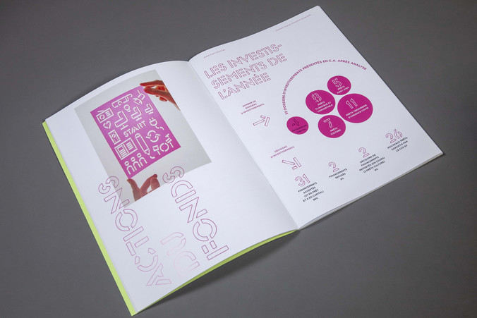
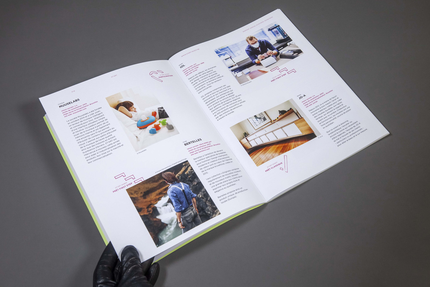
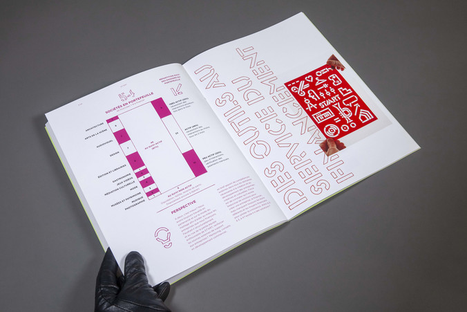
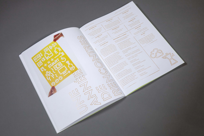
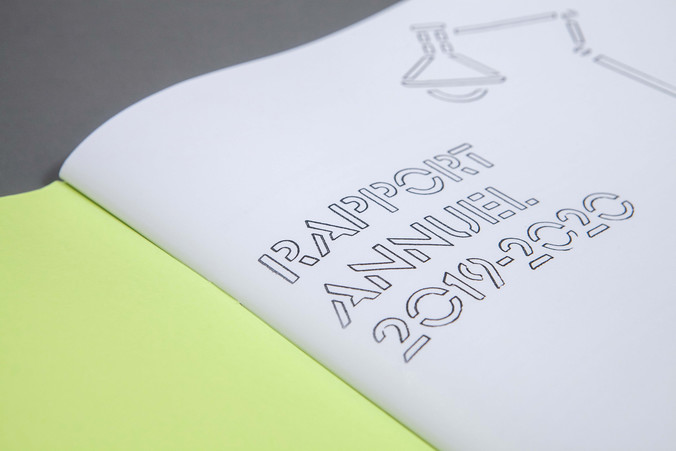
Basing ourselves on their existing logo, we developed a new visual identity on the idea of stencil template. These normographs plates help draw various kinds of elements, from fonts to architectural plan items. A metaphor for St’art’s helping hand to creative and cultural businesses.
visual identity - illustrations - 5 normographs / laser cut / colored Plexigass / presentation booklet / offset & lasercut / 2000 copies - business card / transparent pvc / silkscreen - digital communication - stationary

St'art
St'art manages funds aimed at small and medium-sized businesses, including non-profit organisations in the cultural and creative field.
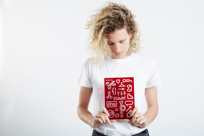
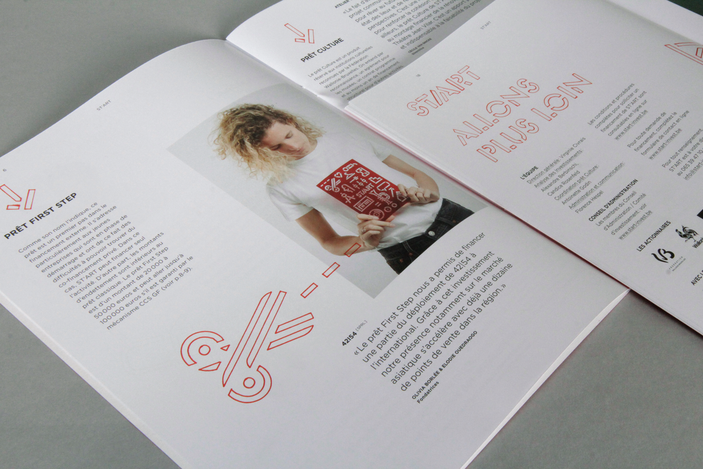
We created standardised illustrations inspired by the businesses involved with St’art. These illustrations were then adapted as stencils and combined so they could be produced without falling apart. The stencil templates were laser cut in coloured Plexiglas in a fablab in Brussels. These came out beautifully and a photoshoot session was organised with several beneficiaries holding them to illustrate their interview featuring the brochure.
- Olivia Borlée (42154)
- Bernard Stevaert (Fonds Mercator)
- Nathalie Uffner (Théâtre de la Toison d'Or)
- Olivier Rey (Cinéma Palace)
