Cifas — Non-Identity
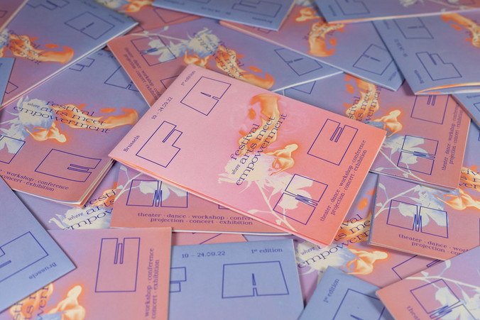
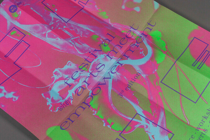
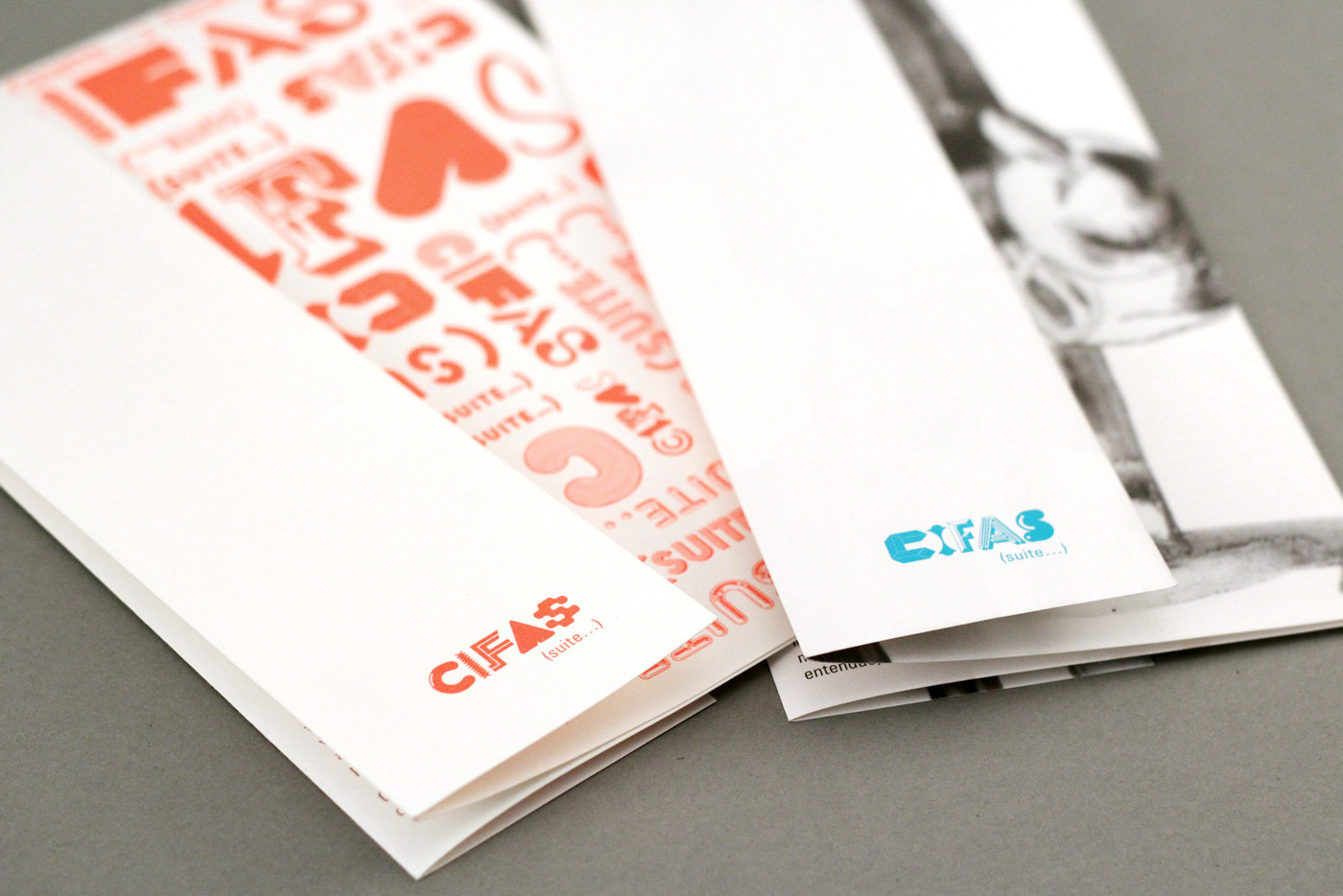
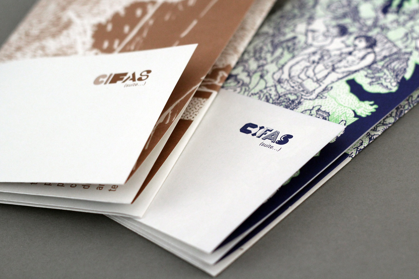
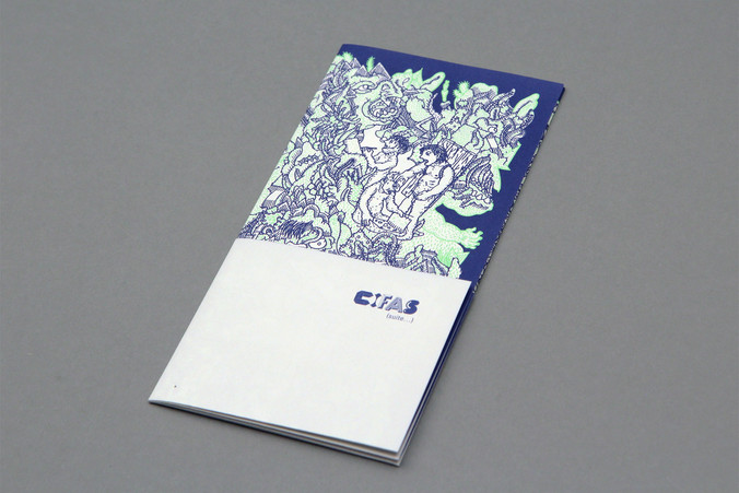
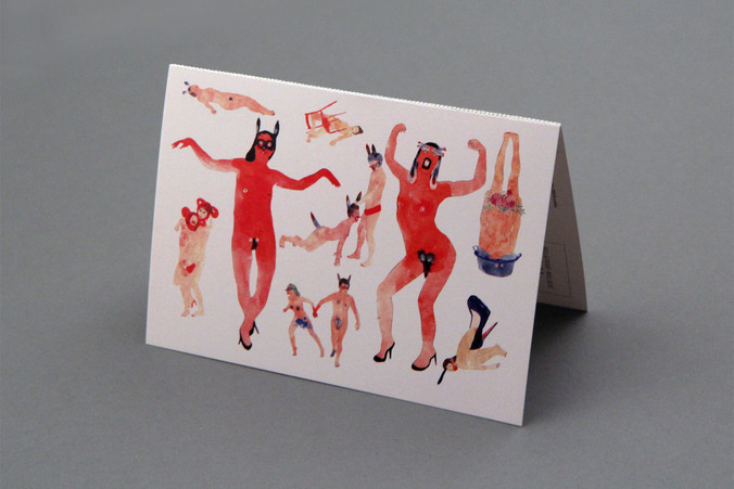
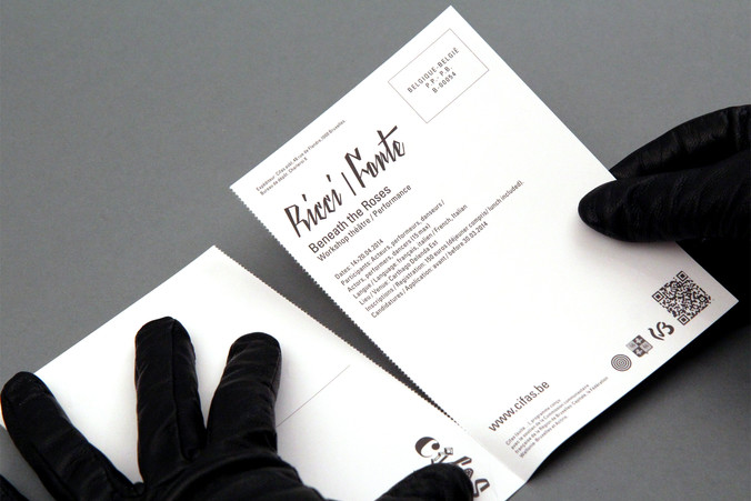
The communication puts forward the illustration the Cifas commissons for each event they organise. When no event, the multiple logo identity takes over.
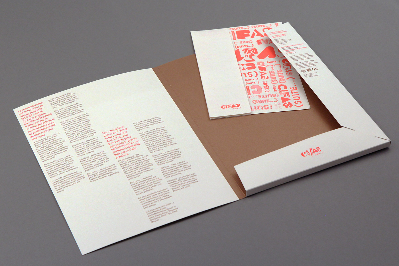
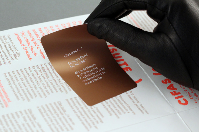
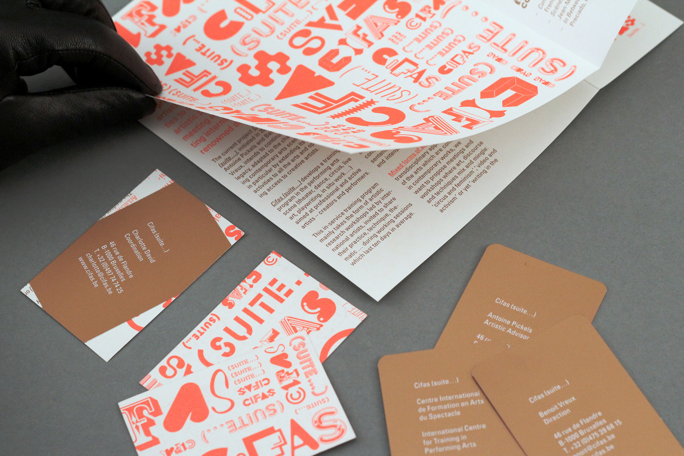
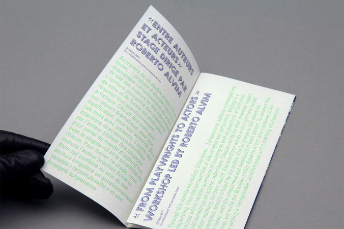
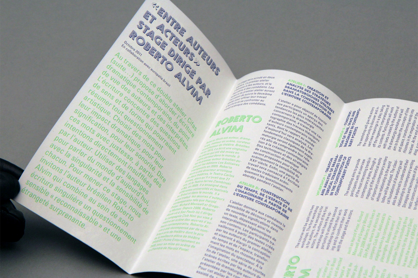
business cards / screenprinted stickers / offset printing fluorescent & metallic PMS / 400 copies – folder / 500 copies – flyers / pre-cut card board / different fold - website
Cifas — Non-Identity
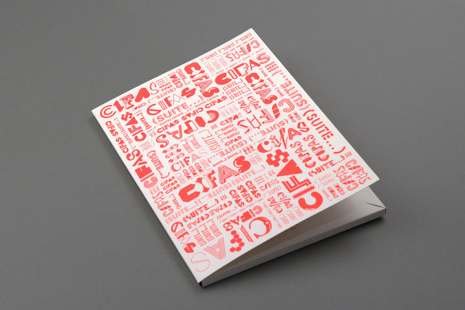
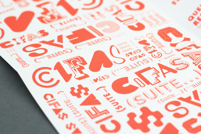
Cifas(suite…) is an association offering master classes in the theatrical and performance industry. The desire of its current team not to set a precise visual identity, coupled with the need to communicate a recognisable and accessible image, led us to develop, not one, but multiple graphic forms. The variety of fonts used for the logo, the multiplicity of formats and the various collaborations with illustrators are all manifestations of this approach.
There is no single Cifas logo, but many. The use of typographical differences for each letter not only allows us to remember the acronym, but to also develop a heterogeneous multi-faceted visual identity that reflects the varied fields of action of the Cifas.
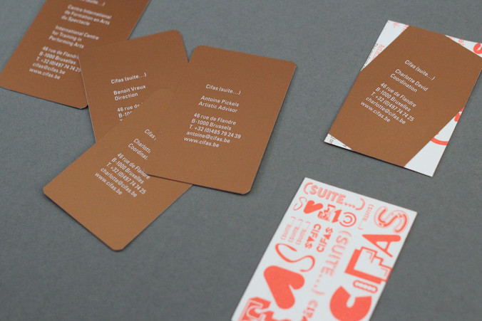
We've designed business cards recycling out-of-date leaflets. We chose to screenprint the contact details on thick sticker and hide the text. They could then keep the colorful leaflet cover visible as the back of their business cards.
Illustrators:
- Francesco Defourny
- Eric Croes
- Bertrand Panier (Bert)
- Joanna Lorho
- Astrid Yskout
- Chloé Perarneau
- Pierre Piech
- Muriel Bleus
- Aurélie William Levaux
- Arno Debal
- Jean-Charles Frémont
- CÄäT
- Anne Brugni
- Carl Roosens
- Nuno Pinto da Cruz
- Annabelle Guetatra
- Steve Michiels
- Fanny Dreyer
- Florian Huet
- Priscille Depinay
- Julie Joseph
- Julia Eva Perez
- Sarah Cheveau
- Delphine Heymans
- Benjamin Monti
- Anne Fontenelle
- Fabienne Loodts
- Noémie Marsily
- Felicie Haymoz
- Marion Sellenet
- Samuel Hackwill
- Alexandre Delft
- Charlotte Peys
- Émeline Brulé
- Cécile Deglain
…on going
Designed for: Cifas
