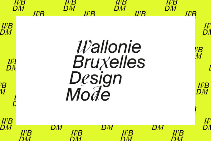
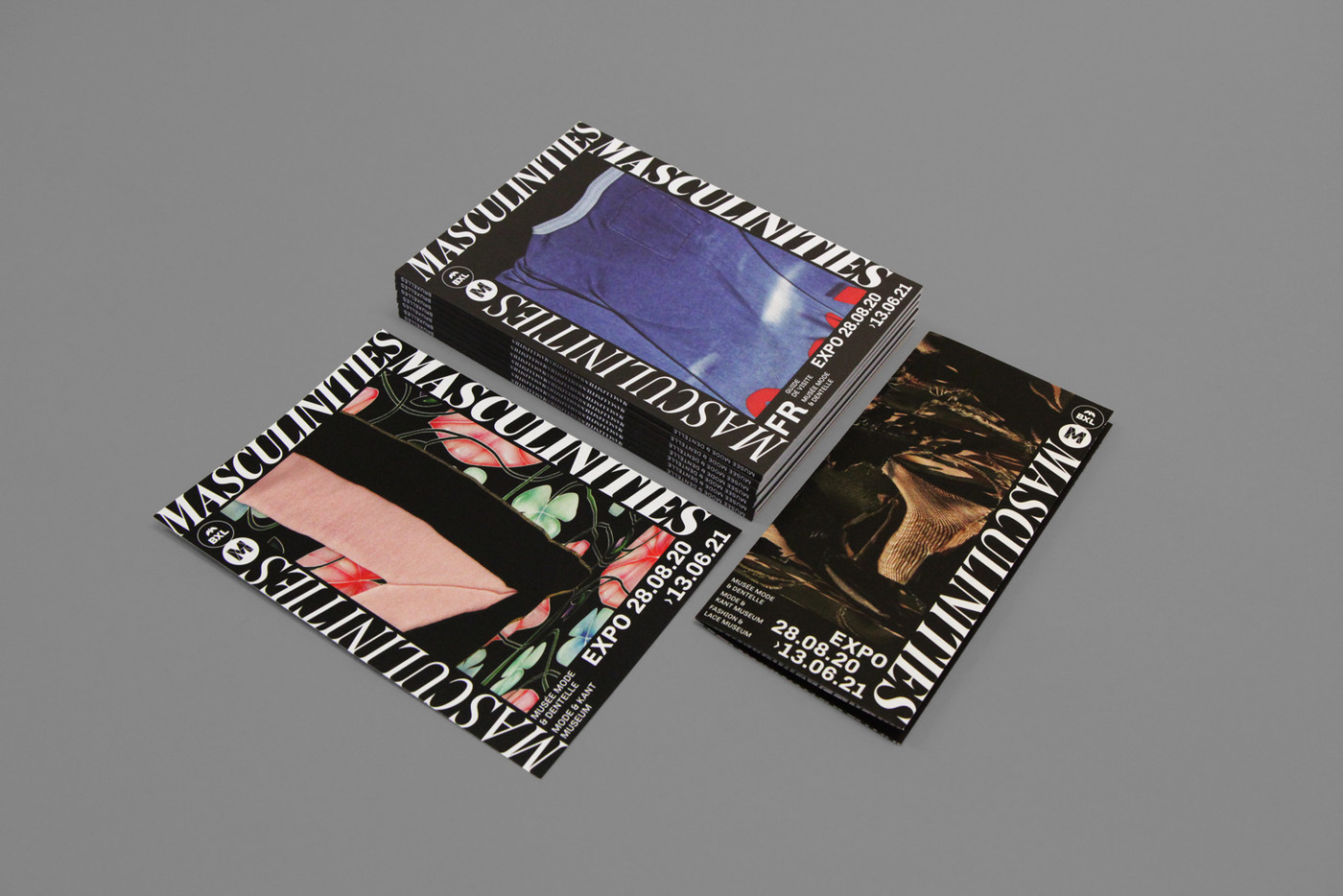
Masculinities
commission
2020
exhibition identity & signage
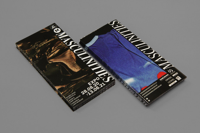
The Museum of Fashion and Lace in Brussels hosted this very generous and exquisite exhibition about masculine fashion through the ages. We were invited to create the communication for this almost year round show as well as the exhibition signage and visitor’s guides.
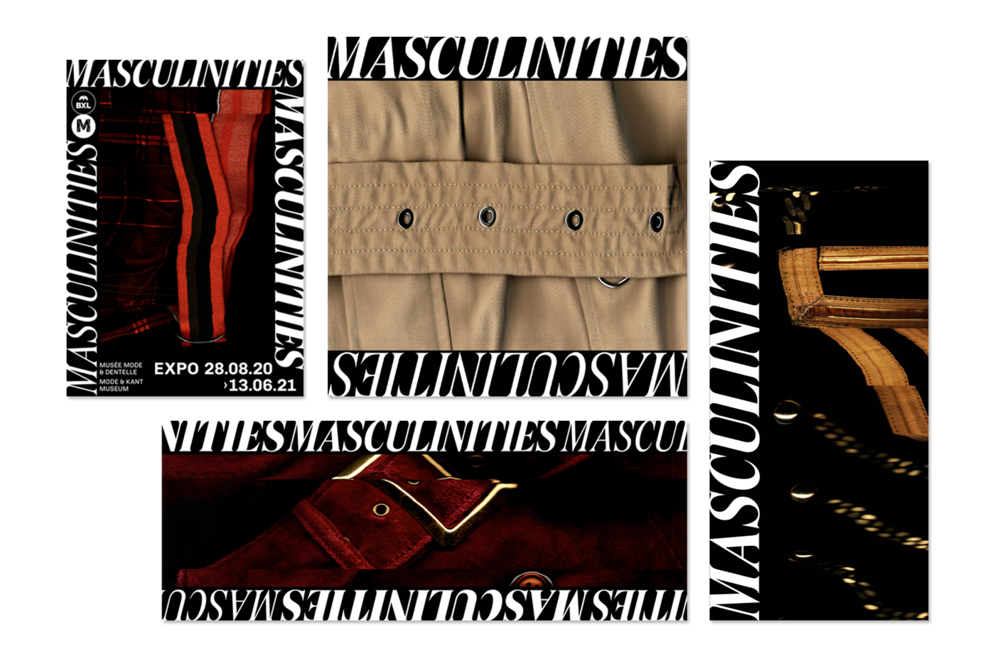
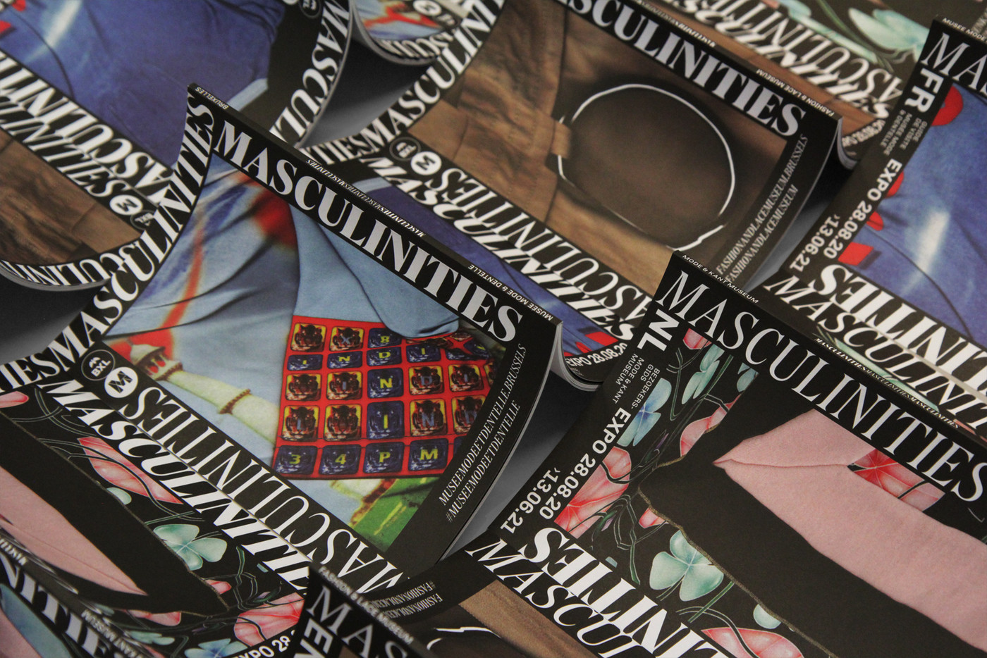
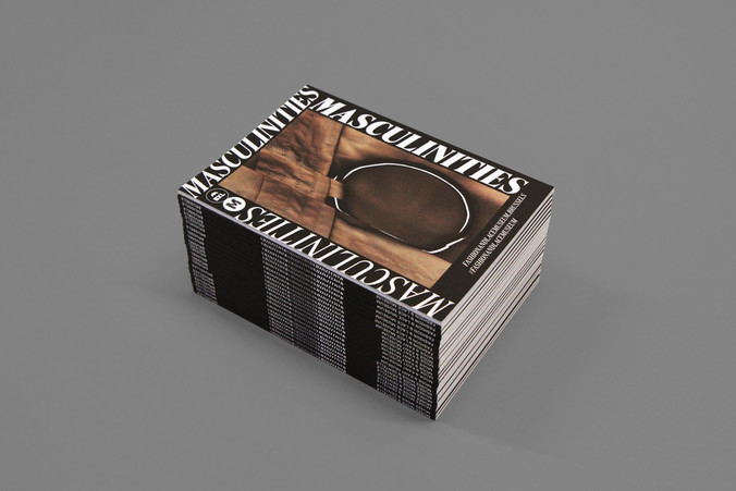
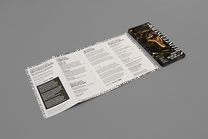
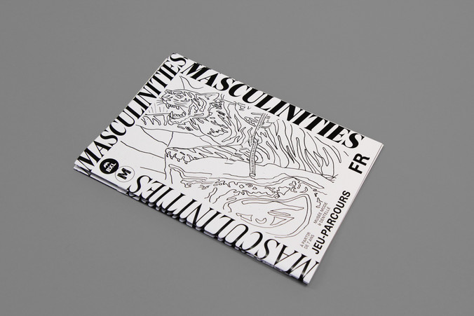
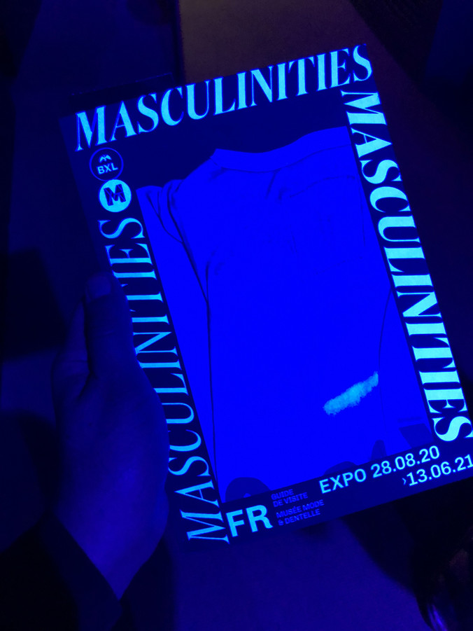
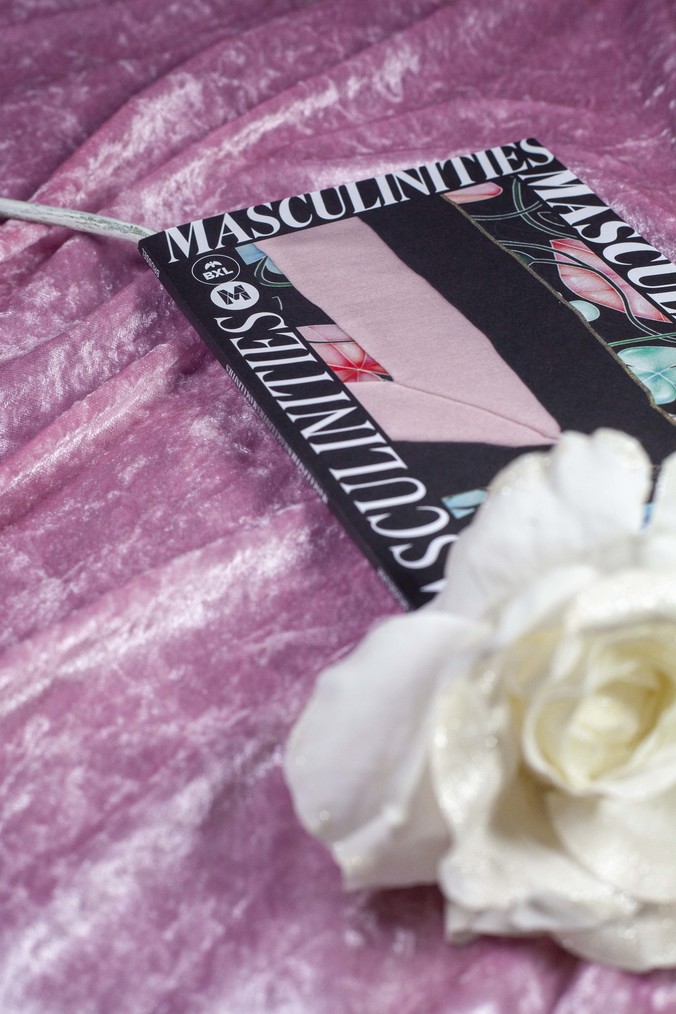
poster 2m2 / A0 / A1 / A2 / 7 versions each / 1,000 copies – animated posters / 4 versions – folder US / 6 pages / 55,000 copies – flyer A5 / 15,000 copies – social media mixed formats – visitor's guide / FR-EN-NL versions / A5 / 64 pages / 5,000 copies – kid's booklet / FR-EN-NL versions / A4 / 900 copies – exhibition texts / 36 versions – surgical masks / 4 versions
Masculinities
commission
2020
exhibition identity & signage
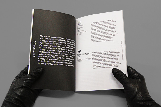
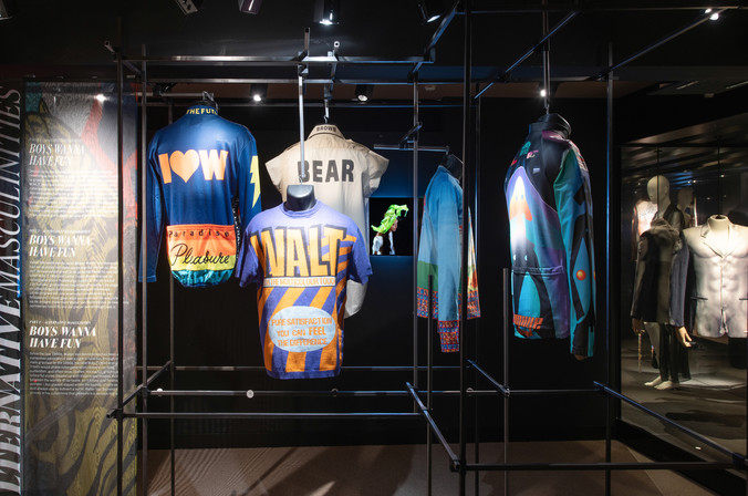
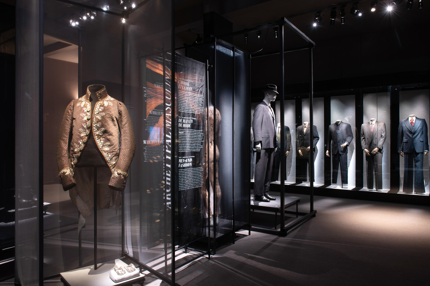
The Museum of Fashion and Lace in Brussels hosted this very generous and exquisite exhibition about masculine fashion through the ages. Starting from the riding coats of the 15th century to the latest Belgian and International brands, the selection doesn’t exclude the questioning of patriarchal traditions. We were invited to create the communication for this almost year round show as well as the exhibition signage and visitor’s guides.
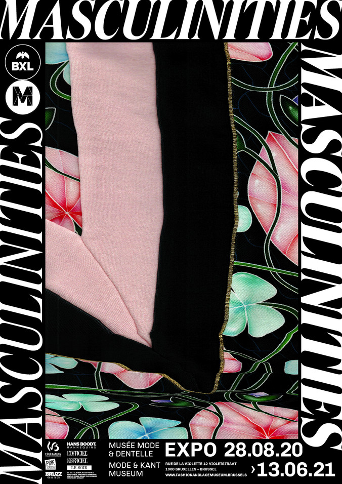
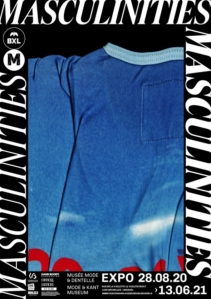
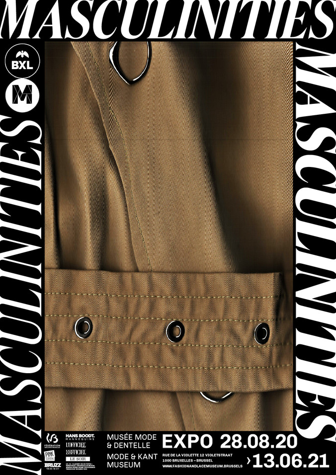
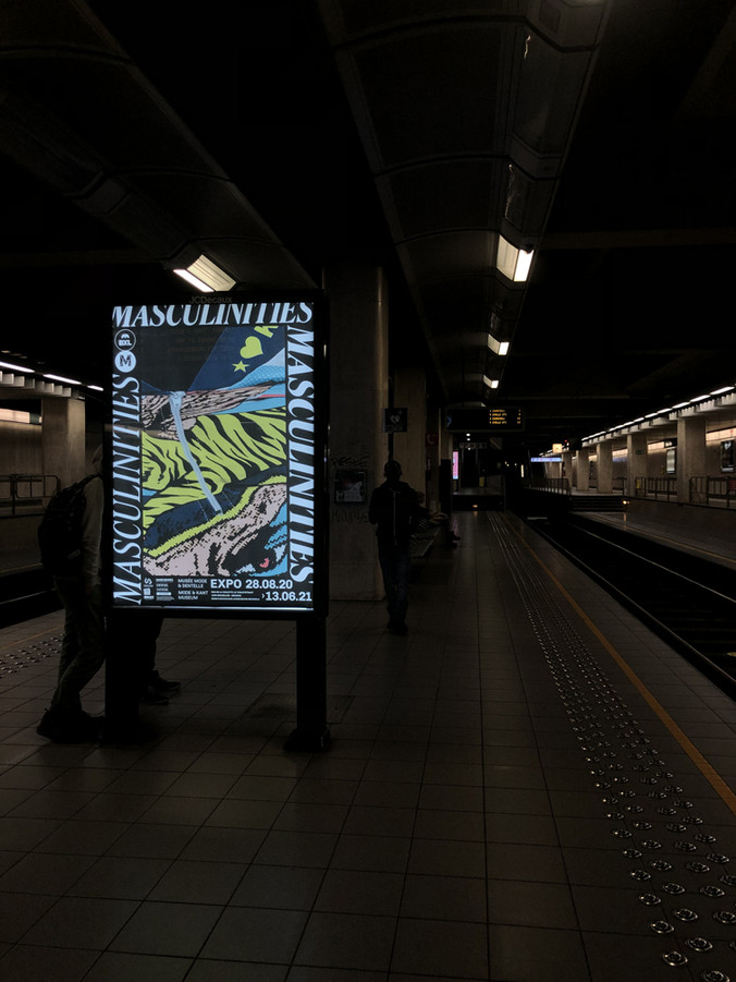
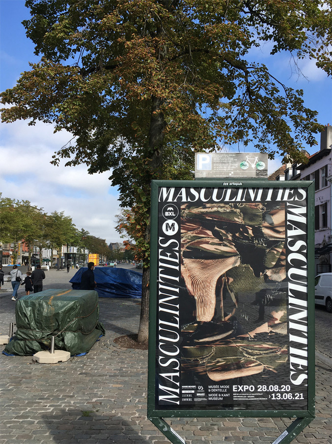
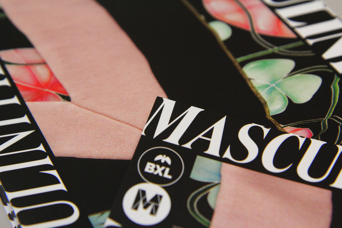
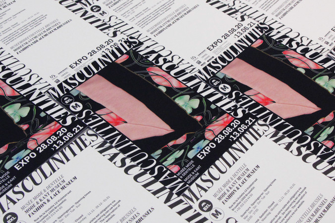
The details of the different fabrics and fashion prints are striking and it seamed natural to put them forward in the communication. With the help of a handheld portable scanner, the delicate cloths were digitalized in high resolution. This scanning method, which is not designed for uneven surfaces, underlines an interesting paradoxical aspect of visual communication. Indeed a confrontation emerges between the three dimensional essence of clothing design, and the intrinsic flatness of images. Therefore, deformation and glitches feature in the results. Nevertheless, the recognizable parts of clothing, the details of thread patterns and the prints illustrate clearly that fashion is the subject of this museum and exhibition.
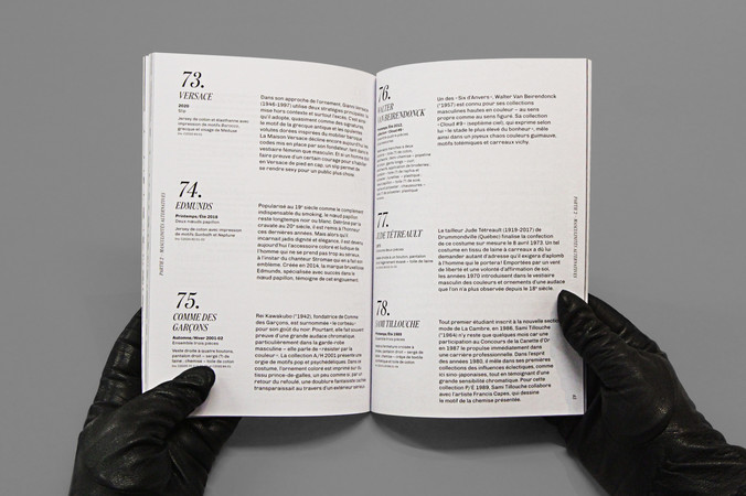
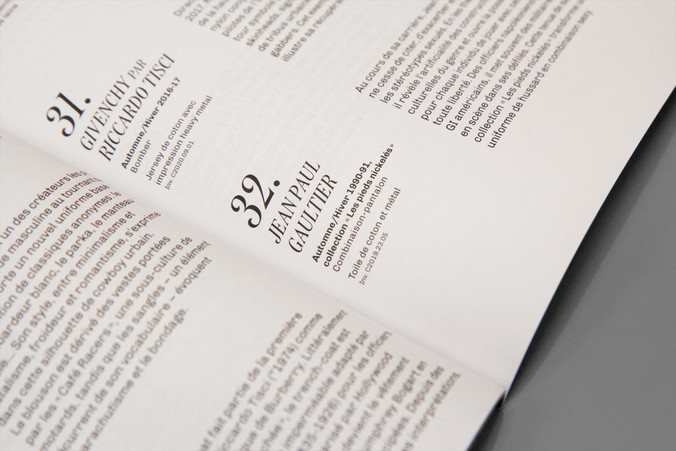
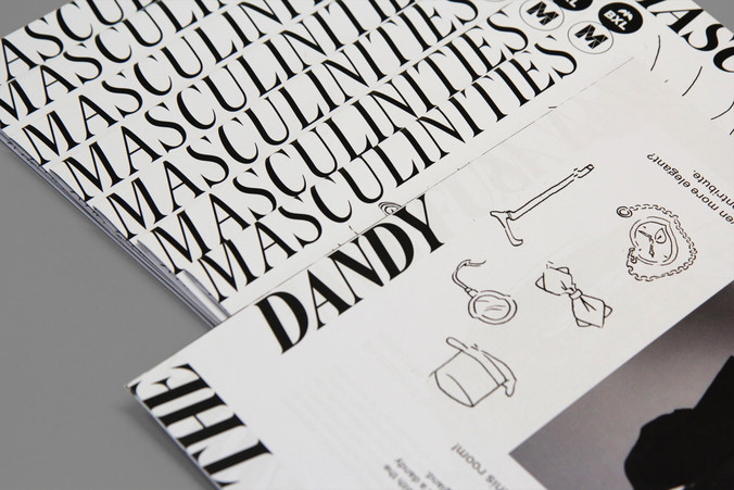
There were so many exciting and colourful images that the communication features up to 7 different visuals, all from top notch creators such as: Belgian's prides Walter Van Beirendonck and Dries Van Noten, the French humble superstar Jean Paul Gaultier, 60s dandy John Stephen, Burburrey's Riccardo Tisci, Stromae brand Mosaert and sky-rocking brand Vetements. The title and information circlude the visual in order to give it the main stage. This framing enables a repetition of the title, with different weights of the ‘Domaine Display Condensed’ font. This typeface from the New Zealanders Klim Type Foundry has strong but also refining features which perfectly illustrate variations in masculinity.
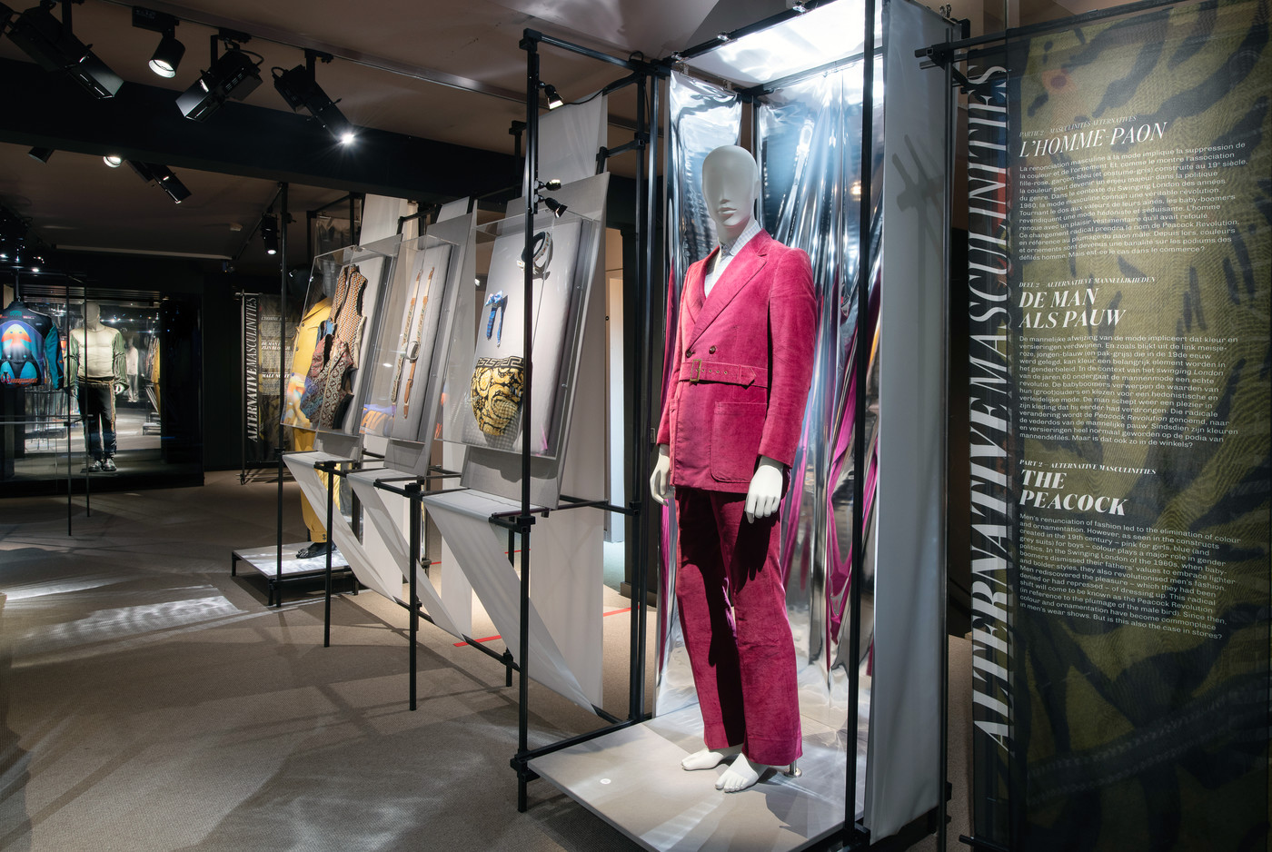
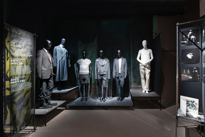
The signage with the main text is printed on almost transparent veil material which contrasts with the strong steel scenography. The rest of the texts are gathered in booklet guides, one for each of the 3 languages. A child's booklet is also designed with creative games and little observations to catch a child's attention.
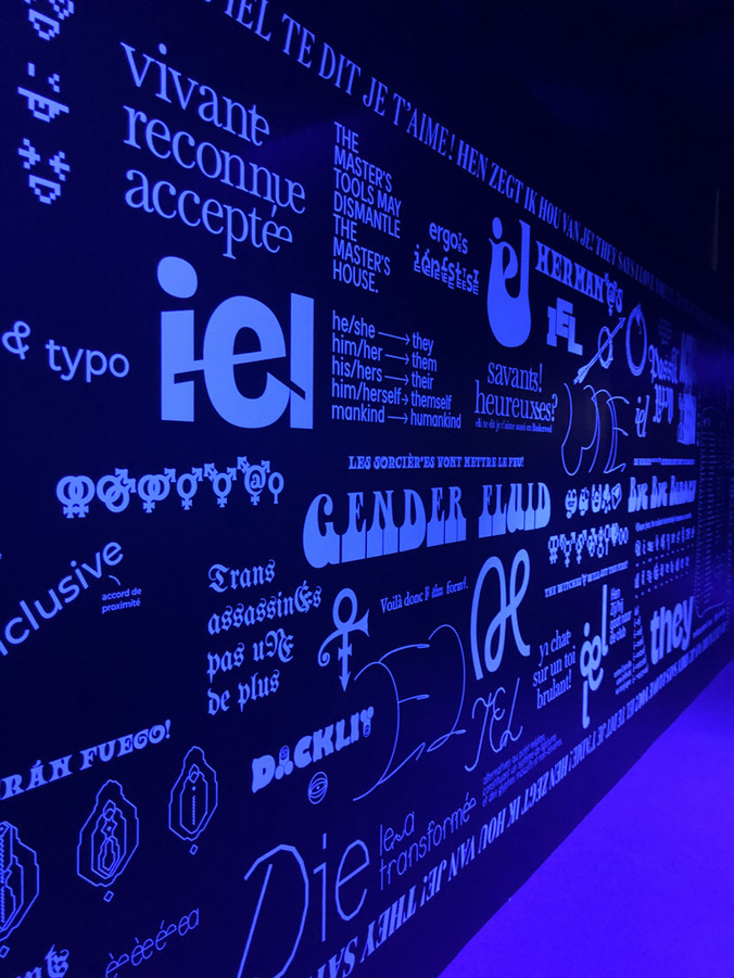
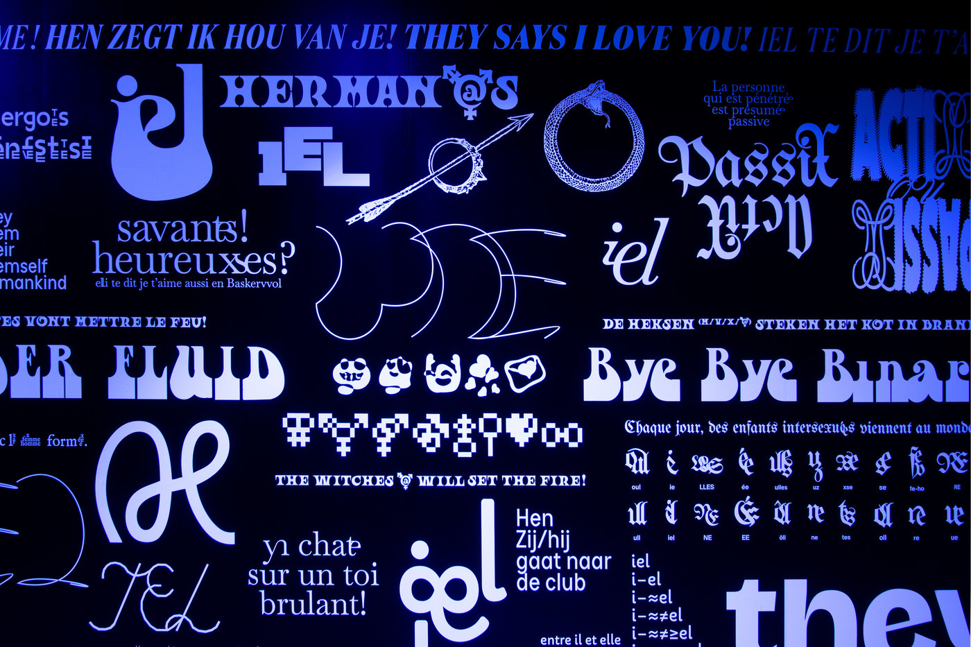
To finish off the visit, the Bye Bye Binary collective was invited to work on the main last wall of the exhibition. Addressing the subject of masculinity deconstruction, the collective works around typographic experiments. Their production proposes alternatives to the prevailing neutral masculine form currently in use in the very gendered French language.
Anouk Boyer Mazal is a Brussels based photographer. We commissioned her to do our portfolio of pictures but also for an imaginative series where you can glimpse our favourite projects (the last photo on this page).