Genres d'à côté
Genres d’à côté was created in 2001. It promotes alternative sexuality and gender. They essentially invade cinema halls and take over the big screen. Its main activities are directly rooted in the world of cinema, a world where it likes to overturn standardised performances and established check boxes.
logotypes - identity - reponsive website - post card - beach flags
Genres d'à côté
For their 15th anniversary we were invited to draw them a new logo and identity. We found their cinematic approach and collective roughness inspiring.
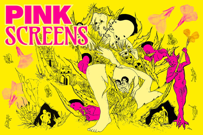
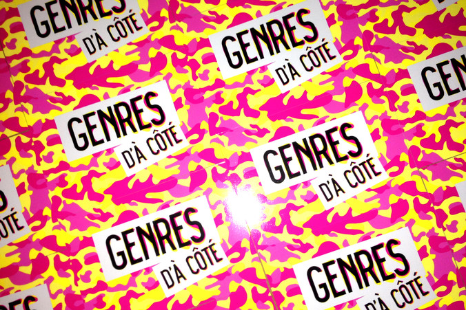
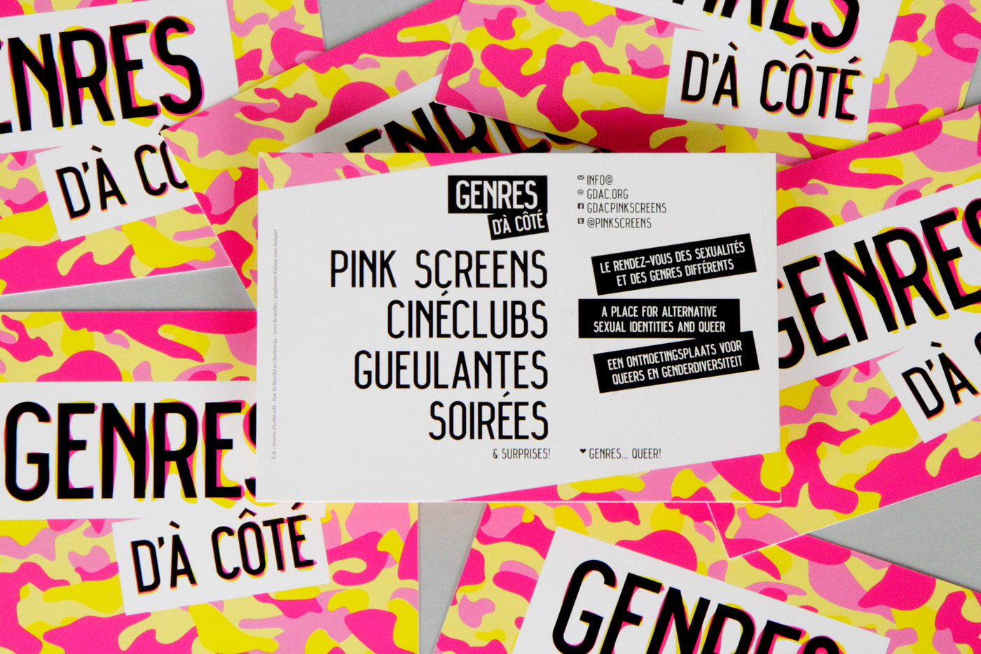
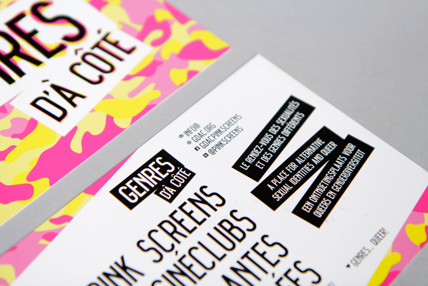
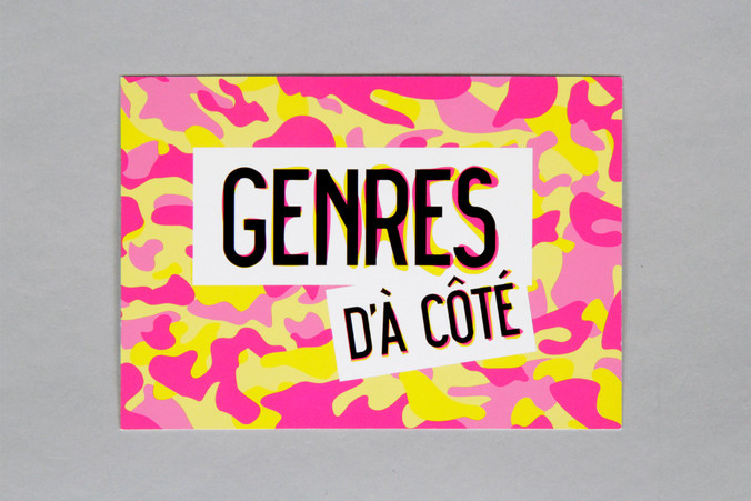
Through the years they had built some communication habits based on a strong colour duo, magenta & yellow, and illustrations for their yearly main festival, Pink Screens. We didn't throw everything away as the public had linked these elements to their events and they were quite efficient. Instead we emphasised the colours by creating a Warholian pop camouflage – somehow underlining the contradictory idea of blending into the crowd while coming out – with typographical blur on sticker-like patches and space left over for photos & illustrations. Also the typeface is Belgian (!) and opensource: Alfphabet III by OPS.kitchen
Last but not least, a new website featuring an extraordinary Queer-O-Rama film database is out and available on many screens sizes. Check it out here: GDAC.org as well as its twin website specially designed for the festival: pinkscreens.org