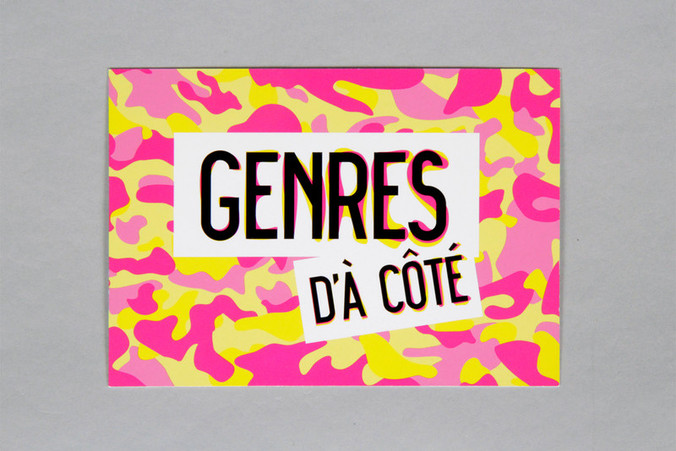
sharethecolor
The mission was to promote a positive message about LGBTQI+ individuals. We decided to make everyone our target audience, as this matter actually concerns everybody and not only LGBTQI+. To reflect that we decided that everyone could become our subjects.
sharethecolor
We were exited to participate, in partnership with the RainbowHouse Brussels – the LGBTQI+ umbrella association and The Flying Fish – Communication Agency, in a call for tenders led by the Brussels Region equality department – equal.brussels.
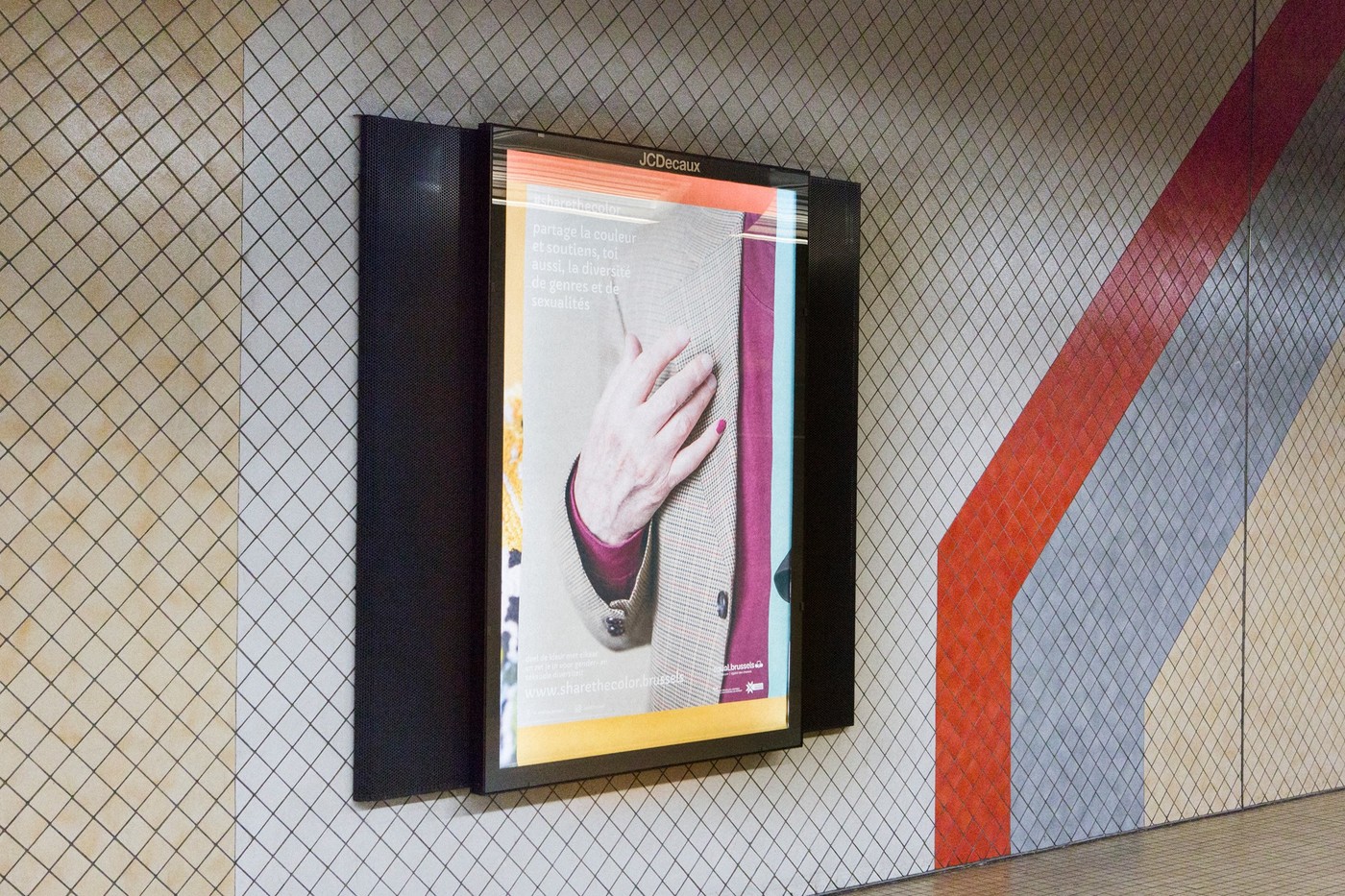
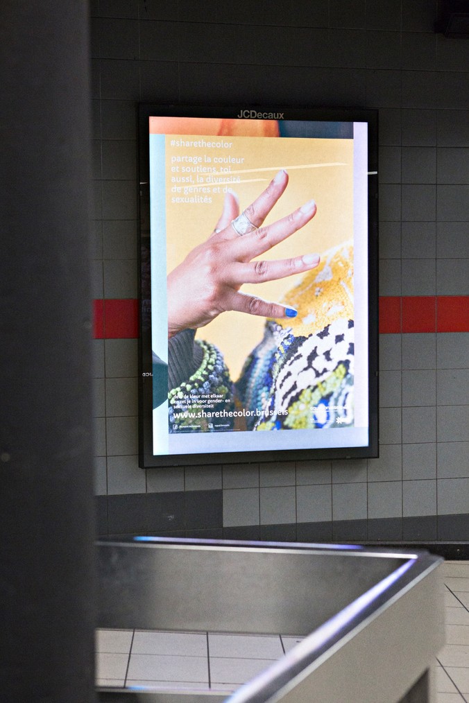
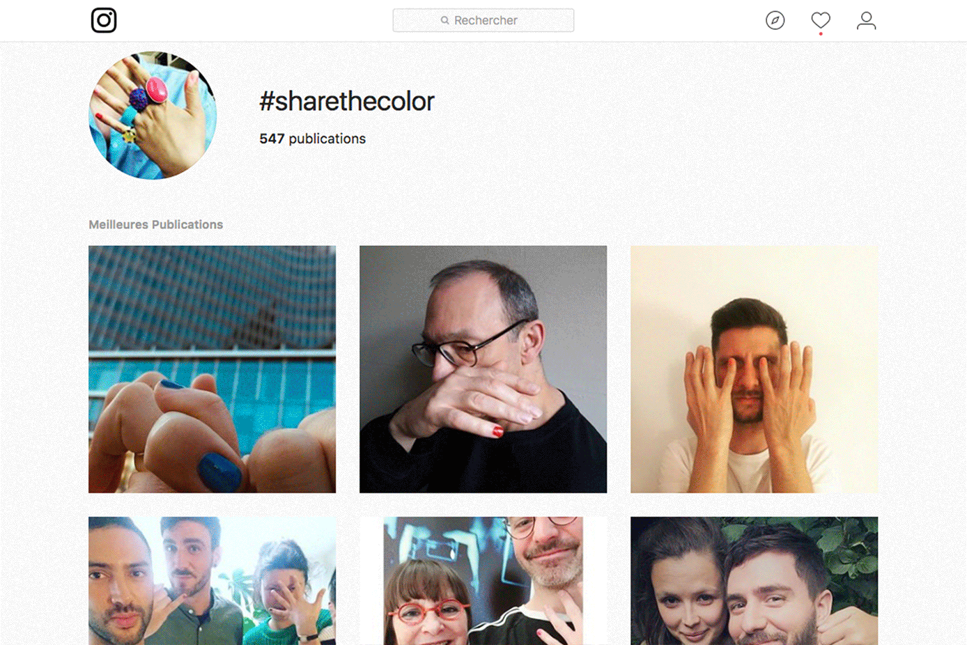
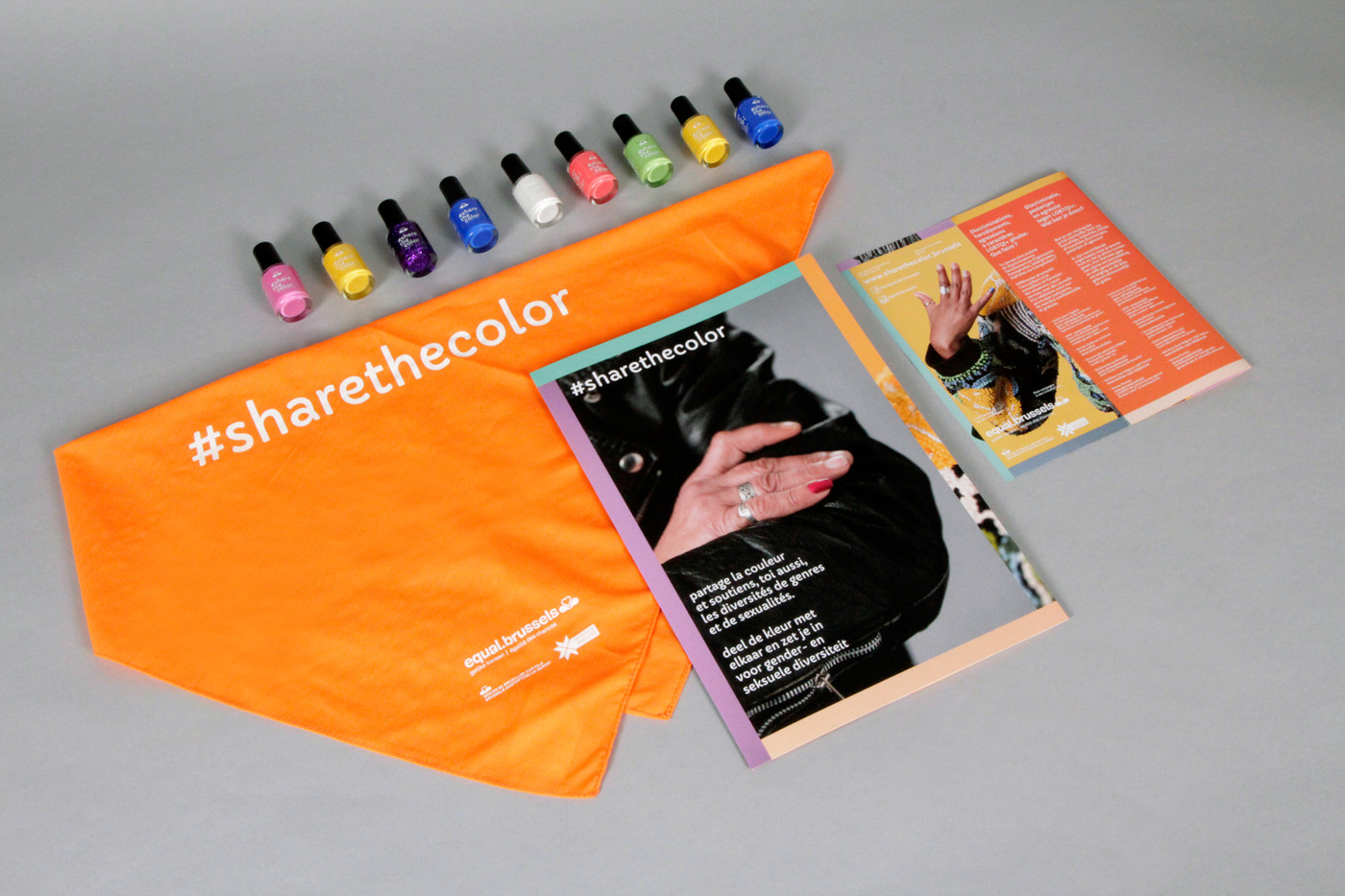
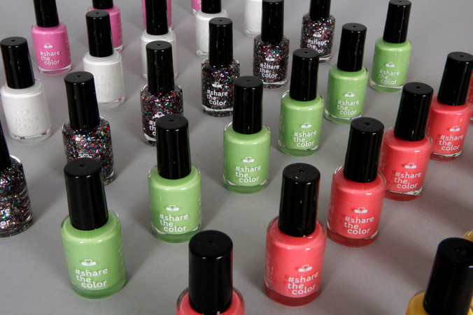
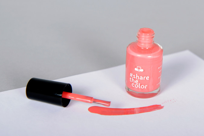
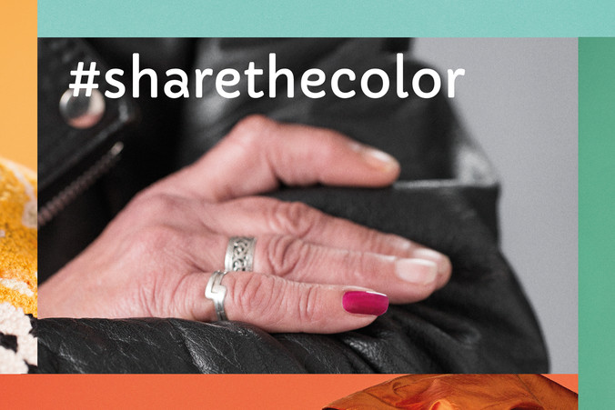
Basing ourselves on the idea of ‘allies’ – mainly non-LGBTQI+ persons who give support to LGBTQI+ – we wanted to give an opportunity to everyone to become an ally and to show it to the world. Inspired by old-fashioned gay traditions of secretly identifying one another with specific accessories, we came up with the idea of applying nail varnish to one's little finger, in any colour, and making it a sign of support for gender and sexual diversity. It then just takes a selfie and a social media post with the hashtag #sharethecolor and soon the buzz spreads to every platform.
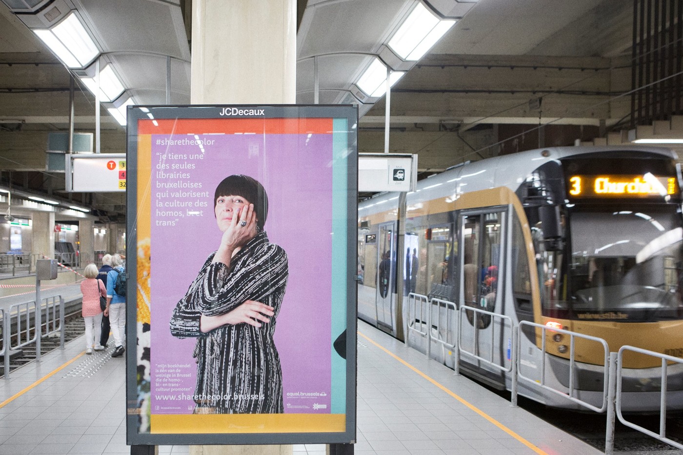
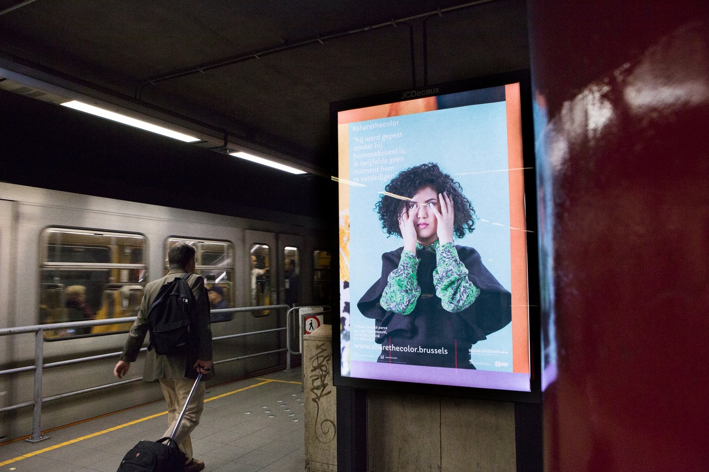
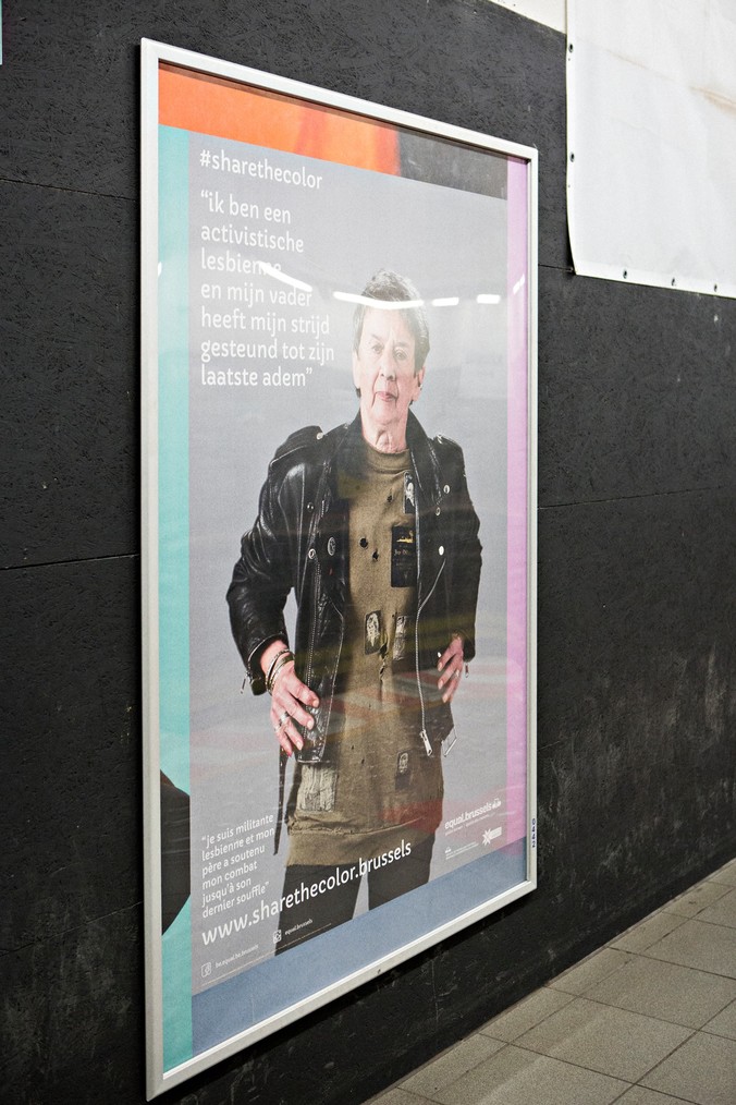
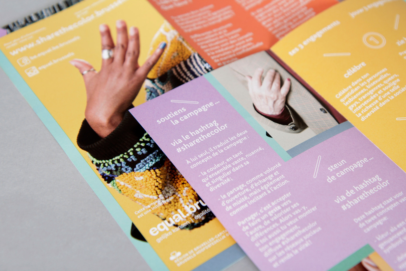
All this seamed exciting but it still needed some realness and we couldn't miss the opportunity to give visibility to LGBTQI+ people who are so often overlooked in wide audience media. We then found people that once had an ‘ally’ experience. We asked them to be interviewed and to become the faces of the campaign. Thanks to RainbowHouse’s wide network of contacts we met extraordinary people who were willing to share touching stories about non-LGBTQI+ friends or family members giving them confidence or just being around when needed without any judgment. And of course some of those comforting hands became examples for our campaign.
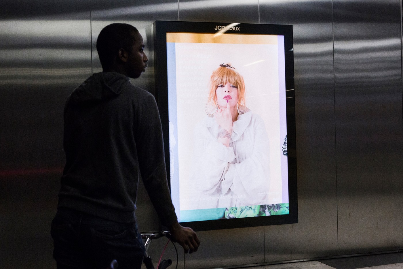
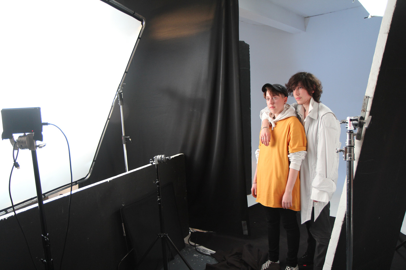
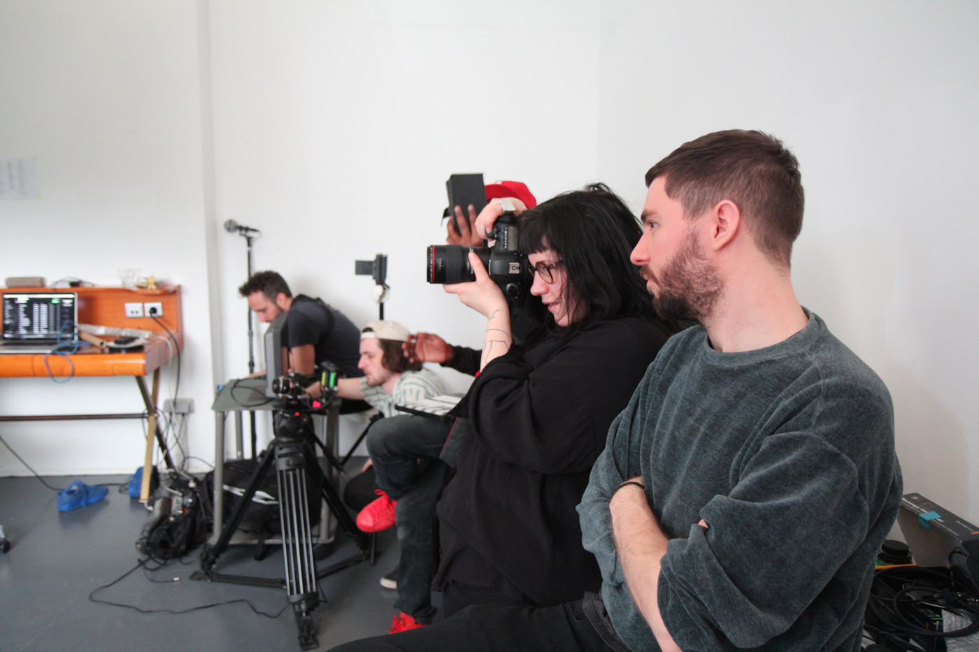
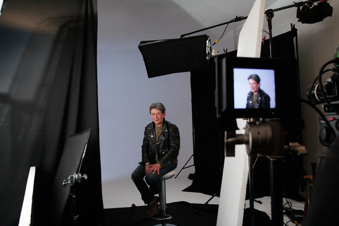
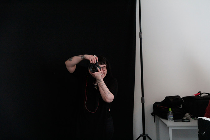
The shooting was an extraordinary moment, both in terms of its energy and its emotion. Thanks to Martin Landmeters and his crew who put everyone together in this short space of time and especially for making these incredibly sensitive videos (and the website). We were also proud to work with Laetitia Bica for those beautiful portraits and Vanessa Pinto for the exquisite clothing.
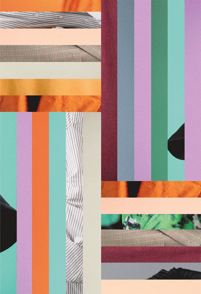
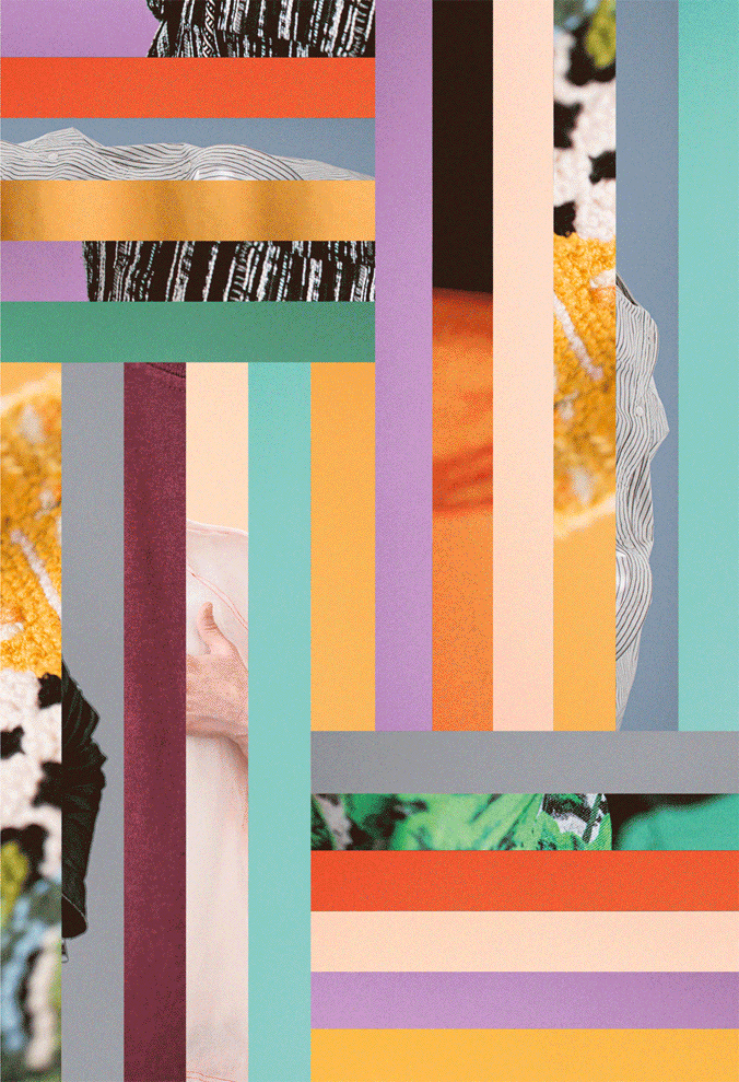
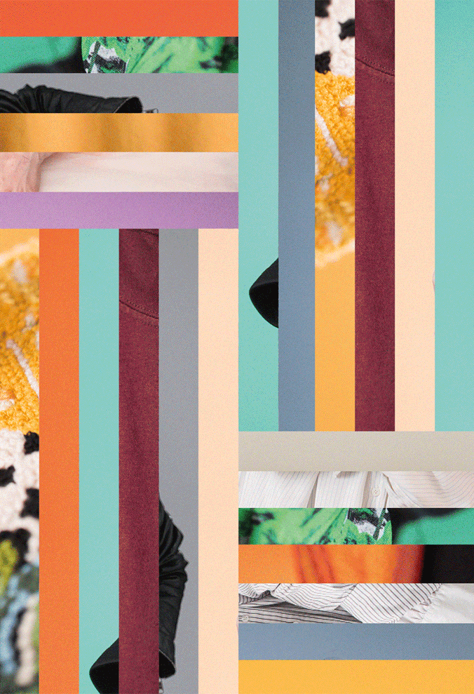
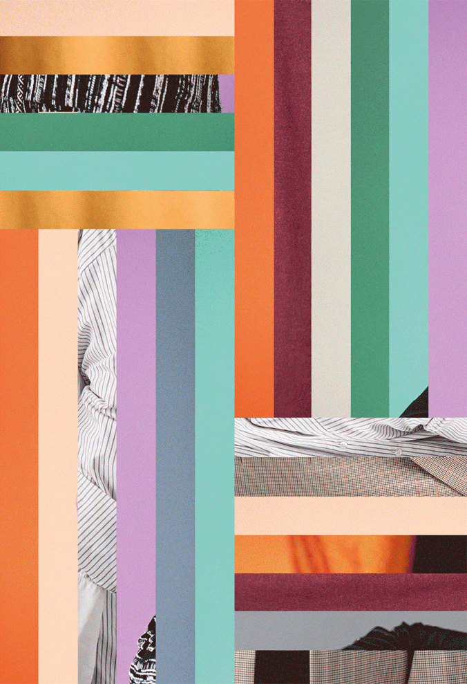
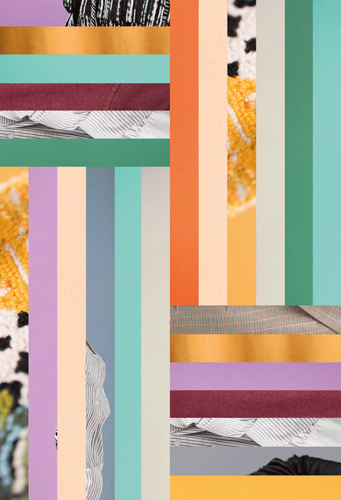
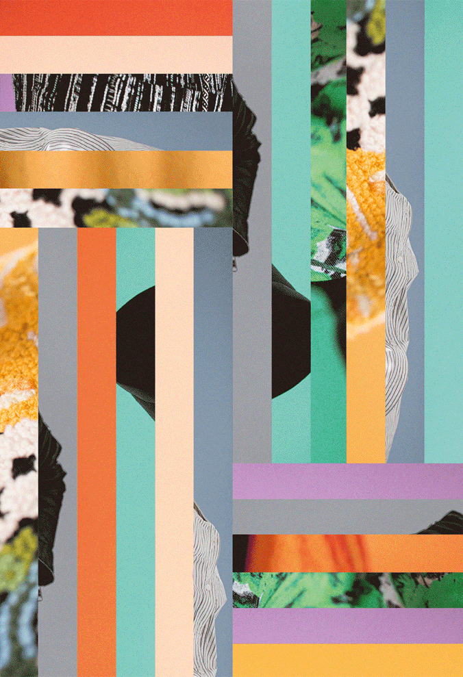
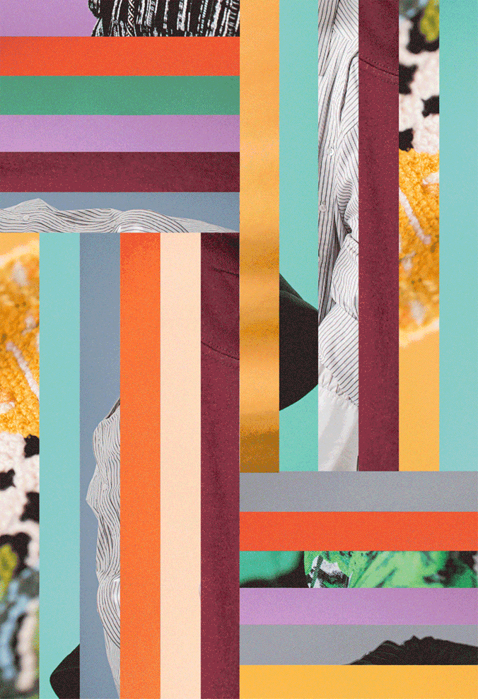
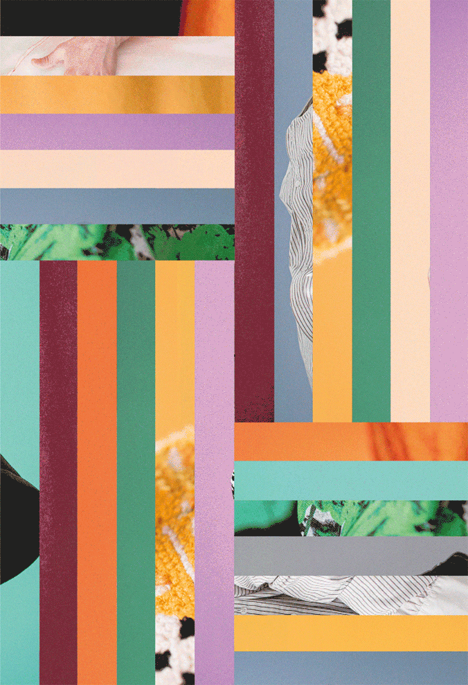
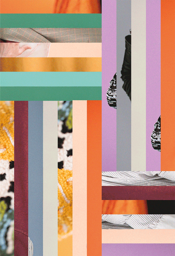
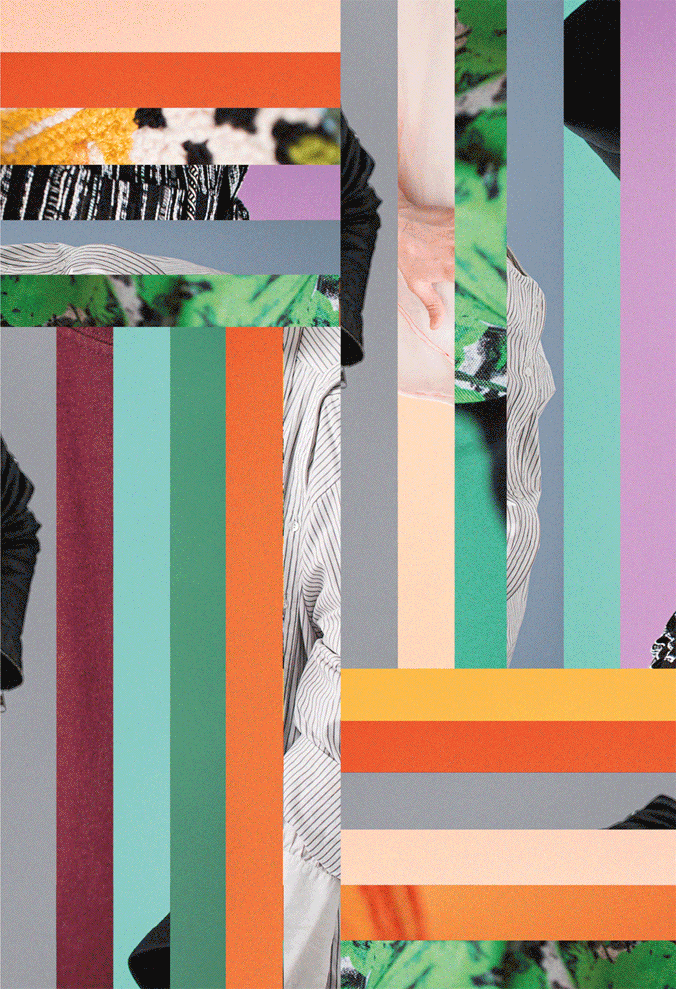
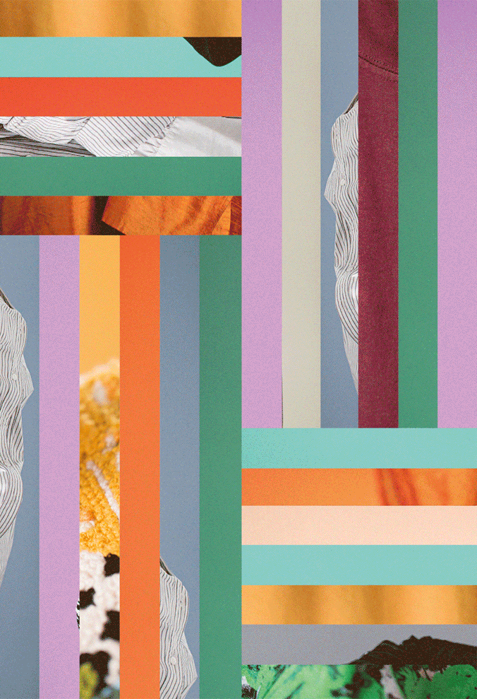
We still wanted to let our graphic skills wrap everything up and with all 10 of these powerful profiles we didn't want them to fit in a poster cluster on their own around town. We then designed the posters with borders made of other portraits suggesting that the other stories were to be found further on. It also added, obviously, more colour …to be shared. The texts are in white, the only colour to have all colours, so it could visually unite the entire campaign. The choice of typeface, Capriola created by Viktoriya Grabowska, was inspired by Badass Libre Font by Womxn, as feminism and intersectionality are also questions raised by the LGBTQI+ community. It is also simply beautiful with these little friendly details such as found in the lower case ‘a’ for instance.
Last but not least, to ignite the buzz around the nail varnish symbol, local stars such as Maureen Louys, Viginie Hocq, Karolien Debecker, Nicolas Testa, Tom Decock, Benedicte Deprez, Girls in Hawaii, Soldout, Sébastien Ministru, and many more engaged on their own social profiles with a coloured pinkie finger nail, a few days before everyone else, but without explaining anything. This was just enough to make the teaser work before the official launch of the month-long campaign and Belgian Pride.