Belgium is Design – M&O 2016
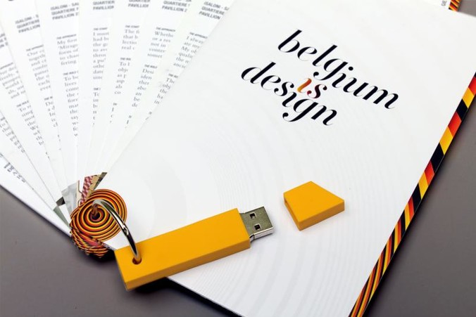
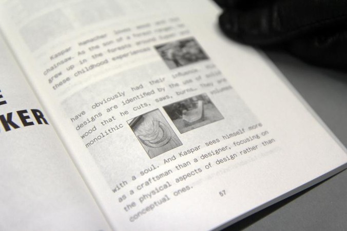
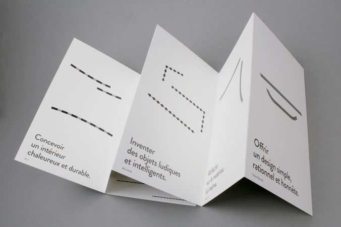
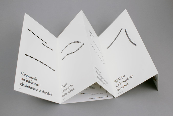
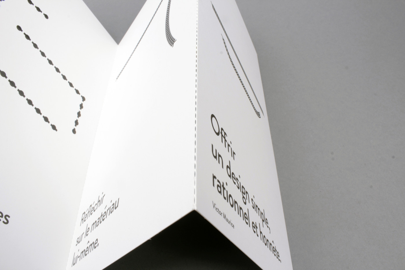
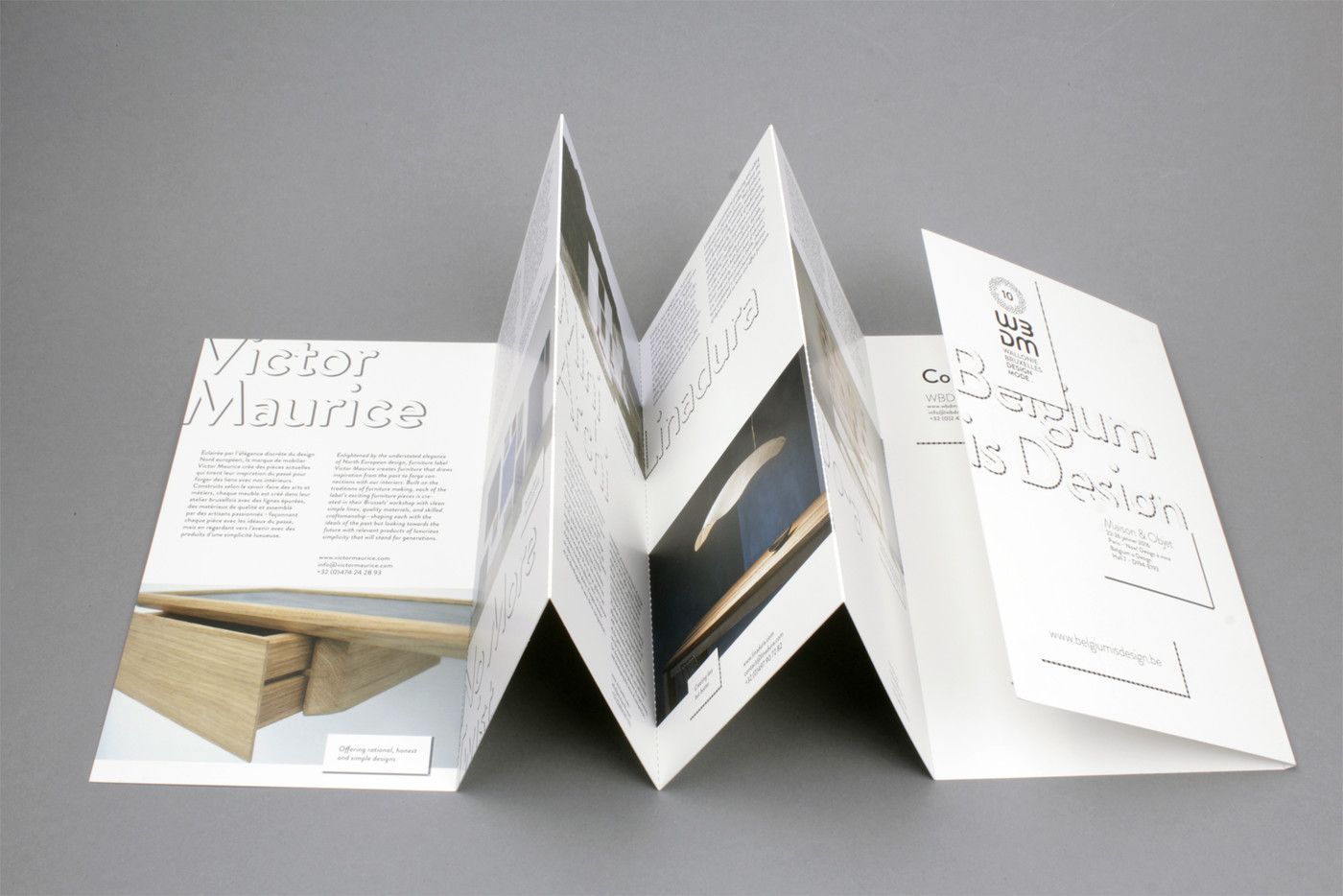
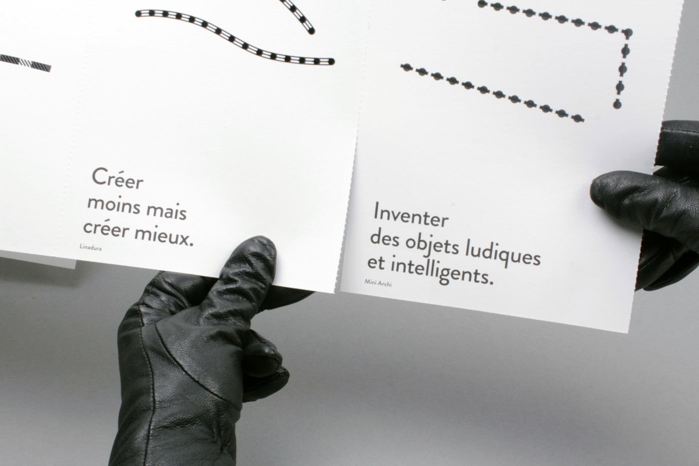
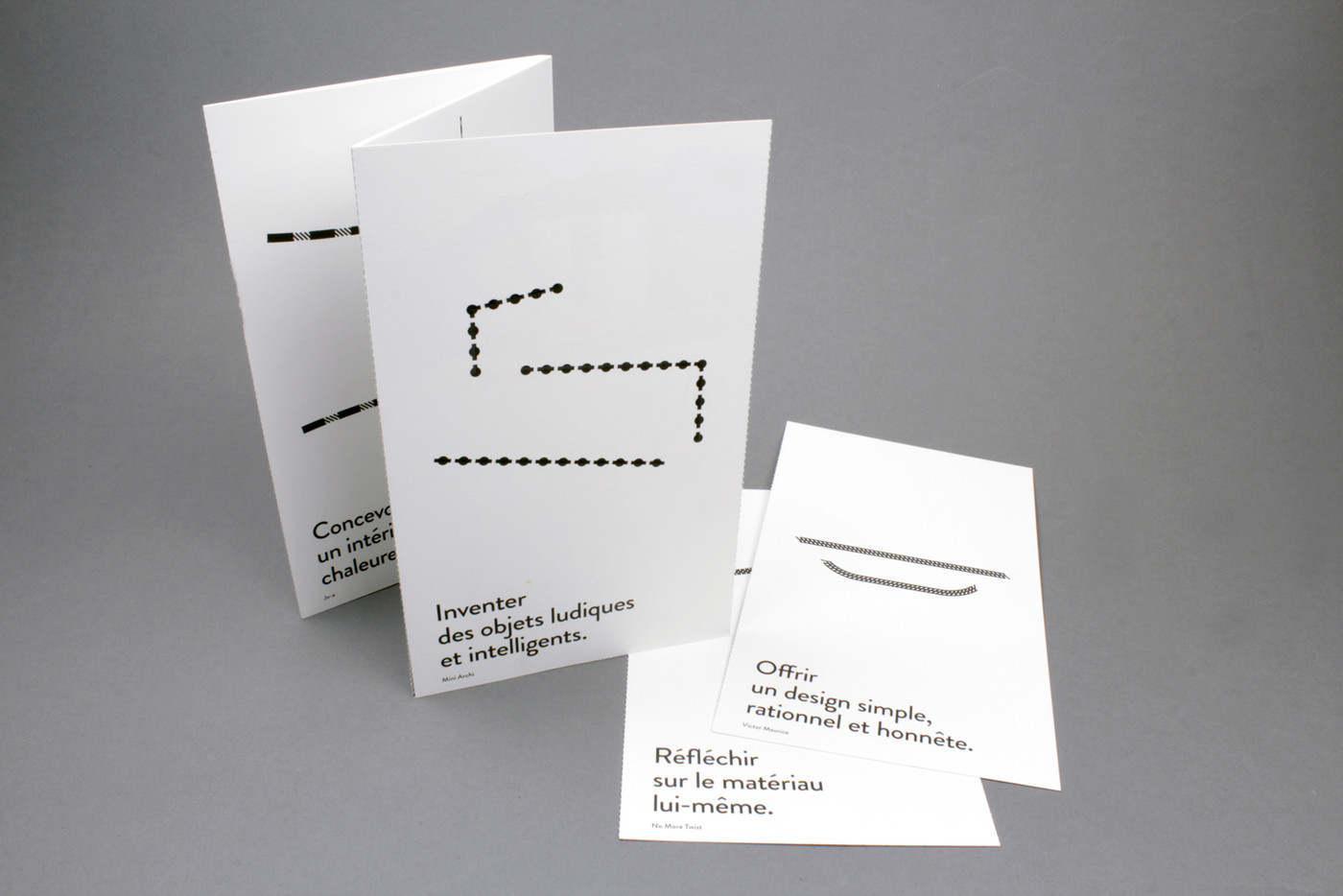
For this project, we decided to gather a series of postcards, one for each designer, binding them as a detachable accordion folder. For each one, we chose a strong sentence coming directly from their practice acknowledgement and illustrated it in simple lines, one iconic product each.
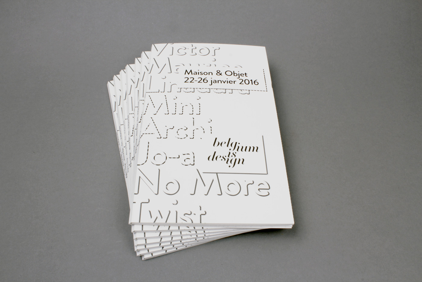
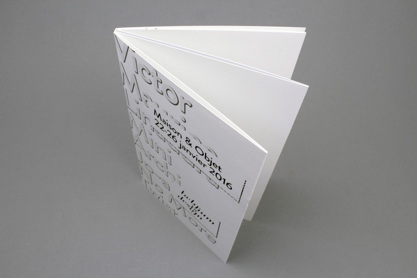
micro perforation folder - Invercoat G 350gr - black recto & full quadri offset printing verso - selected gloss varnish - 500 copies
Belgium is Design – M&O 2016
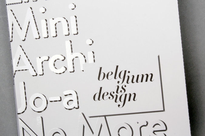
During Paris’ ‘Salon Maison & Objet’ in January 2016, the Belgium is Design label presented a cutting-edge selection of brands that exemplify a very modern image of the emerging scene in Belgium. Mini Archi, No More Twist, Victor Maurice, Jo-a and Linadura are five new furniture design companies created by the designers themselves and which together represent a manifesto on current Belgian creativity.
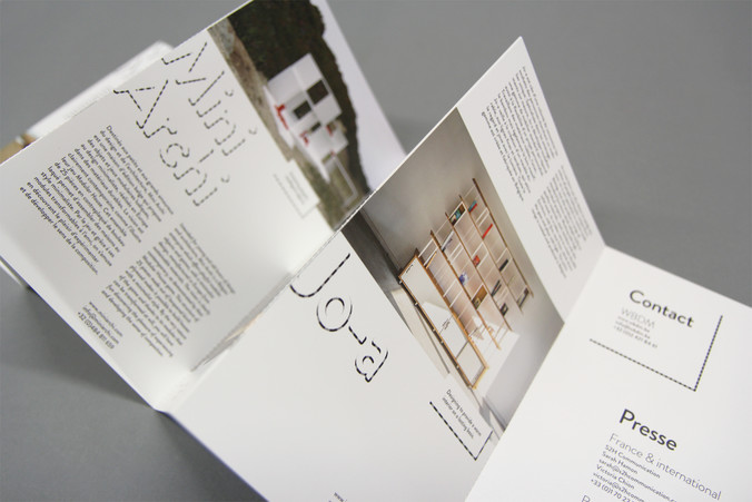
For this project, we decided to gather a series of postcards, one for each designer, binding them as a detachable accordion folder. For each one, we chose a strong sentence coming directly from their practice acknowledgement and illustrated it in simple lines, one iconic product each. The opposite sides present more detailed texts and pictures. These graphic design choices amplify a sense of unity as well as the individual practices specific to this Belgian design scene.
