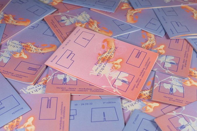
THOR – Thierry Smits 2023-2024
commission
2023
Communication
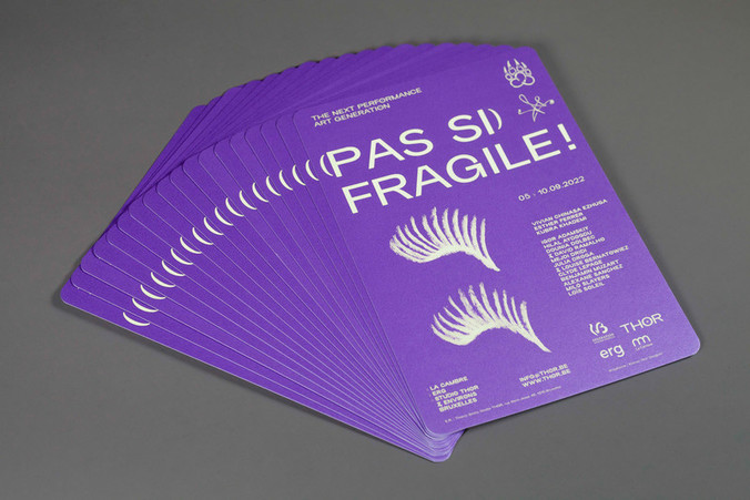
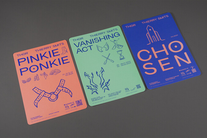
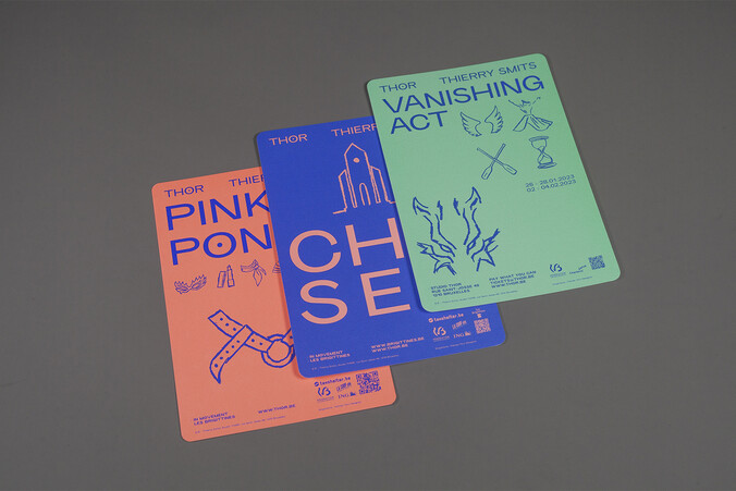
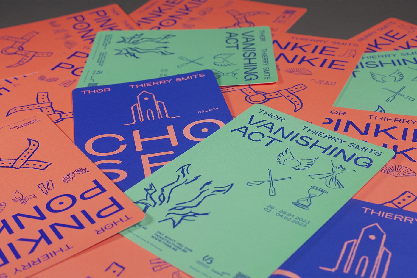
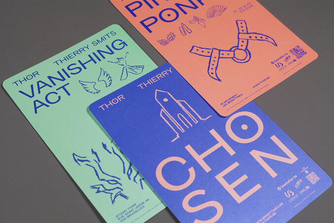
Following our work on THOR's graphic identity based on a series of a rough hand-drawn symbols, a new series of fancy flyers announce several events and shows to come.
flyers A5 2,000 copies rounded corners - illustration - social media mixed formats
THOR – Thierry Smits 2023-2024
commission
2023
Communication
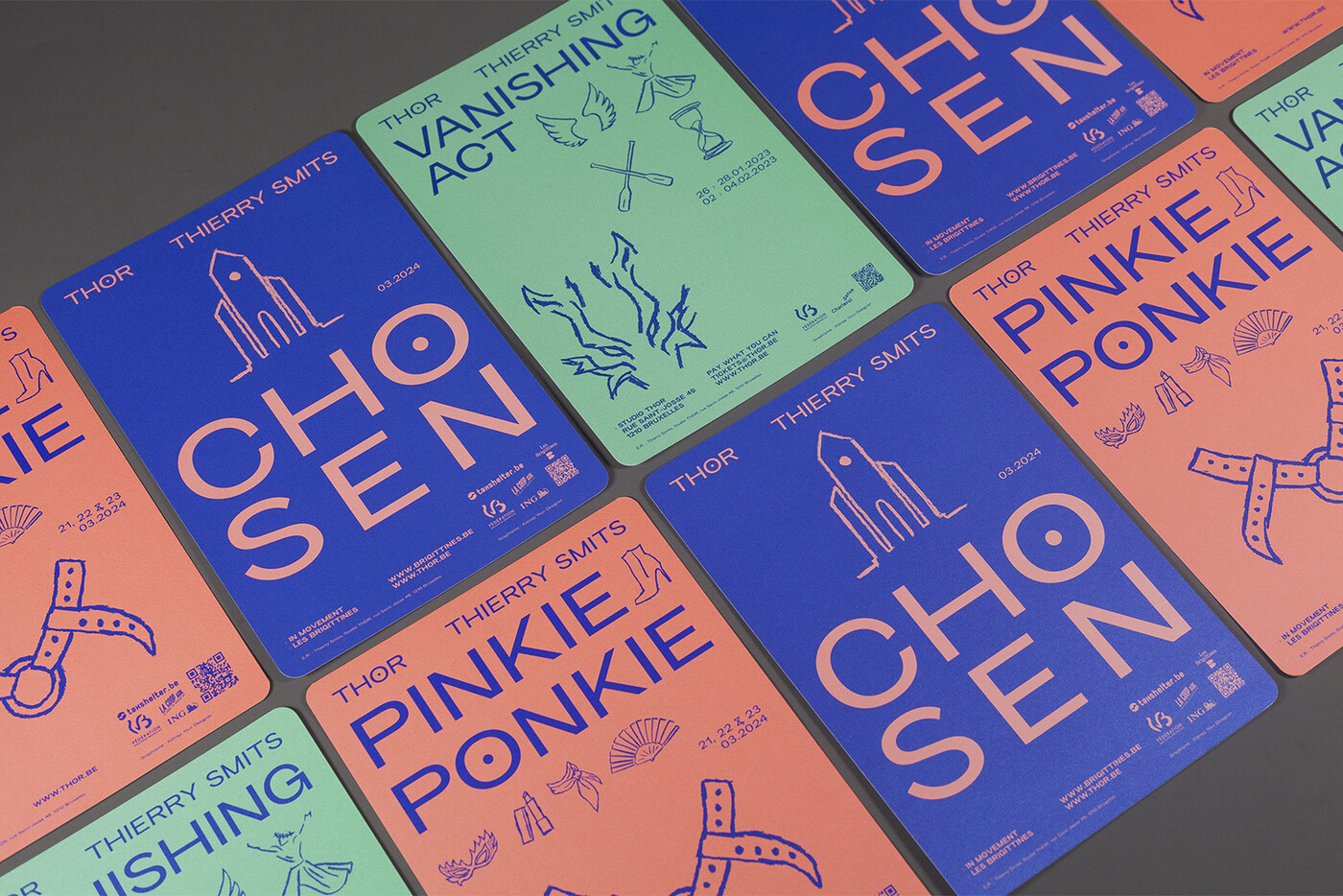
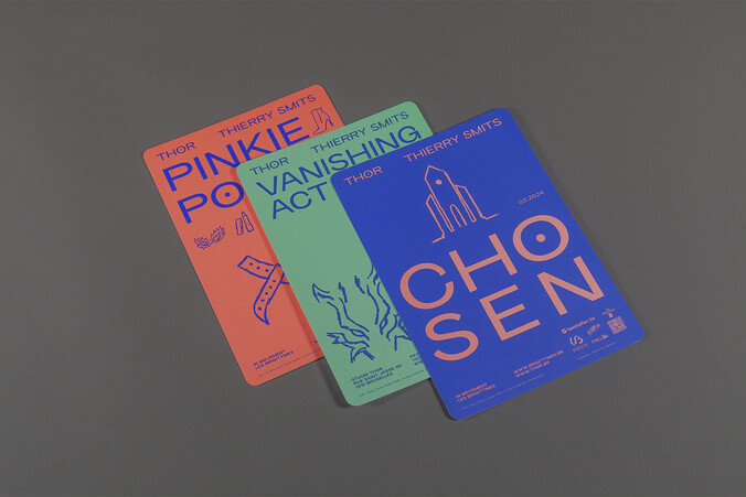
After (Pas si) Fragile! & TROUBLE #12 performance festivals, the shows Pinkie Ponkie, Vanishing Act and Chosen have their own glittery flyer. Each one has its own chromatic range and is printed with PMS on a pearl paper.
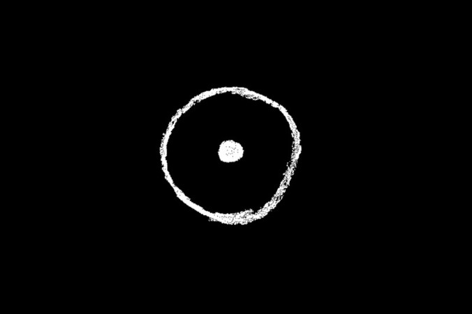
The graphic identity of THOR (which brings together the activities of THOR Studio, Thierry Smits dance company and the performance festival TROUBLE) is based on a series of a rough hand-drawn symbols partly inspired by punk aesthetics. With this common aesthetic, the series of graphic symbols accompanying the logo can be varied and diverse, allowing for the protean filled representation of the THOR company.
The symbols come from different lexical fields which are intertwined:
- Nordic mythology
Inspired directly by the company name THOR, borrowed from the god Thor in Norse mythology, the series of symbols clearly evokes the origin of the name. The symbolic significance of these symbols is not removed and is used to add meaning to the visuals produced. The ‘Sporting Grotesque’ typeface, major visual identity player, has been augmented with an O glyph (a special character), derived from a Rune symbol representing fire.
- Dance scores
Choreographic annotations, very specific to this artistic practice, add a vocabulary of movement to the gallery of symbols.
- Queer signs
THOR clearly claims to be a queer company, notably with the organisation of the Trouble festival. Symbols questioning gender and sexualities are part of the collection.
- Context & neighbourhood
The THOR company is located in Saint-Josse in the centre of Brussels district. This local anchoring in the heart of the neighbourhood (the poorest and most dense in Belgium) is of key importance to the company's audience development.
- Evocative symbols
A series of natural elements (water, fire, sea, wind, etc.) completes the vocabulary and allows the graphic evocations to be extended.
website:
thor.be
thor.be
web developer:
geometry.be
geometry.be
