(Pas si) Fragile ! & TROUBLE #12
commission
2022
Event communication
Thor places particular emphasis on performance as a space for interdisciplinary cross-fertilisation, where choreographic practices meet other artistic practices.
This support takes the form of two different alternating events: the (Pas si) Fragile! springboard in even-numbered years, and the TROUBLE international festival in odd-numbered years.
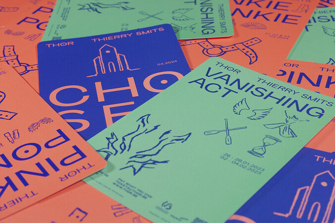
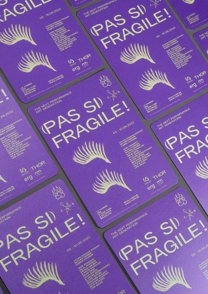
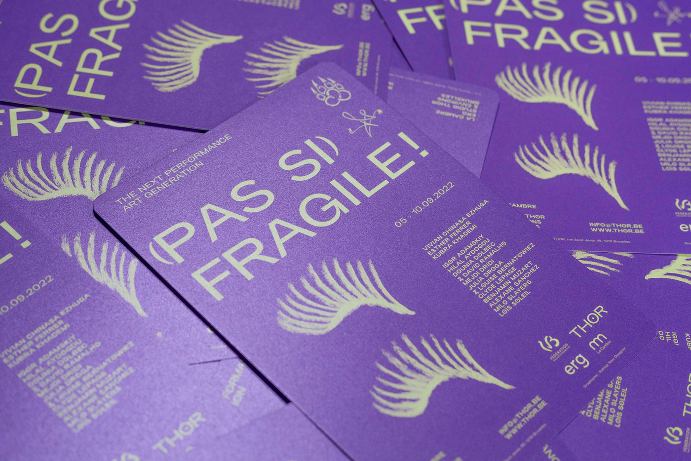
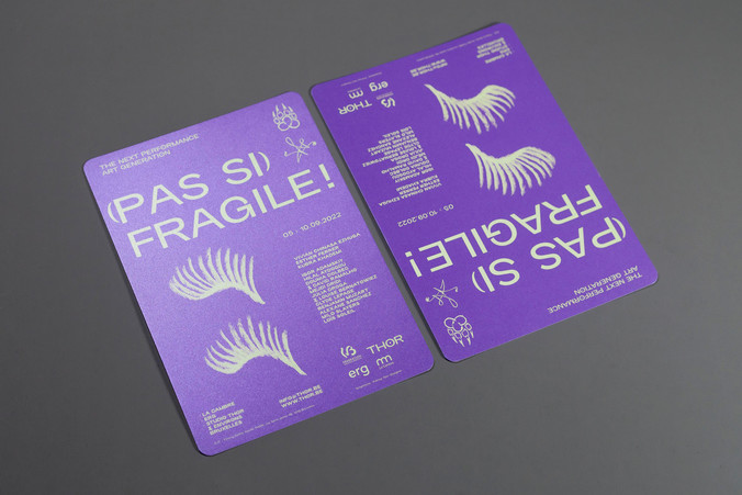
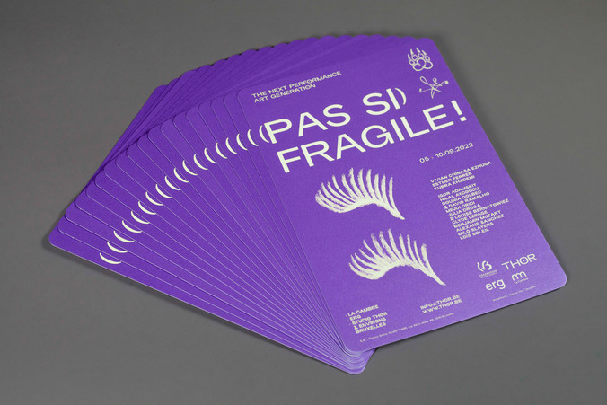
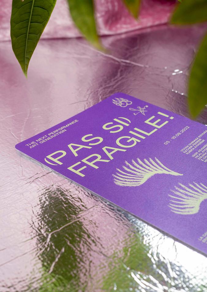
Eye lashes, wings, … Anything strong on that mother-of-pearl paper goes for the communication of this festival!
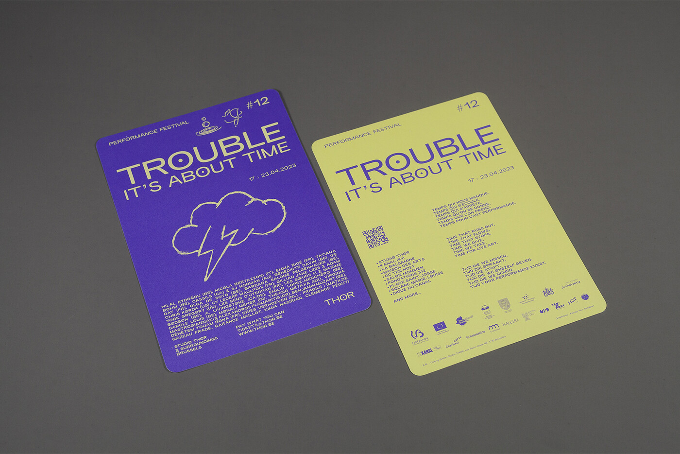
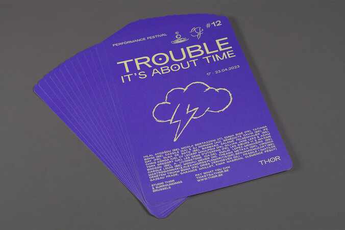
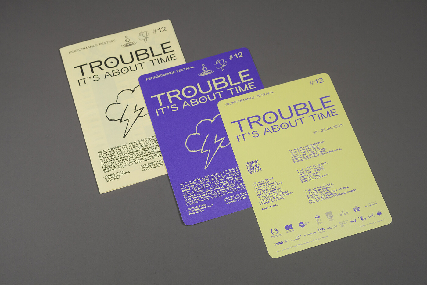
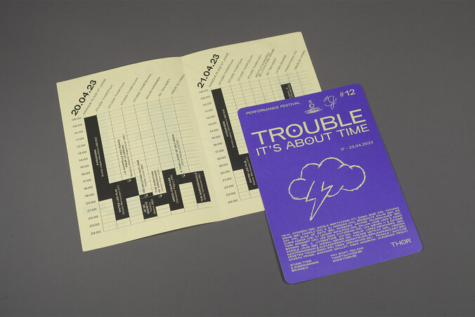
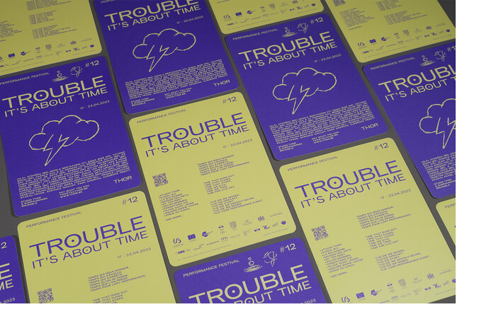
flyer A5 2,000 copies rounded corners - illustration - social media mixed formats
(Pas si) Fragile ! & TROUBLE #12
commission
2022
Event communication
(Pas si) Fragile! edition 2022:
Igor Adamskiy, Hilal Aydogdu, Mejdi Dridi, Julia Droga, Vivian Chinasa Ezugha, Esther Ferrer, Kubra Khademi, Clyde Lepage, Benjamin Muzart, David Ramalho et Dounia Dolbec, Alexane Sanchez, Milø Slayers, Loïs Soleil
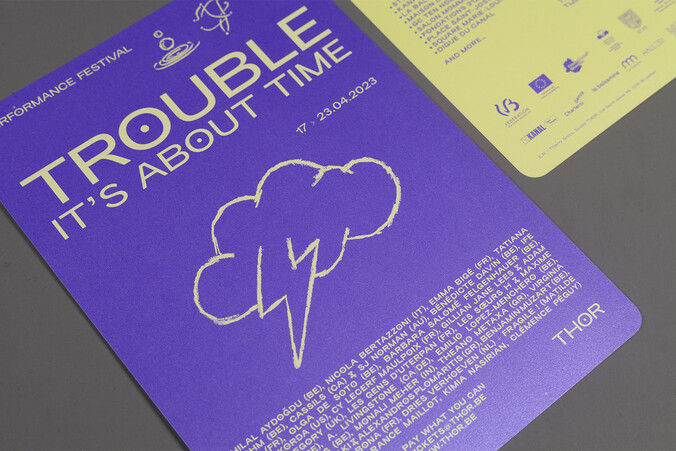
TROUBLE #12:
Hilal Aydoğdu (BE), Nicola Bertazzoni (IT), Emma Bigé (FR), Tatiana Bohm (BE), Cassils (CA) & SJ Norman (AU), Bénédicte Davin (BE), Ife Day (FR), Olga de Soto (BE), Barbara Salomé Felgenhauer (BE), Chris Korda (US), Cy Lecerf Maulpoix (FR), Gillian Jane Lees & Adam York Gregory (UK), Jennie Klein (US), Les gens d’Uterpan (FR), Les sœurs h & Maxime Bodson (BE), A. Livingstone (CA/DE), Emilio Lopez-Menchero(BE), Carole Louis (BE), Monali Meher (IN), Theano Metaxa (GR), Virginia Mastrogiannaki & Alexandros Plomaritis(GR), Benjamin Muzart (BE), Dénètem Touam Bona (FR), Dries Verhoeven (NL) + Fragile ! (Matilde Gazeau Frade, Garance Maillot, Kimia Nasirian, Clémence Péguy)
The graphic identity of THOR (which brings together the activities of THOR Studio, Thierry Smits dance company and the performance festival TROUBLE) is based on a series of a rough hand-drawn symbols partly inspired by punk aesthetics. With this common aesthetic, the series of graphic symbols accompanying the logo can be varied and diverse, allowing for the protean representation of the THOR company.
The symbols come from different lexical fields which are intertwined:
- Nordic mythology
Inspired directly by the company name THOR, borrowed from the god Thor in Norse mythology, the series of symbols clearly evokes the origin of the name. The symbolic significance of these symbols is not removed and is used to add meaning to the visuals produced. The ‘Sporting Grotesque’ typeface, major visual identity player, has been augmented with an O glyph (a special character), derived from a Rune symbol representing fire.
- Dance scores
Choreographic annotations, very specific to this artistic practice, add a vocabulary of movement to the gallery of symbols.
- Queer signs
THOR clearly claims to be a queer company, notably with the organisation of the Trouble festival. Symbols questioning gender and sexualities are part of the collection.
- Context & neighbourhood
The THOR company is located in Saint-Josse in the centre of Brussels district. This local anchoring in the heart of the neighbourhood (the poorest and most dense in Belgium) is of key importance to the company's audience development.
- Evocative symbols
A series of natural elements (water, fire, sea, wind, etc.) completes the vocabulary and allows the graphic evocations to be extended.
website:
thor.be
thor.be
web developer:
geometry.be
geometry.be
