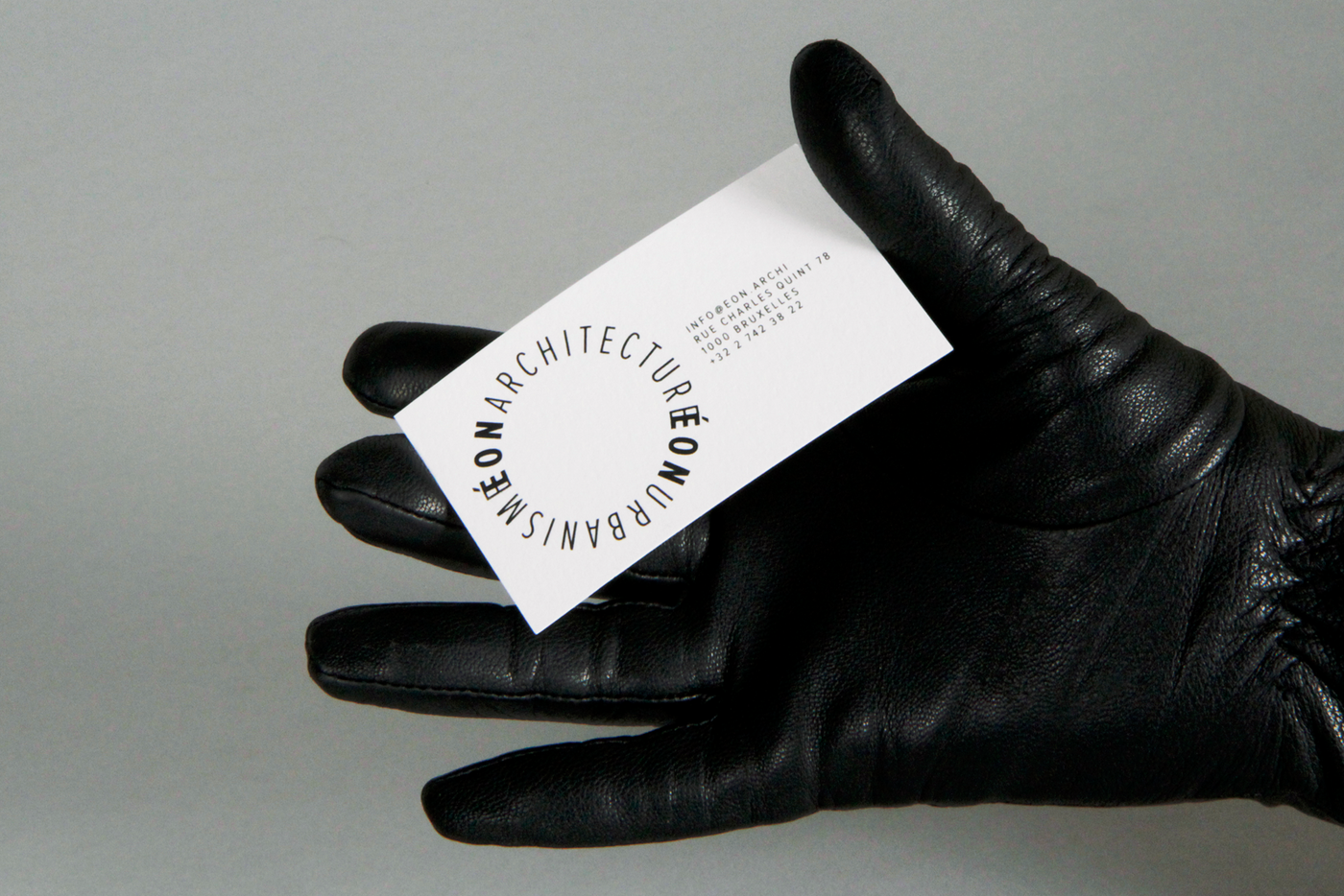
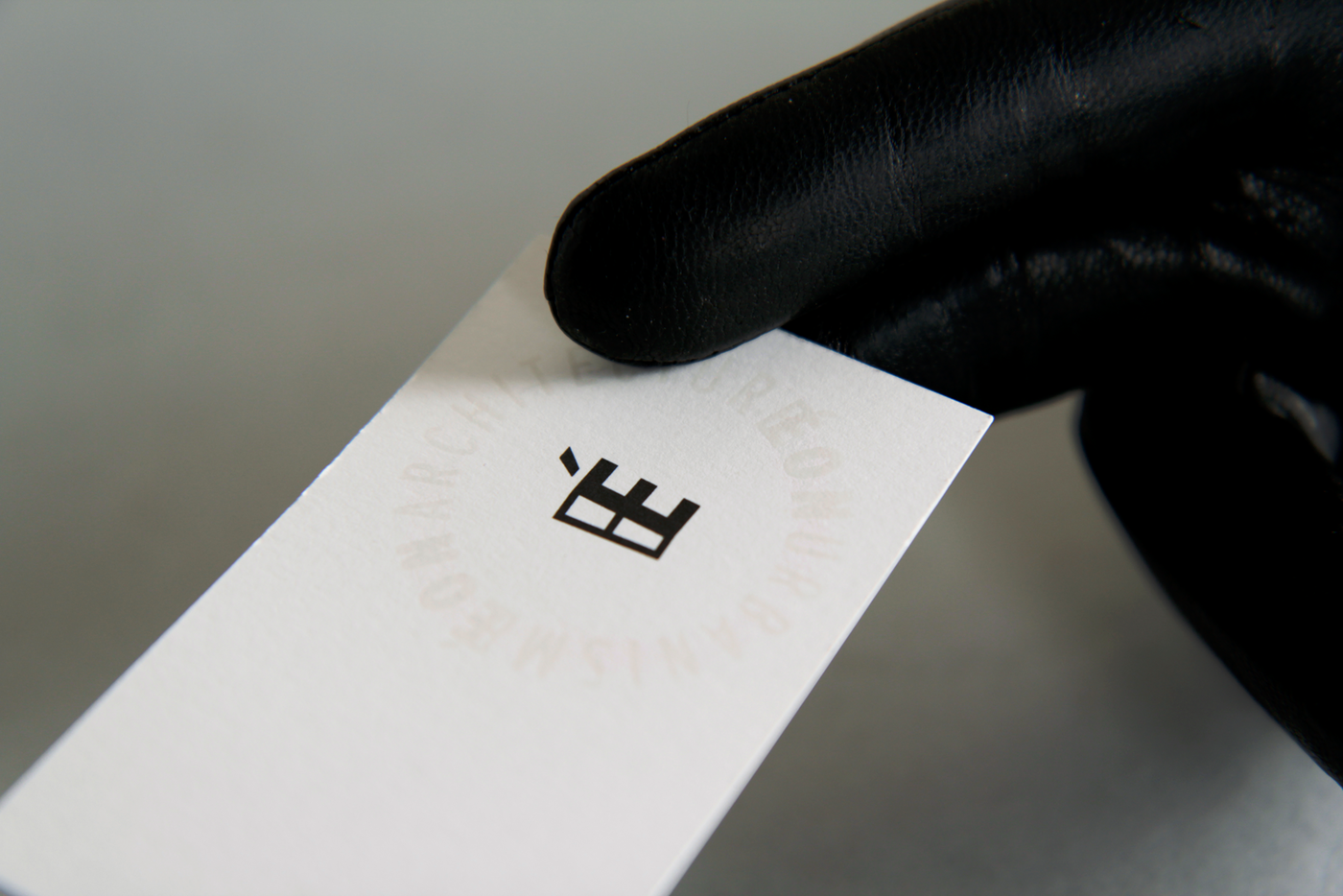
Éon Architecture Éon Urbanisme
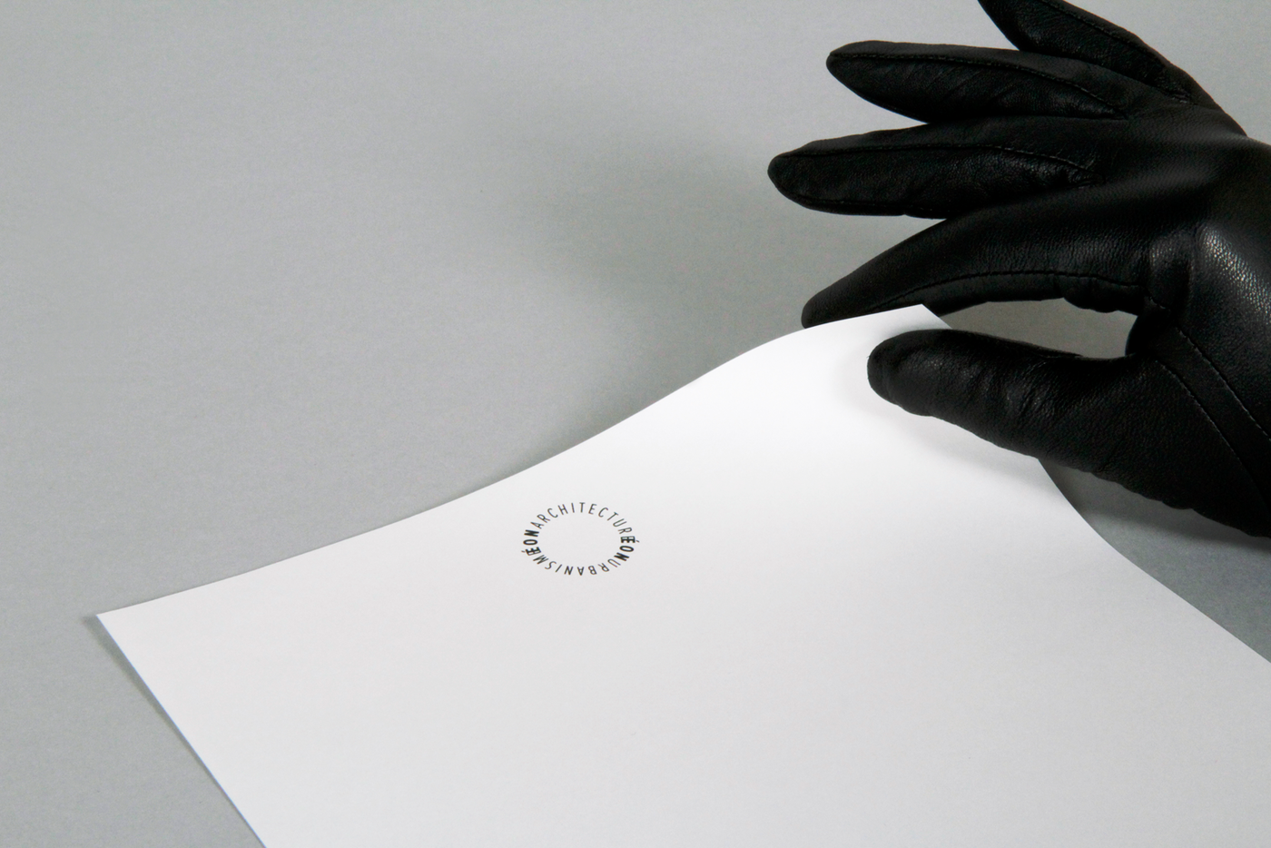
Éon was the Phoenician and Romain god of eternity and was usually represented with a ribbon hoop symbolising the infinite cycle of time. The merging E & É closes the typographical loop and refers to all those aspects like a new ∞ symbol.
Éon Architecture Éon Urbanisme
Éon Architecture Éon Urbanisme is a company run by two Brussels-based architects. They work on a wide range of projects, always adapting their projects to take account of their context. They avoid ready-made fashionable styles, as buildings are meant to stand the test of time – hence the name Éon.
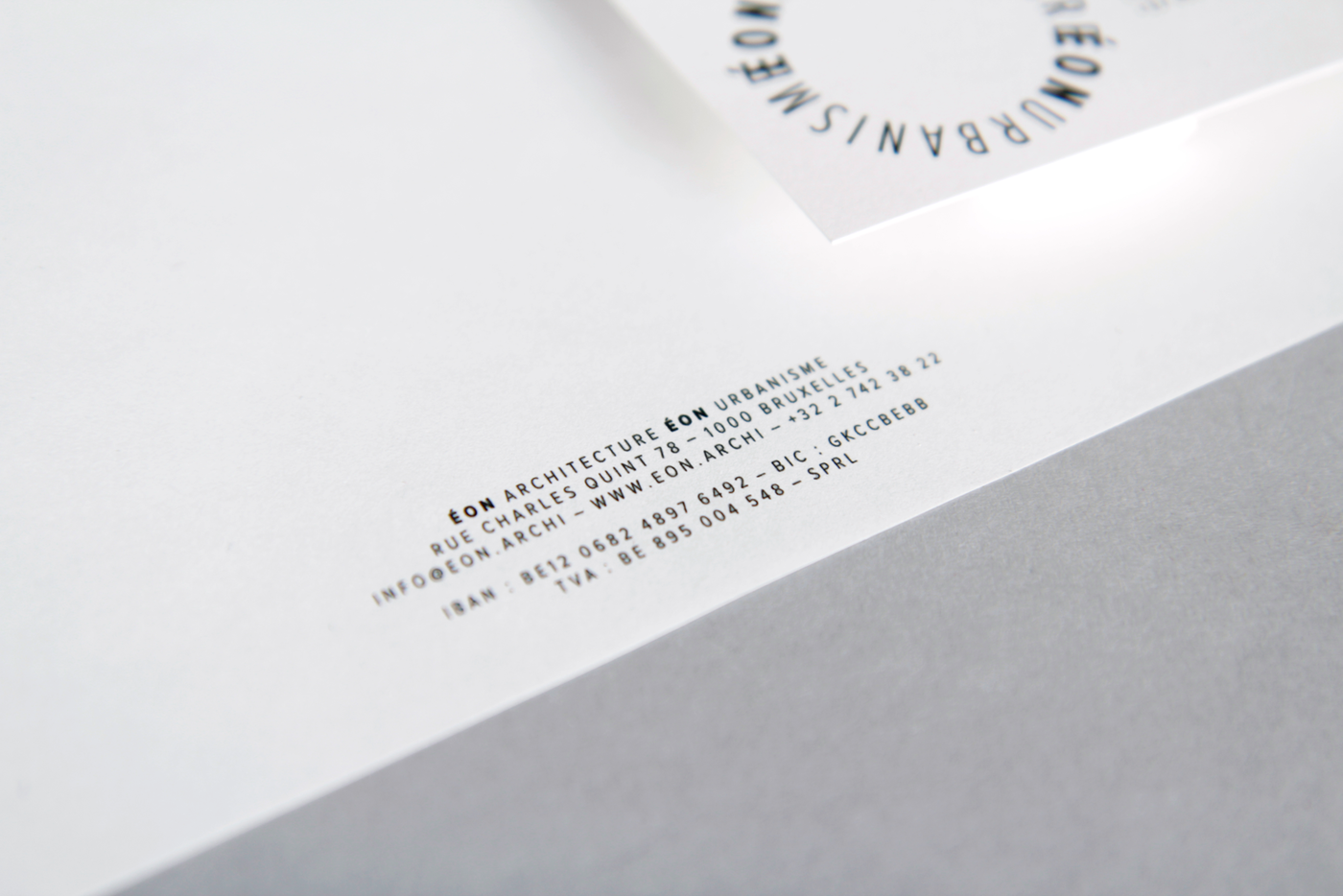
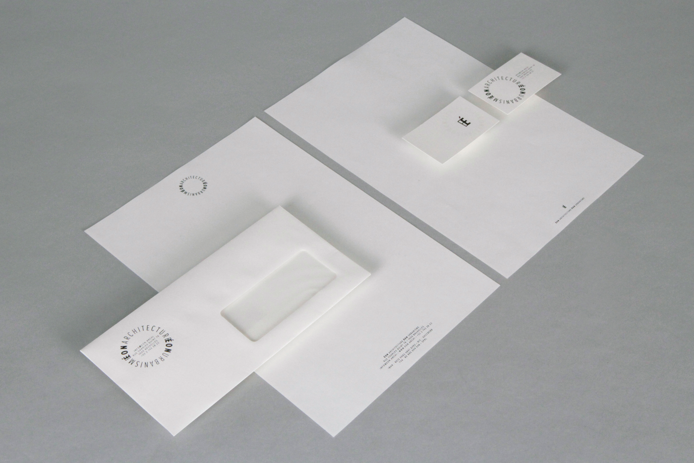
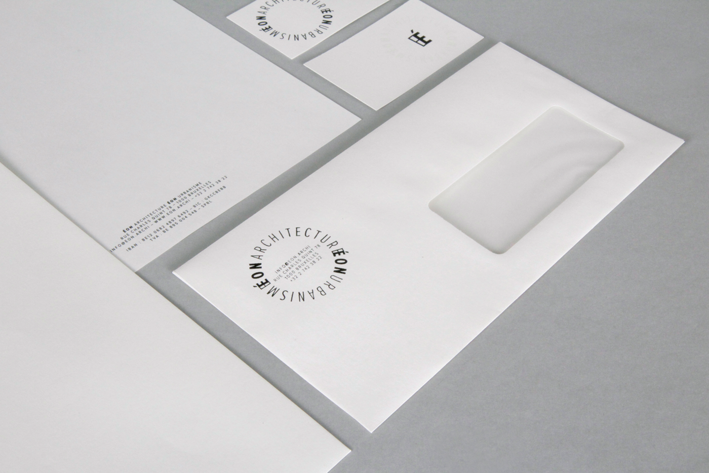
The stationery and the website are straightforward but detailed in their minimalism. The choice of paper or the functional web taxonomy play an essential role in this. Nevertheless some little twists keep the project exciting: a multi-function stamp or invisible ink, a hovering rotating logo, etc.
Enjoy the visit: eon.archi
web developer:
bienavous.be