Beau Architects
commission
2014
identity
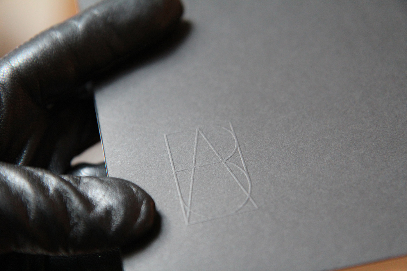
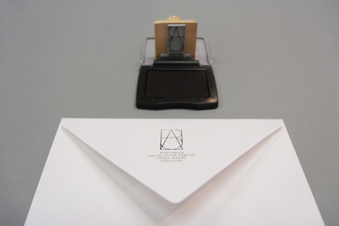
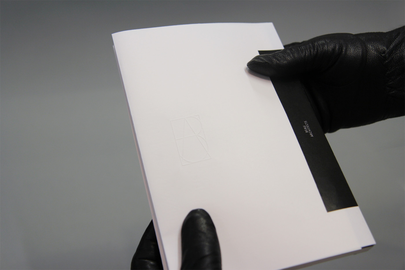
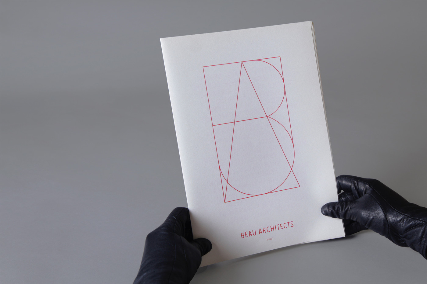
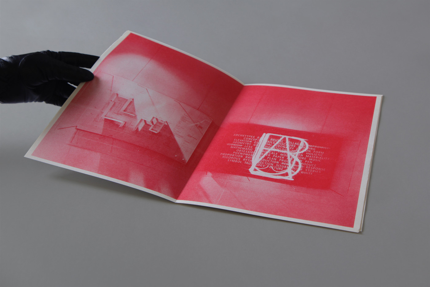
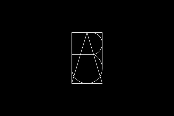
We designed a logo with the four letters which make up the name superimposed on top of each other, creating something between art deco and freemason esoteric symbols, between a map and stained glass structure suggesting the wideness of their interest in projects.
Beau Architects
commission
2014
identity
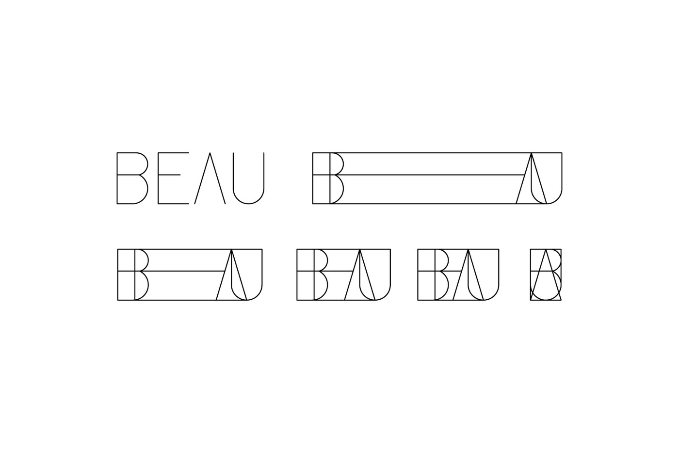
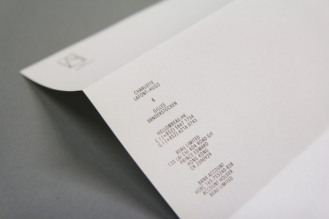
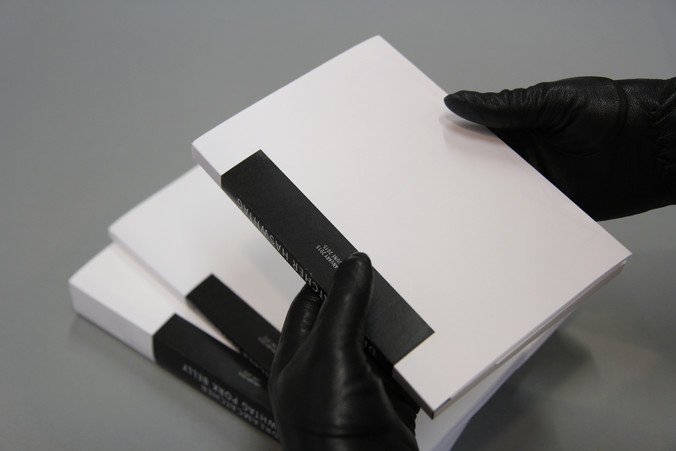
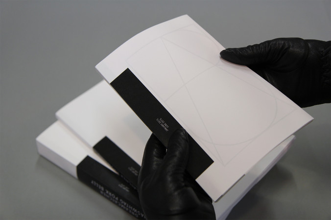
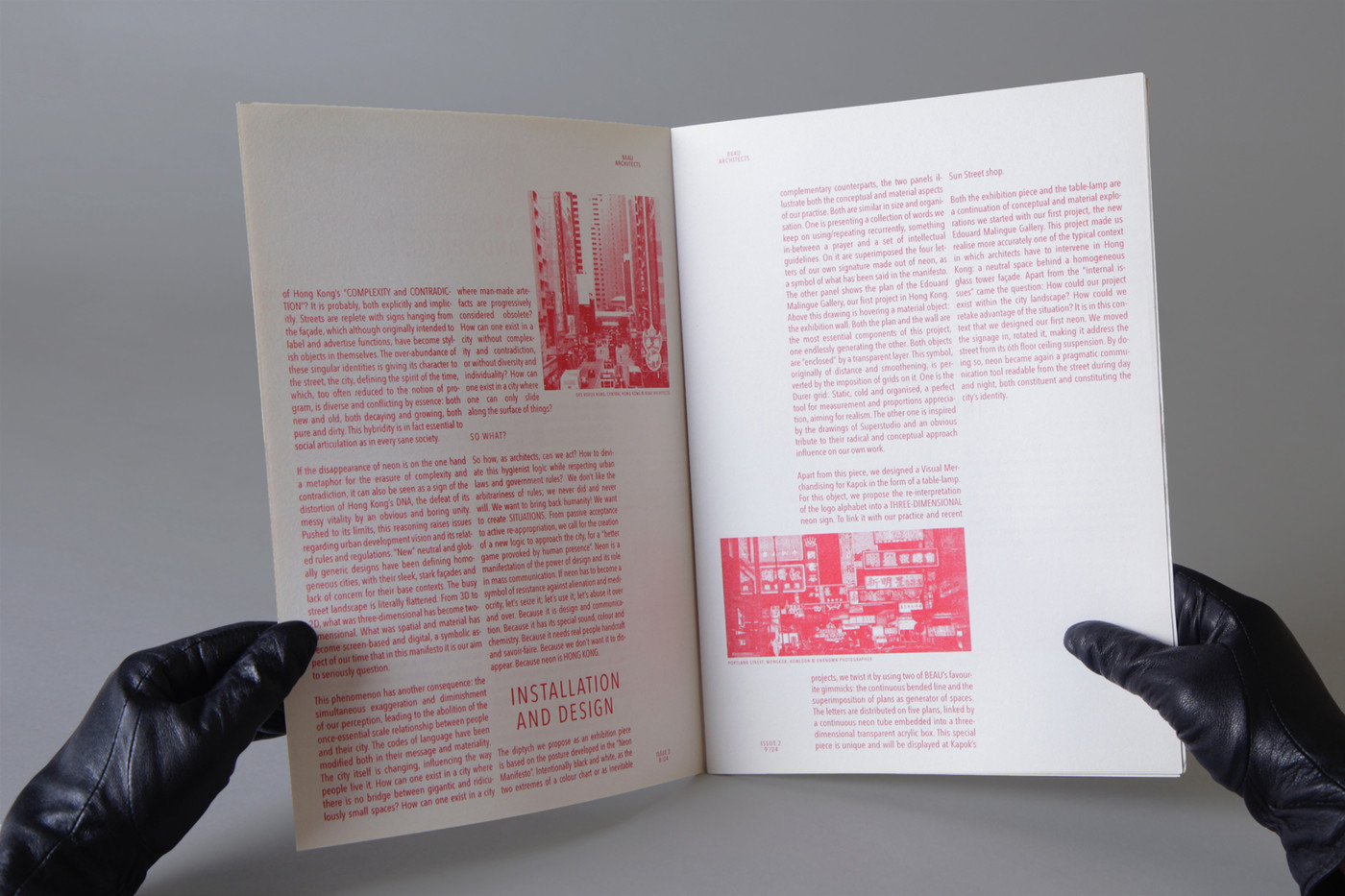
BEAU Architects is a Hong Kong architecture studio led by Charlotte Lafont-Hugo & Gilles Vanderstocken.
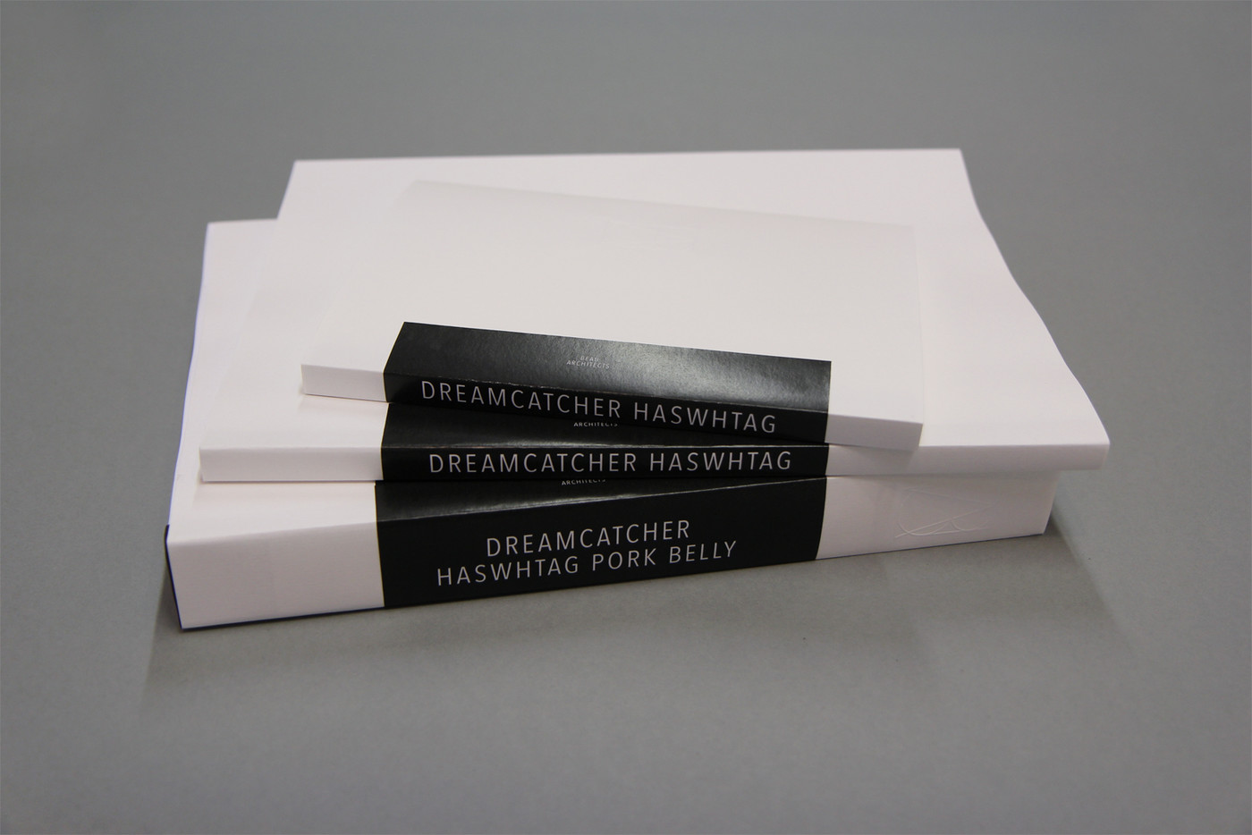
We helped with the naming referring to their Francophone origins and their dandy taste as well as, of course, beauty itself. We designed a logo with the four letters which make up the name superimposed on top of each other, creating something
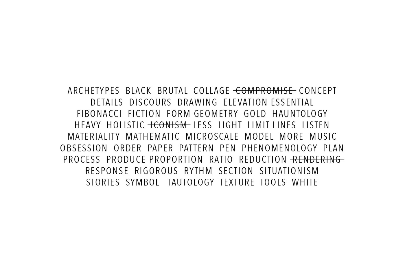
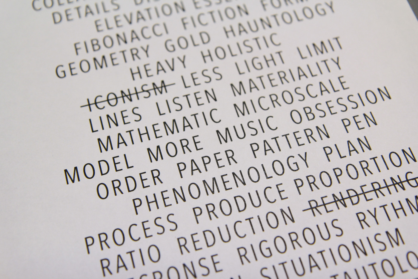
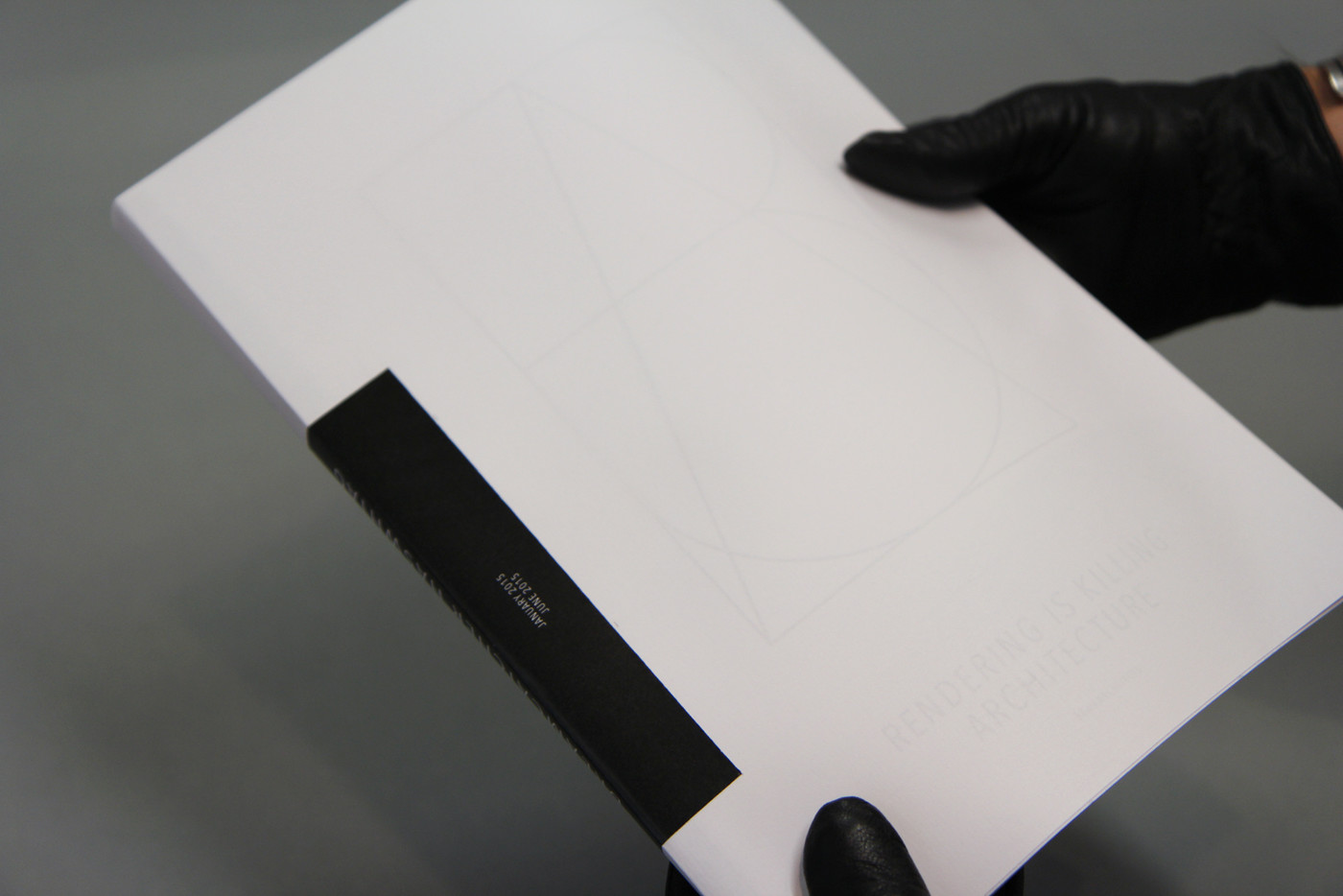
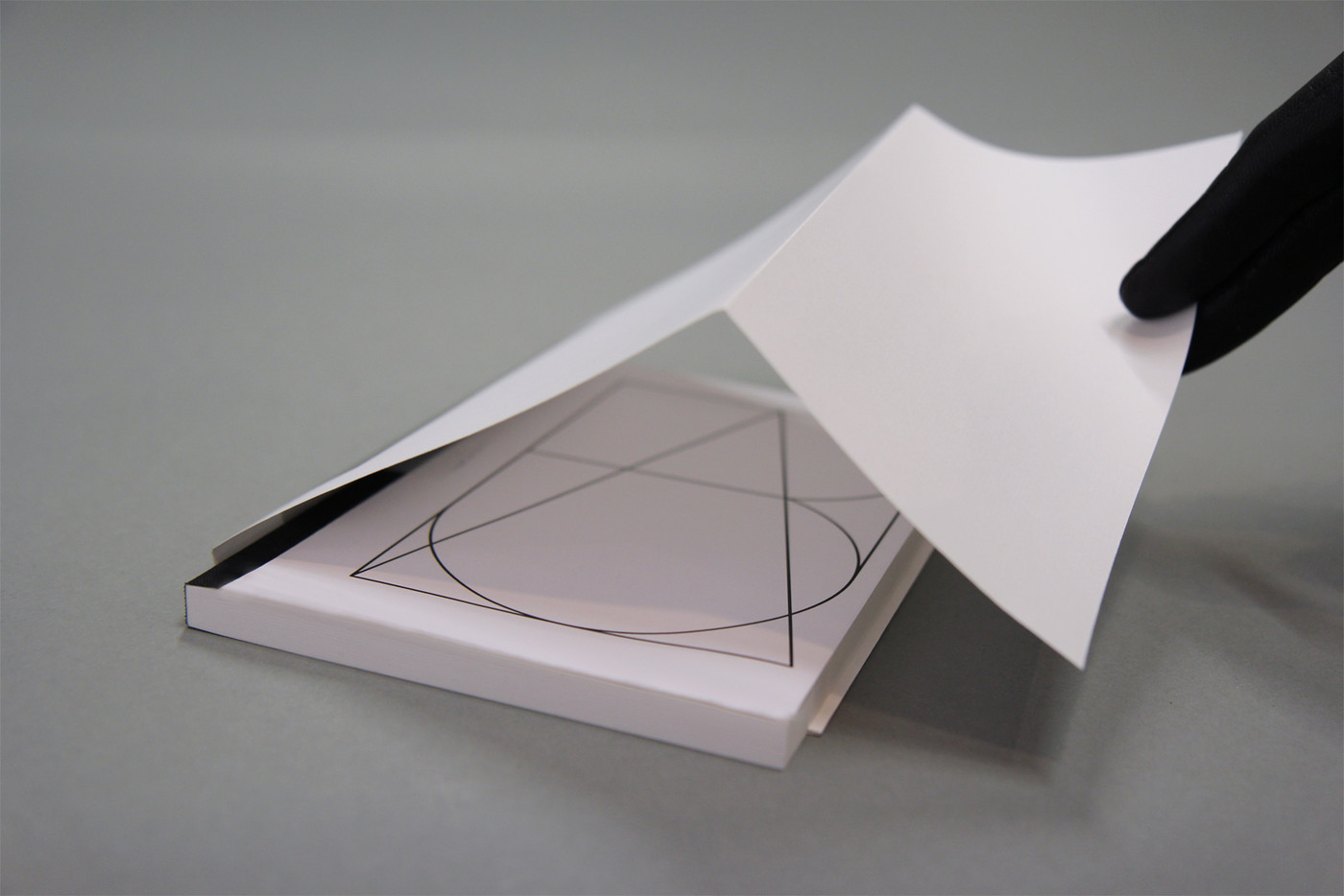
between art deco and freemason esoteric symbols, between a map and stained glass structure suggesting the wideness of their interest in projects. This logo is mainly about black lines and white spaces, two strong concerns for architects.Charlotte & Gilles wrote a 'manifesto' to define themselves and their own practice of architecture. In 'Avenir Next Condensed' type, simple & strong sentences and keywords are laid out one after the other, proudly stated or rejected with strikethrough.
web developer: geometry.be