Design Museum Brussels — Spaces.
The Design Museum Brussels commissioned us to build the graphic design communication and signage for their main temporary exhibition.
Spaces. Interior Design Evolution.
posters A0 to A2 - animations - social media animation & mix formats - addesive vinyl cut lettering - screenprint on wall - art reproduction




Design Museum Brussels — Spaces.
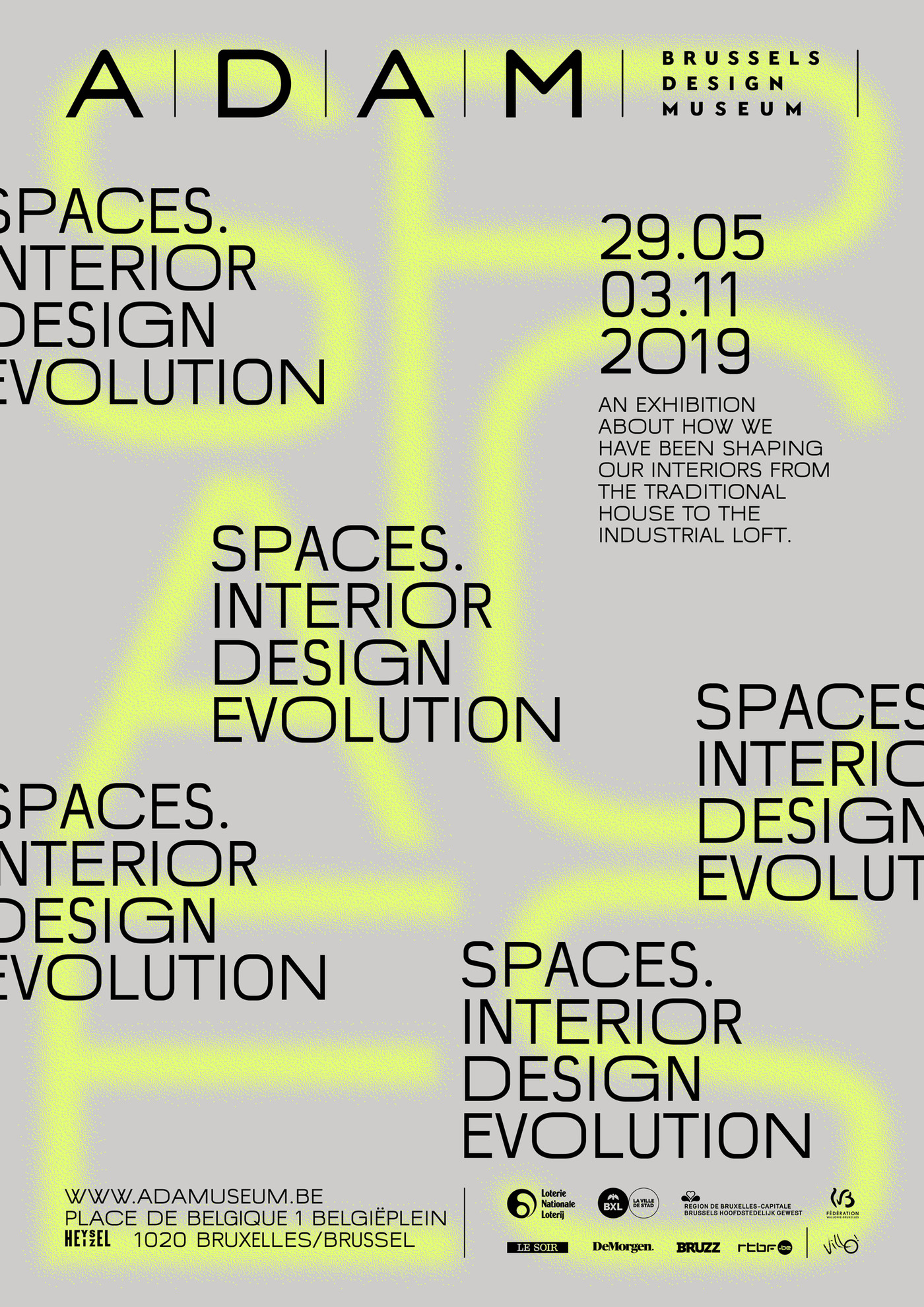
The Design Museum Brussels (formerly ADAM) commissioned us to build the graphic design communication and signage for their main temporary exhibition: Spaces. Interior Design Evolution.
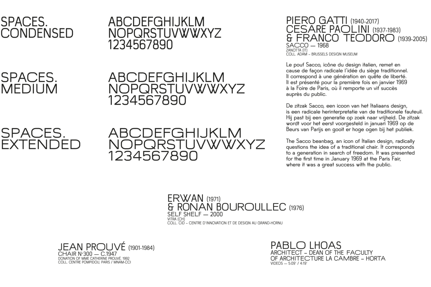
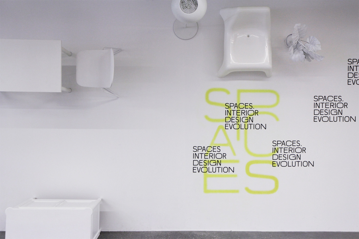
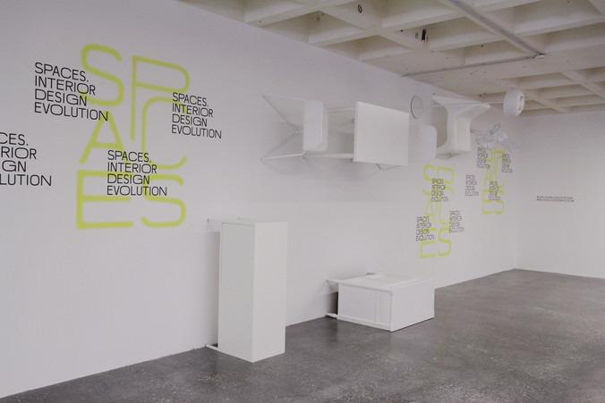
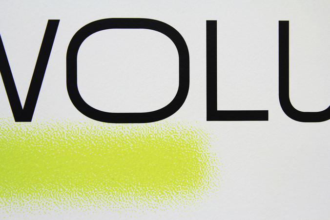
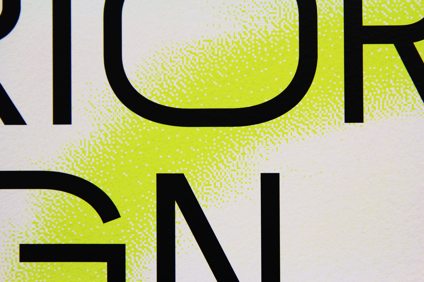
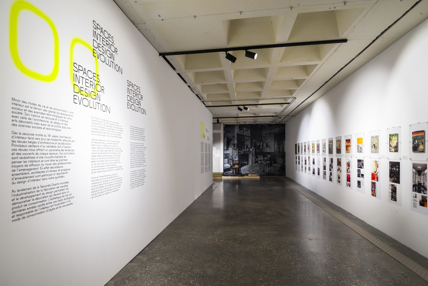
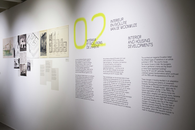
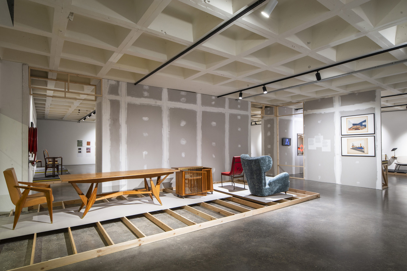
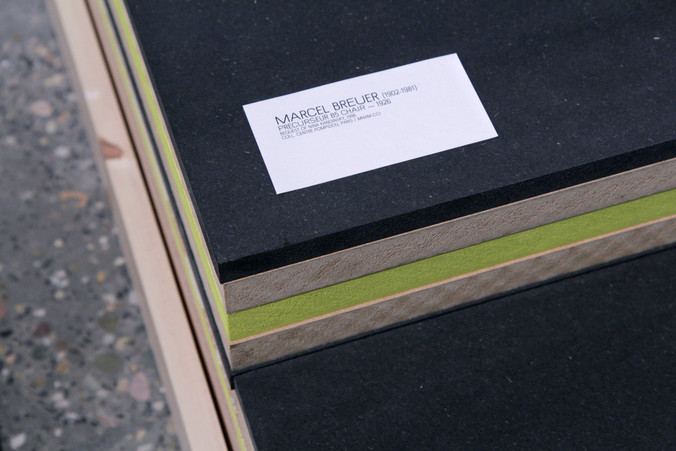
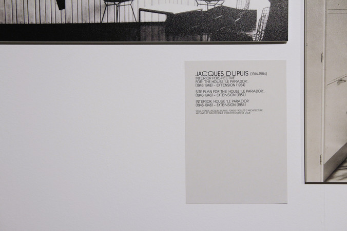
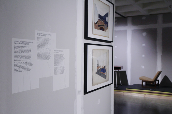
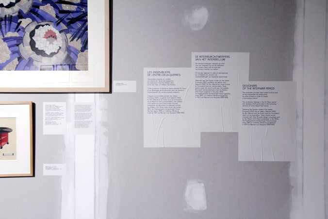
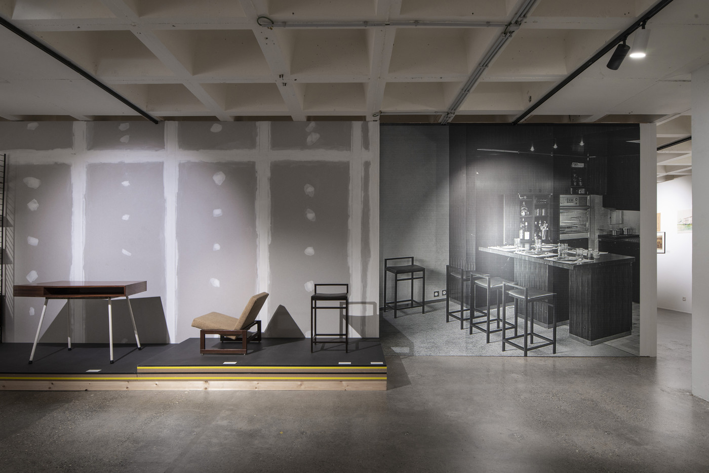
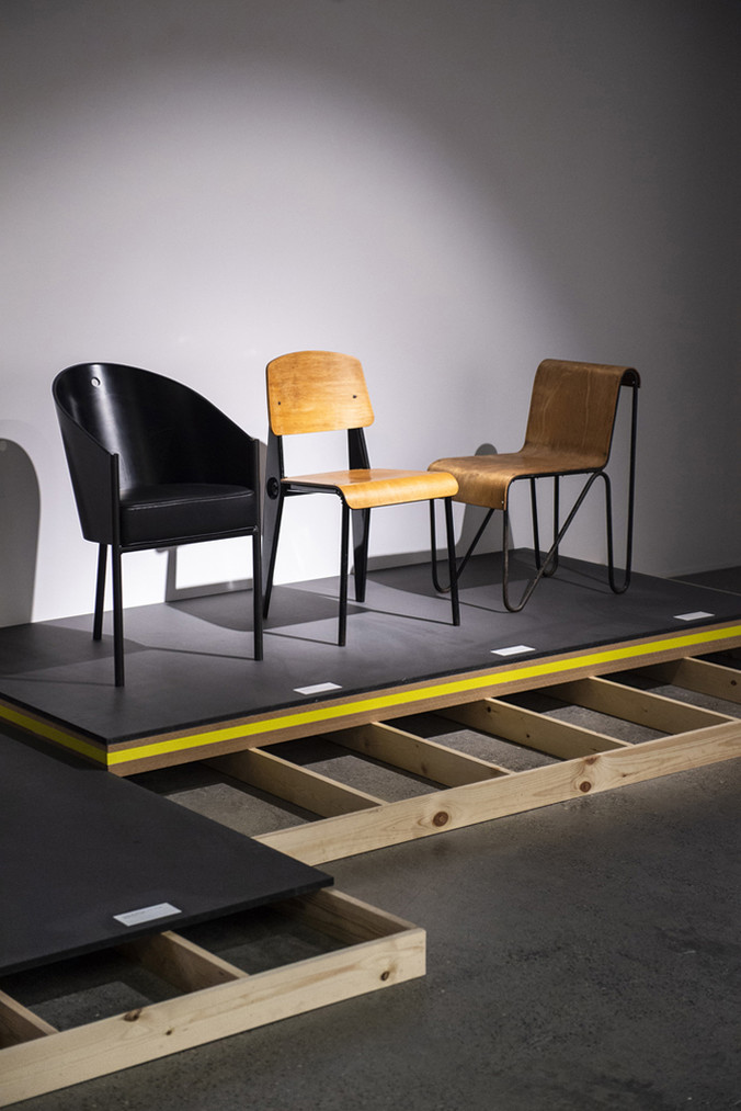
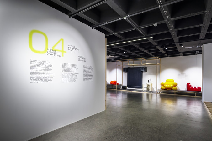
In partnership with Benjamin Stoz, curator and scenographer, we followed the “construction site” effect he had foreseen for the display. A rough attitude was intentionally displayed with the explanation texts printed on basic recycled paper and glued directly onto the plaster walls or inspired by the bright spray paint used by construction workers to indicate what needs to be done. Among those spray paint colours, yellow is the one that brings the most contrast to scenography. Getting the blurry effect of spray paint without the imprecision of handwriting for the big section numbers was challenging. For this, we came up with a silkscreen method printed directly onto the wall surface. In addition to these contextual effects, we created a custom font containing 3 different widths enabling spatial modulations within the texts.
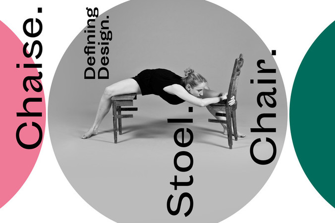
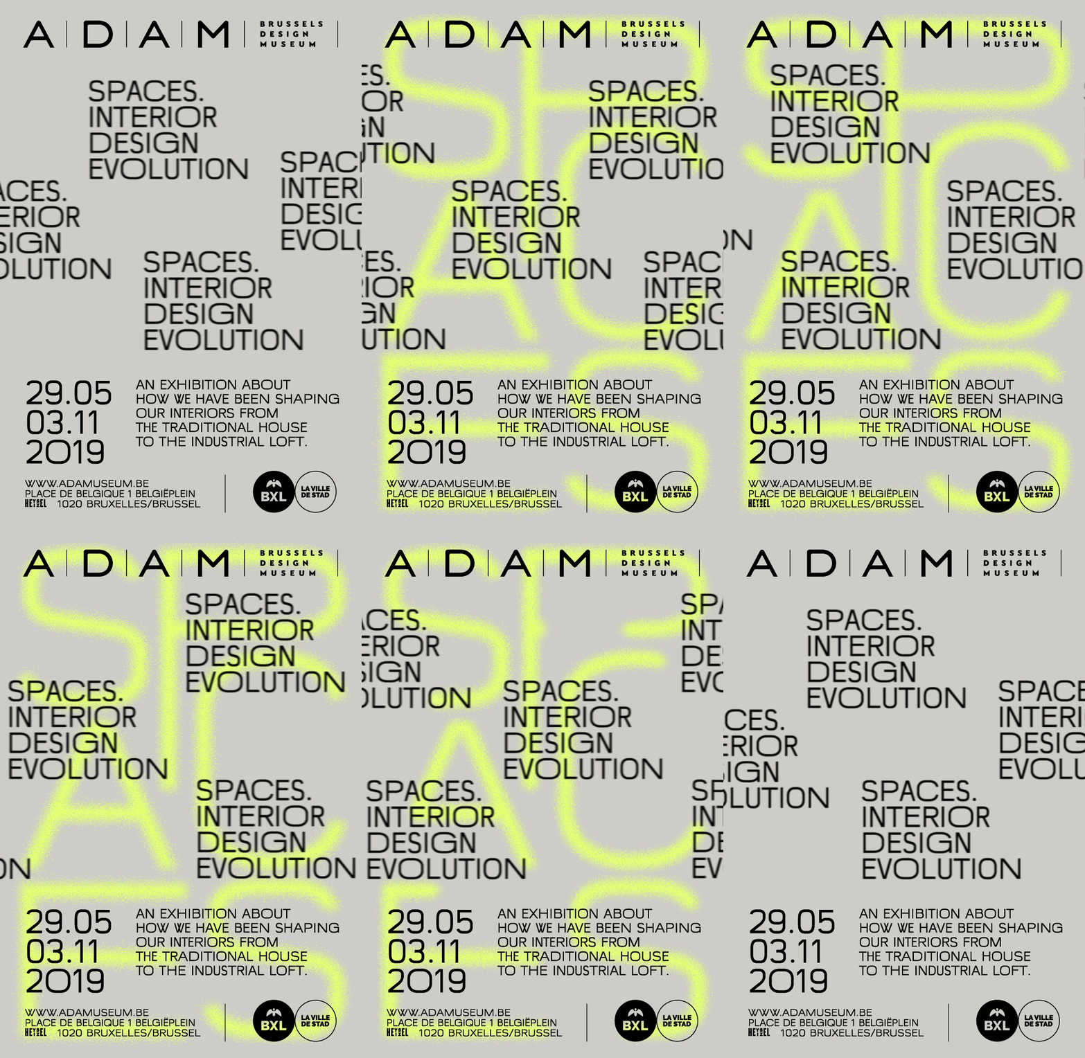
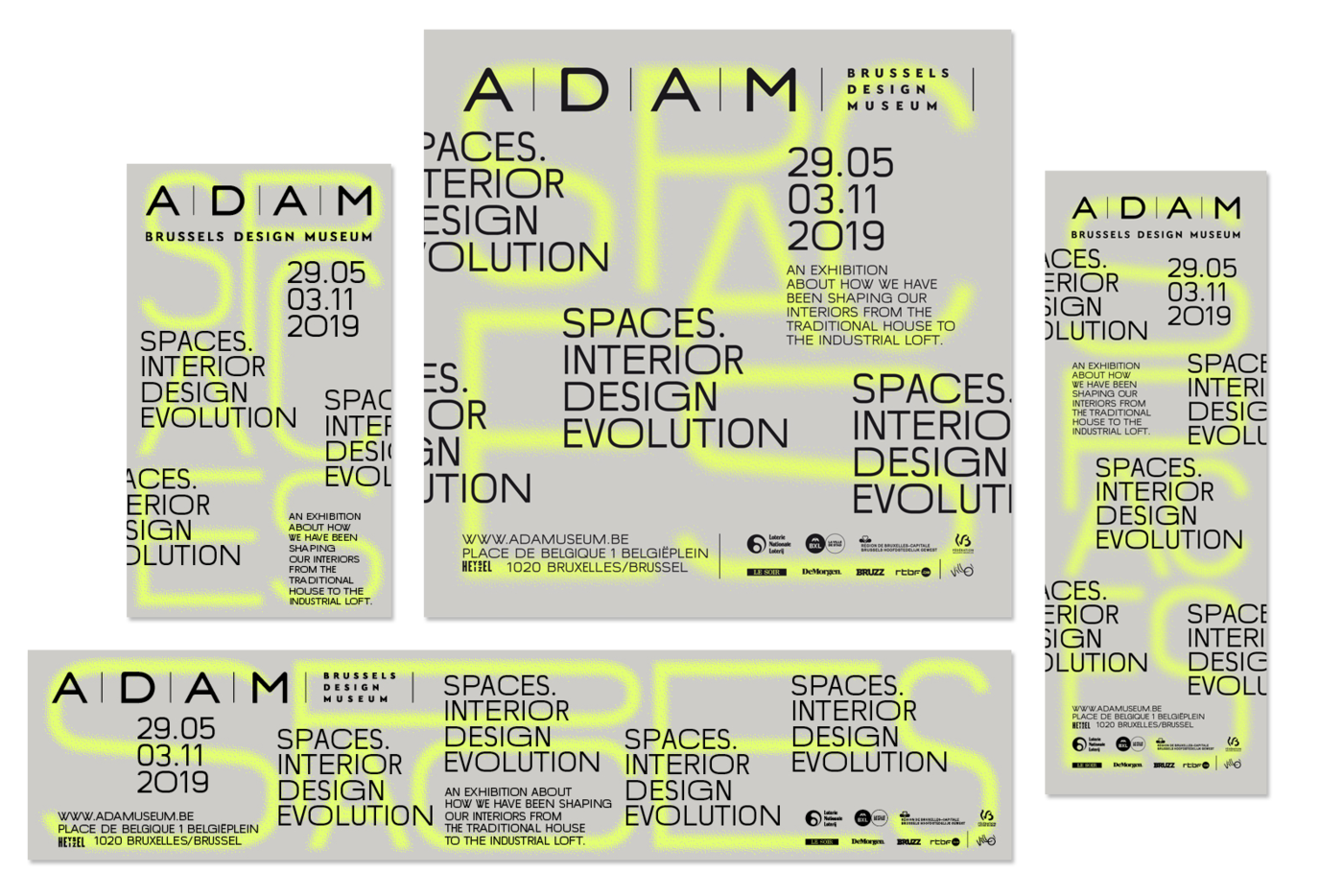
For the communication, the posters feature a typographical composition filling the background space with extended and condensed letters – the composition is then different for every poster proportion, from DIN formats to web banners. On top of this, the title is repeated in the foreground as a reference to manufactured duplication or interior wallpaper, both topics of the exhibition.
Video animations were produced in order to give emphasis to the spray painting gesture and the industrial production flow.
scenography © stoz.design
