Charleroi pictogram system
Just like graphic design identity, the use of official pictograms has a direct impact on the city's visual and interactive environment. Every stakeholder in the city can therefore do their bit to contribute to the graphical coherence of the overall environment.
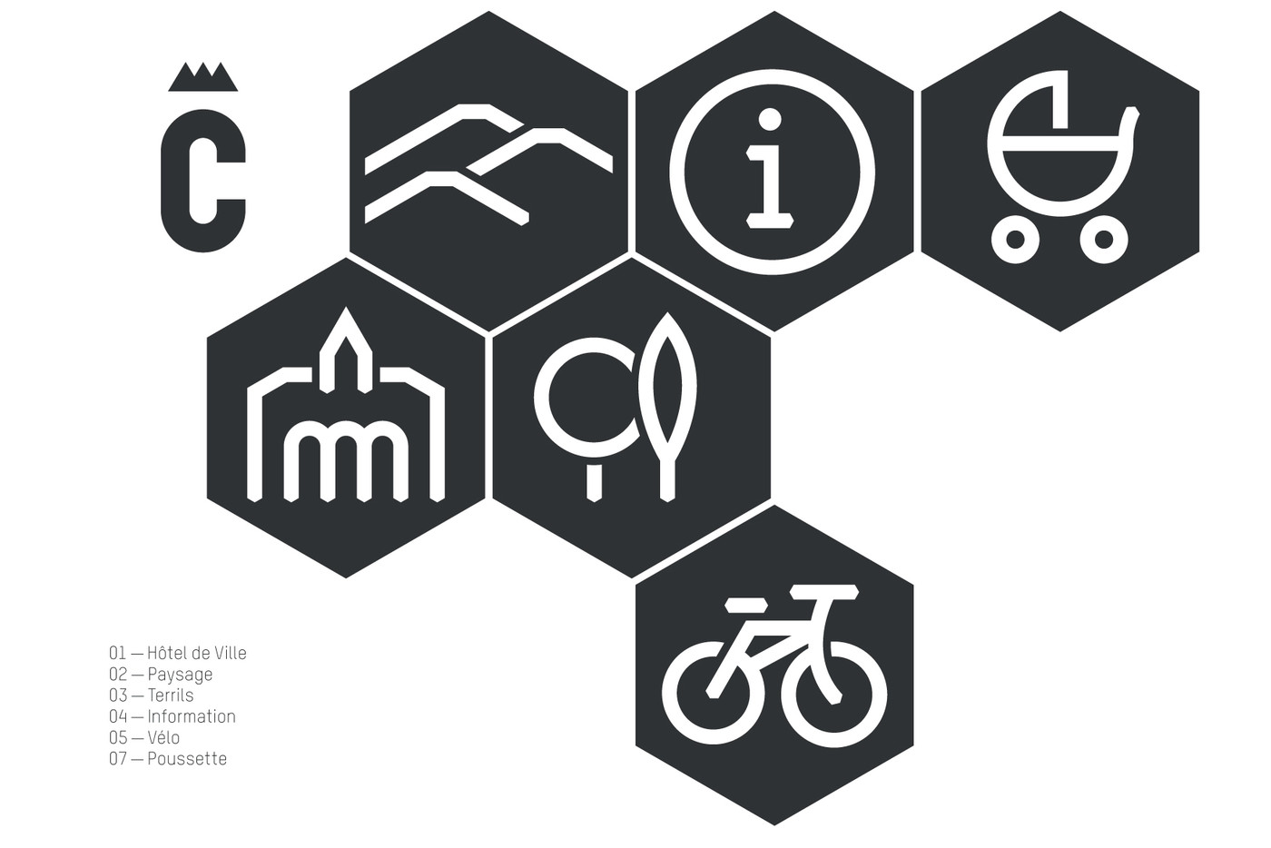
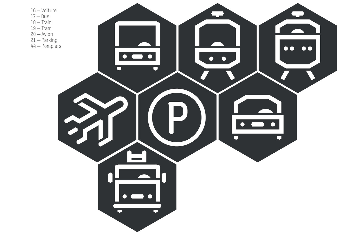
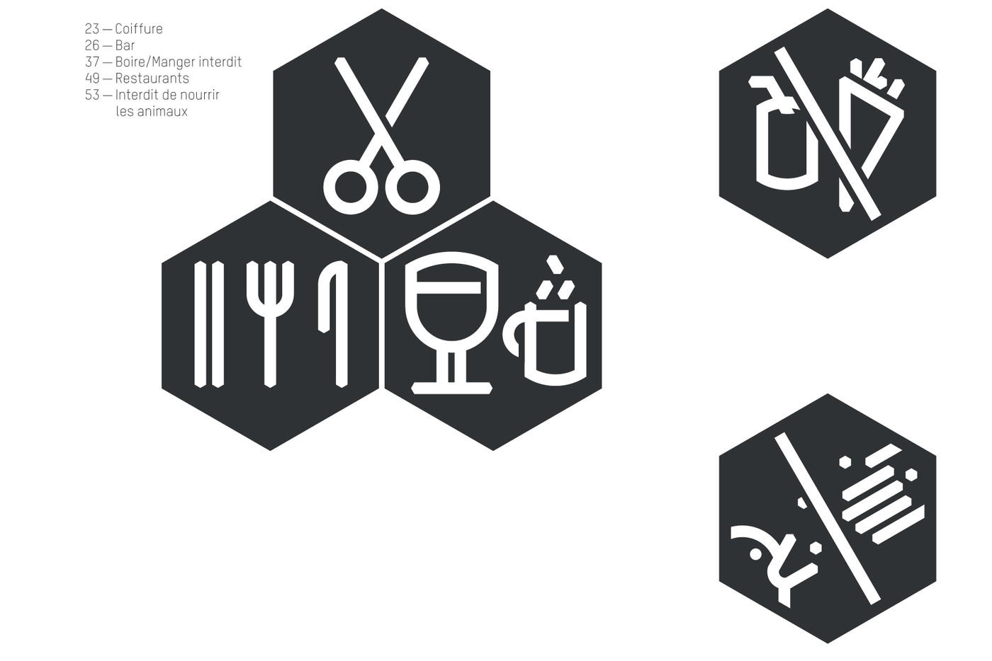
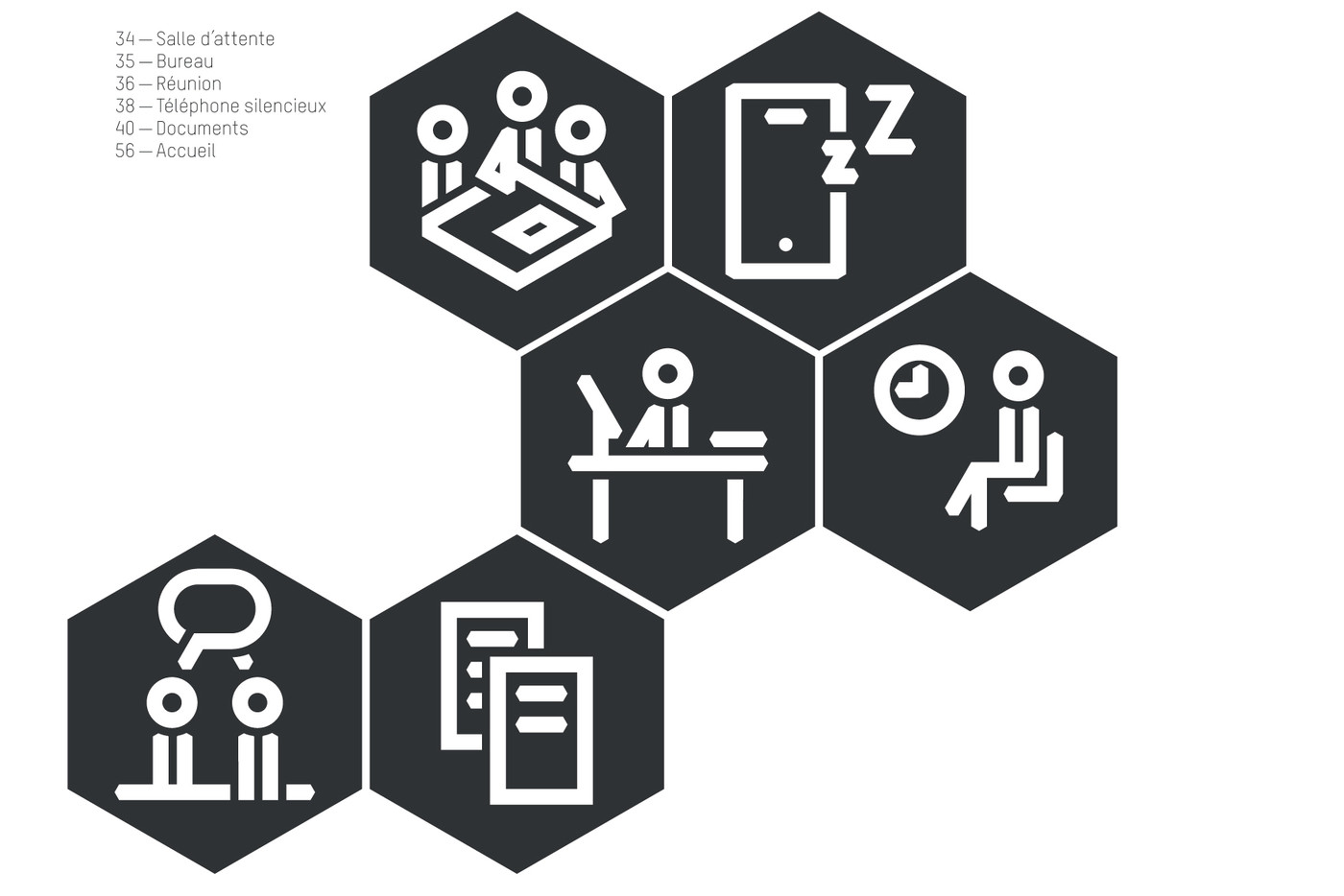
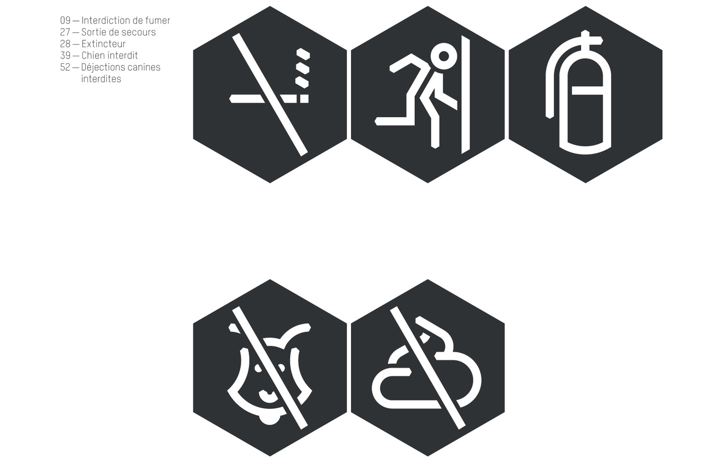
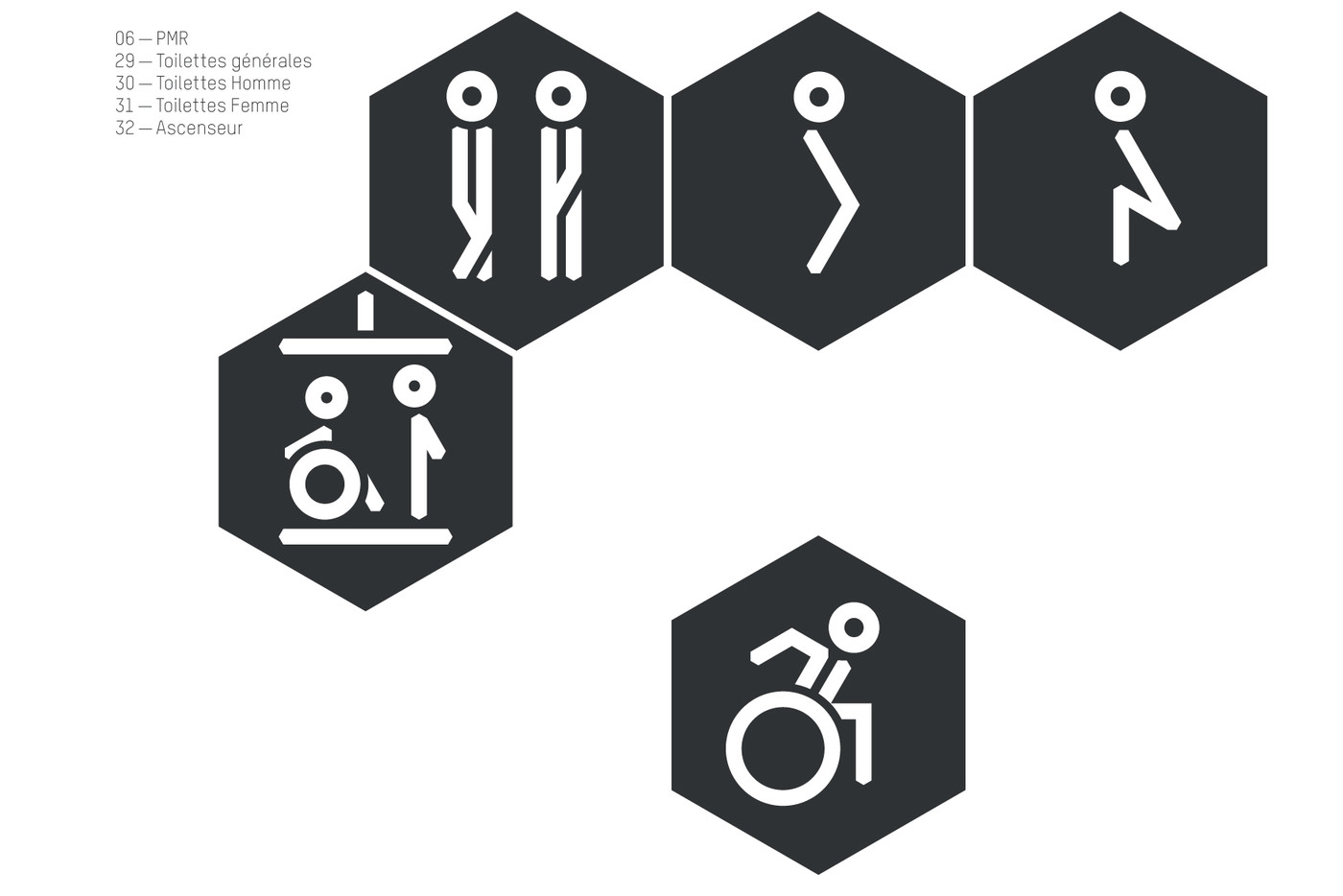
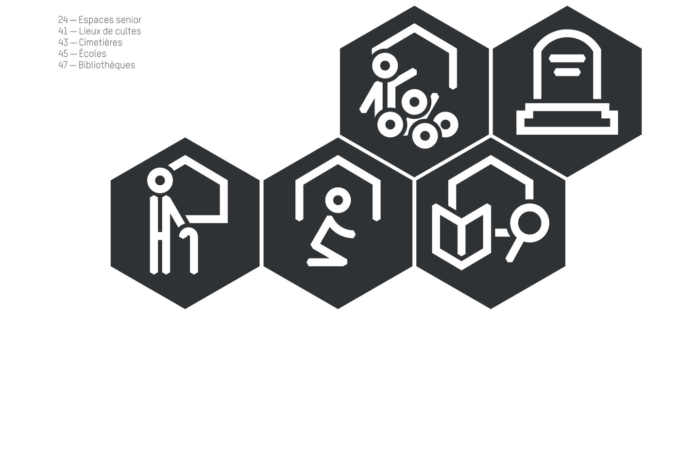
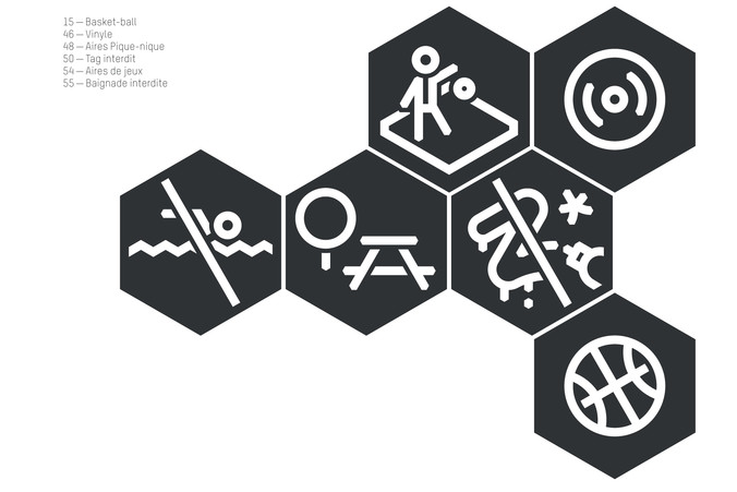

Charleroi pictogram system
The Belgian city of Charleroi has adopted new graphic guidelines (by Pametjenny in 2015). In order to help the city continue to build its contemporary identity it seemed essential to help them further develop their graphics based on these guidelines.
The pictogram system we developed is to be used on all signage or communications media of the city. It can also be used by local companies, small businesses and associations, so not only members of the civil society of Charleroi.
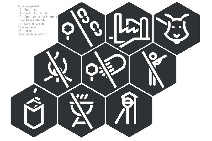
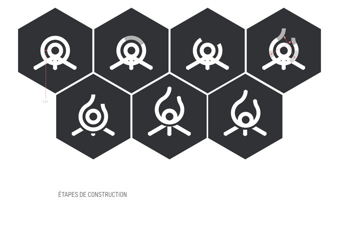
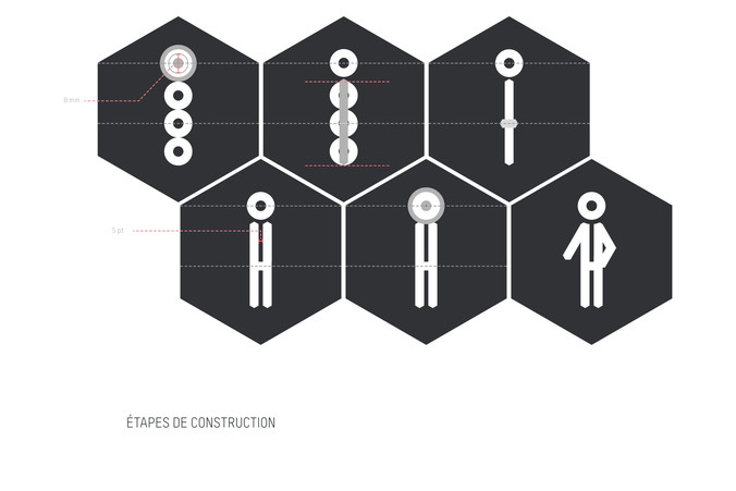
The range of pictograms developed is based on several precise construction criteria and different concepts in close connection with Charleroi. The curves and geometric shapes that make up the typographic characters of the T-STAR font, used in the city's graphic design guidelines, have been a source of natural inspiration for this system. The geometric drawing reflects engineering and avoids unnecessary confusion. The constant thickness of the stroke is nonetheless dynamic and fluid. The hexagon, a strong and historical shape for the city, serves as a cartridge-like frame for the various drawings and symbols of the system. This visual background unites and links every pictogram to the whole like a signature and guarantees the readability of each element. The shape itself encourages combinations of several pictograms enabling them to evoke more than the sum of their parts.
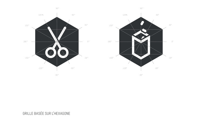
A grid based on this same hexagon mechanically regulates the drawings but still allows plenty of freedom. This standardisation guarantee, with the other guidelines, gives visual coherence to the whole. The viewer is offered a calm environment which can be understood at a glance. Wherever legibility allows, the creation of pictograms has remained vigilant and careful not to convey stereotypes, but rather to promote inclusiveness.
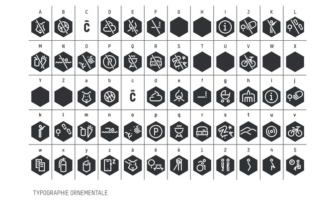
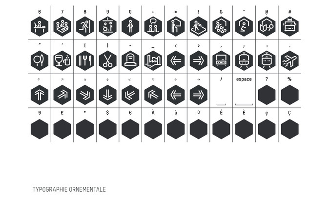
A whole range of specific files is available for different types of usage. The basic vector files are destined for professional graphic designers but also a font file clustering every single pictogram has been developed, allowing non-graphic design workers to access all pictograms from their keyboard on a simple text editor program.
Further more, we invite local people and businesses to enlarge the range of pictograms following the precise guidelines and methods described in a detailed construction manual. Naturally, the guidebook is accompanied with the original construction files, allowing the newborns to join the family with the same DNA.
Designed for: www.charleroi-bouwmeester.be
with Sebastien Lacomblez
