Moodboards — Jean-François D'Or
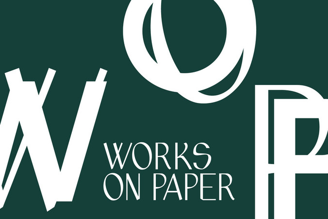
For this monographic design exhibition at Grand Hornu Images, we worked with Jean-François D'Or – Designer of the Year, 2013 – to create the typographic guidelines for this event. We chose the font called "Aperçu" partly because of the beautiful "ç" integral to the name of the designer.
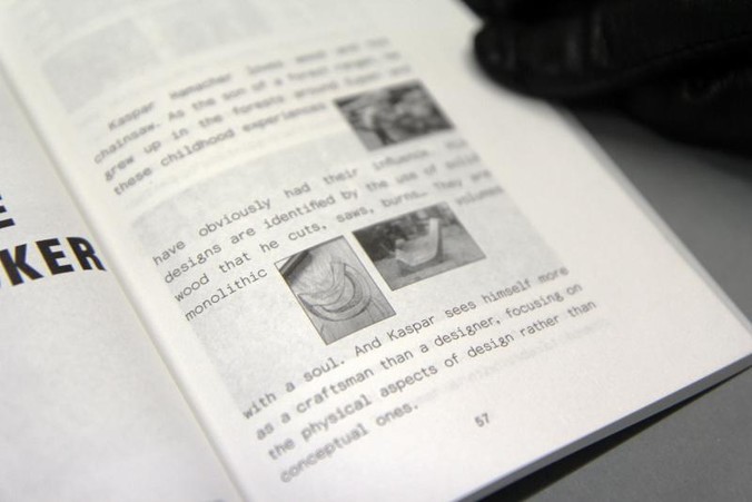
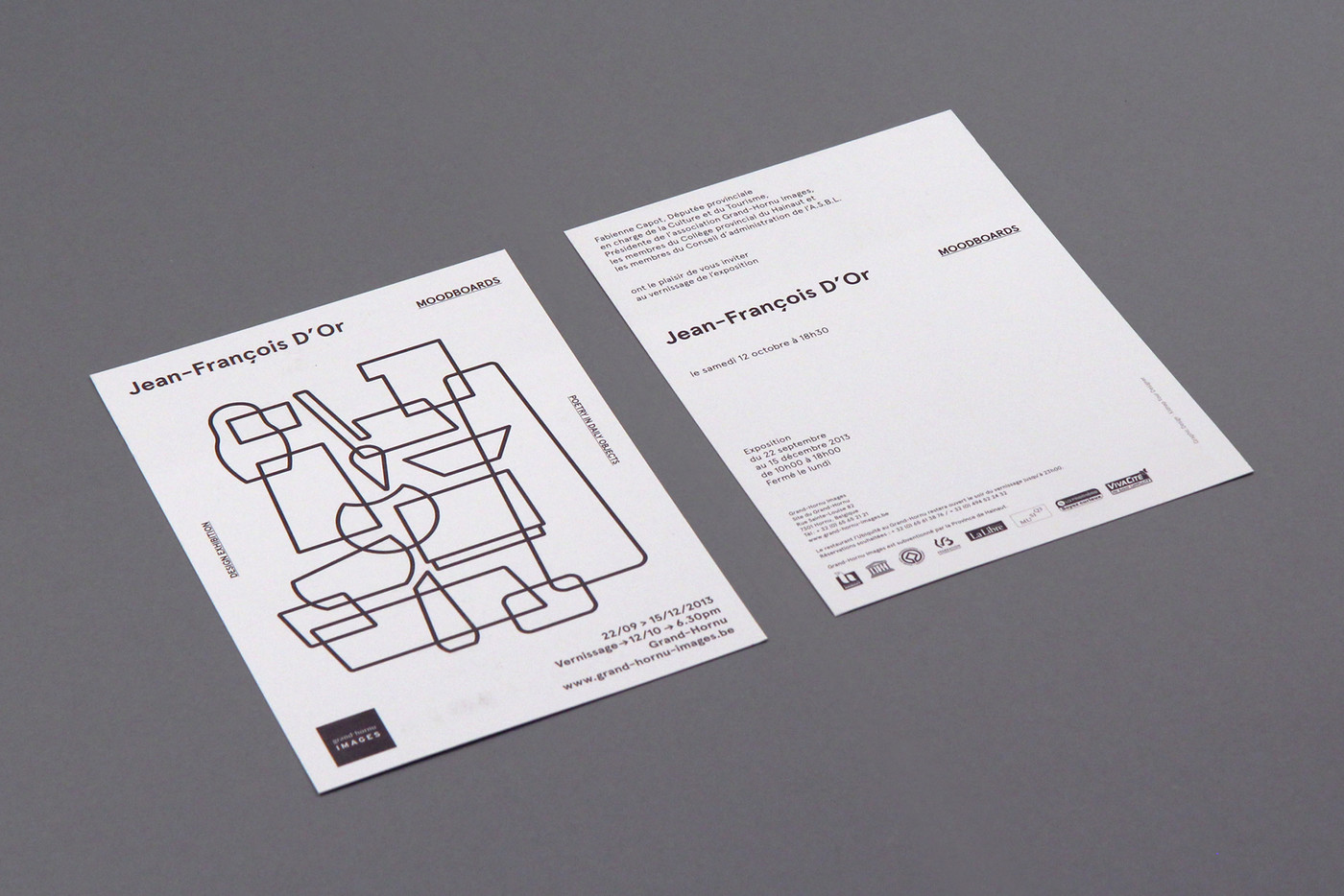
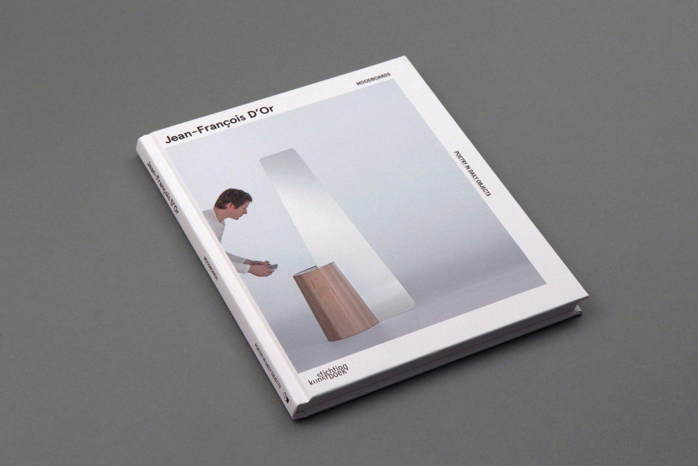
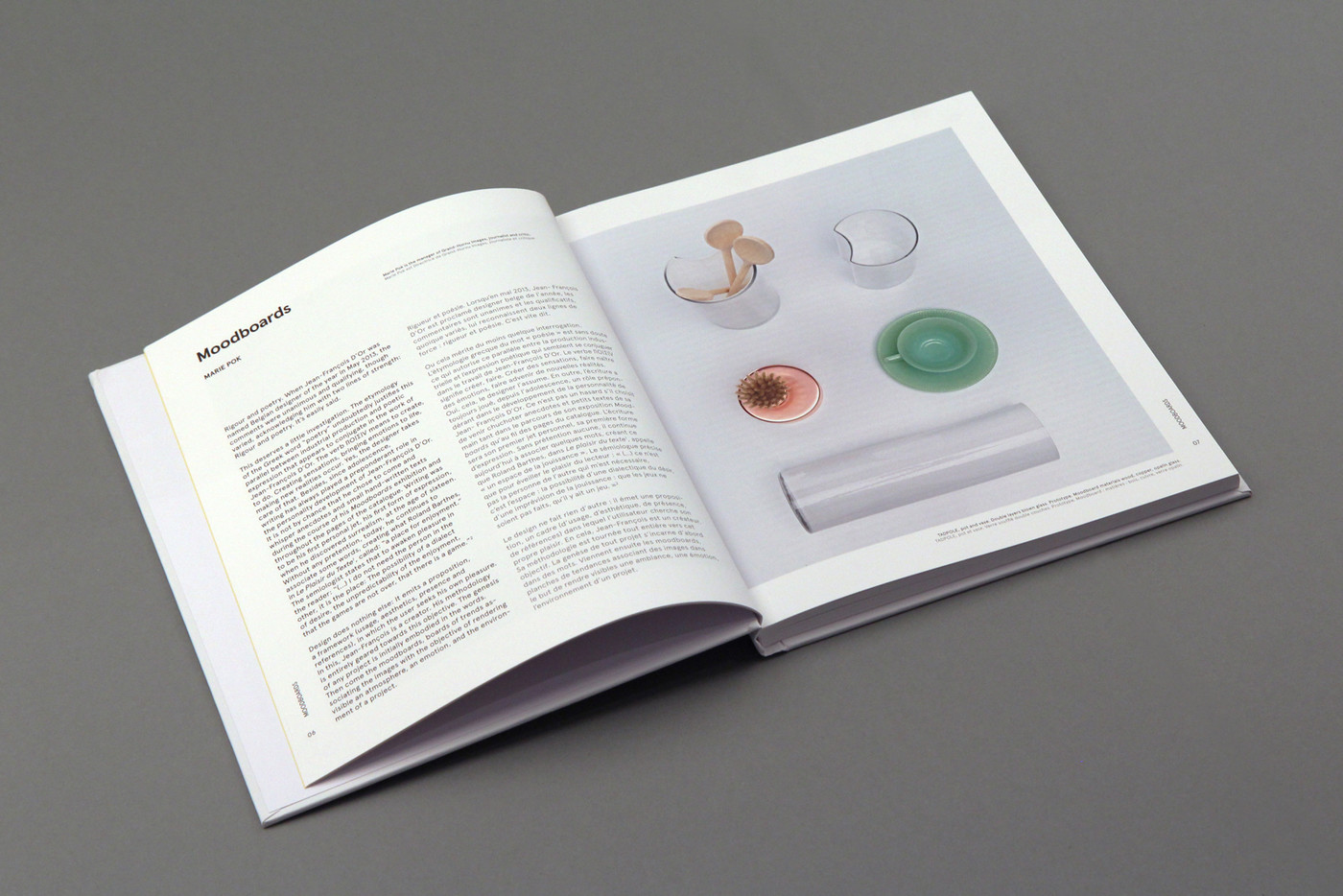
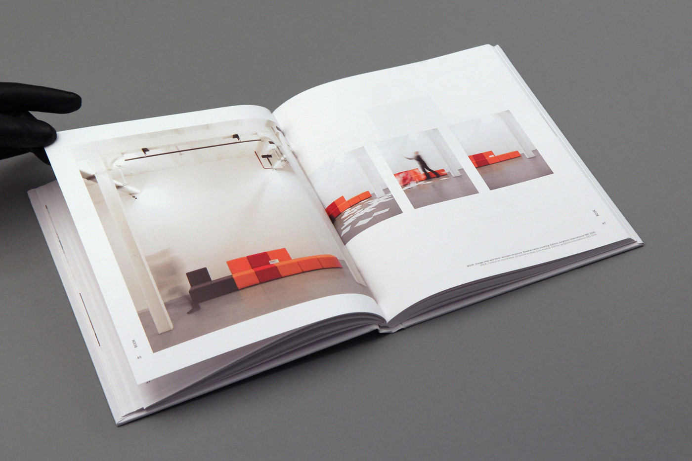
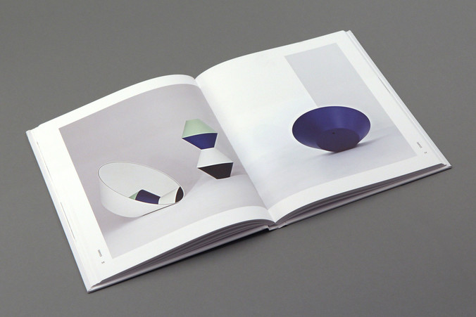
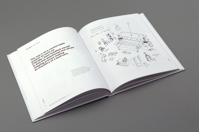
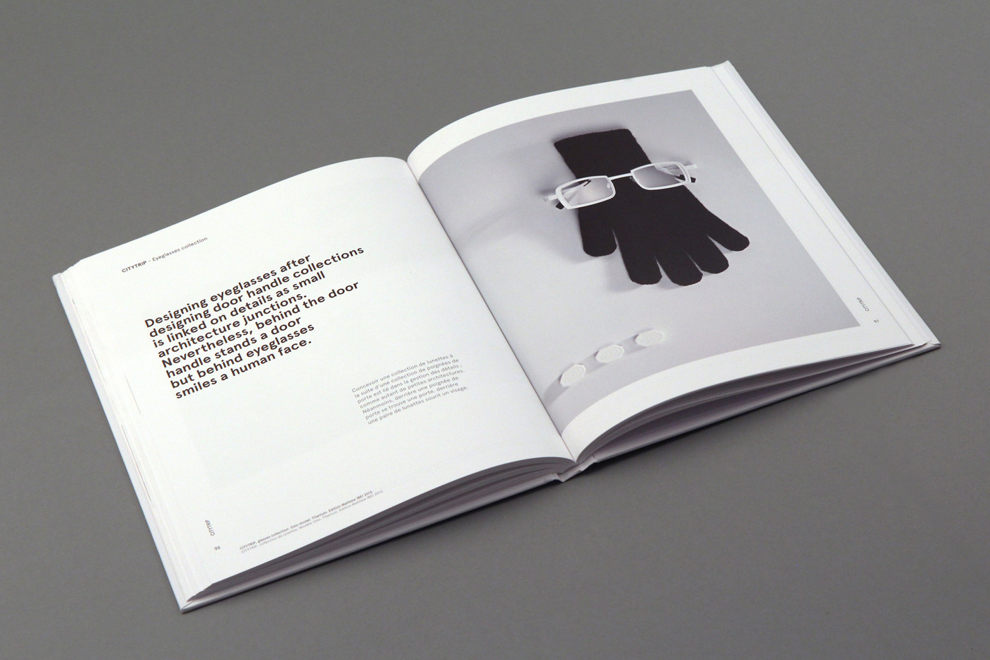
hard cover book / 128 pages / colour offset printing / Conda Mat paper / 1,000 copies – invitation / black offset printing / 1,000 copies

Moodboards — Jean-François D'Or
For this monographic design exhibition at Grand Hornu Images, we worked with Jean-François D'Or – Designer of the Year, 2013 – to create the typographic guidelines for this event. We chose the font called "Aperçu" partly because of the beautiful "ç" integral to the name of the designer.
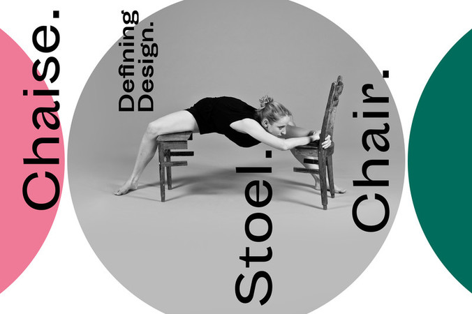
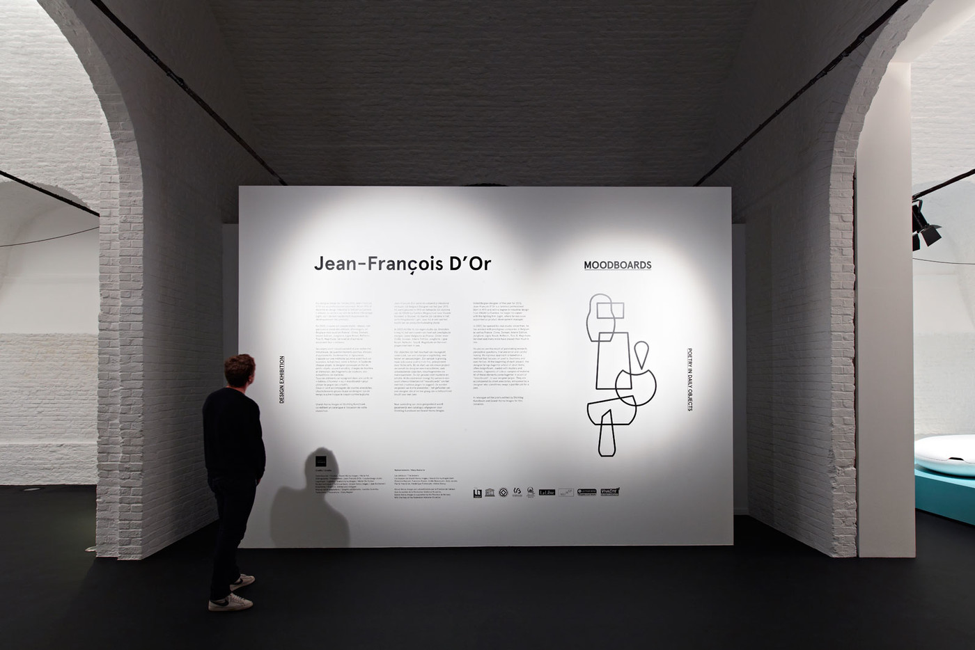
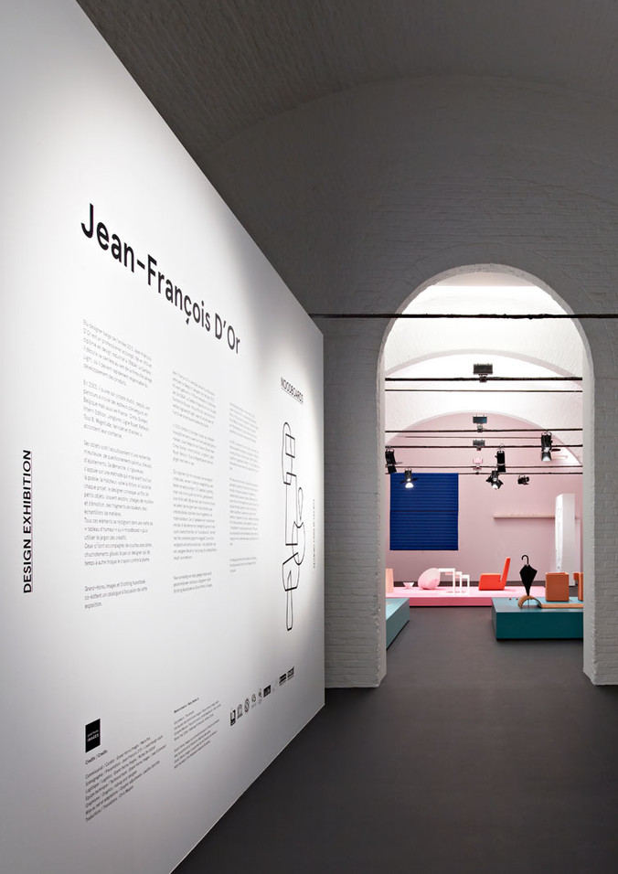
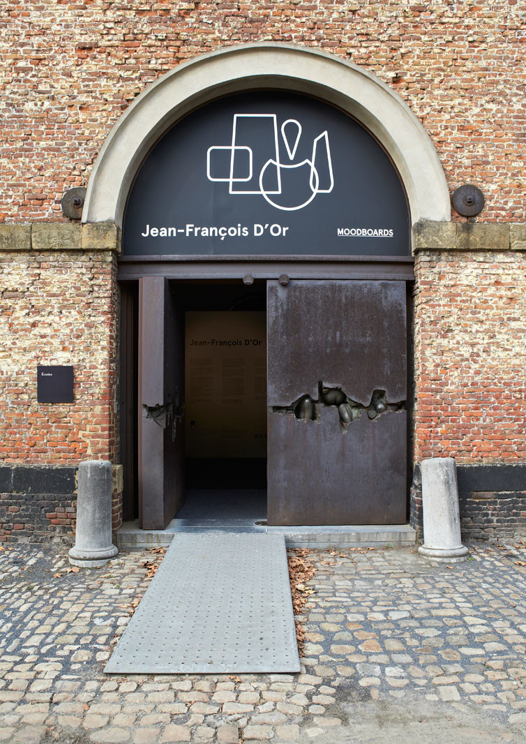
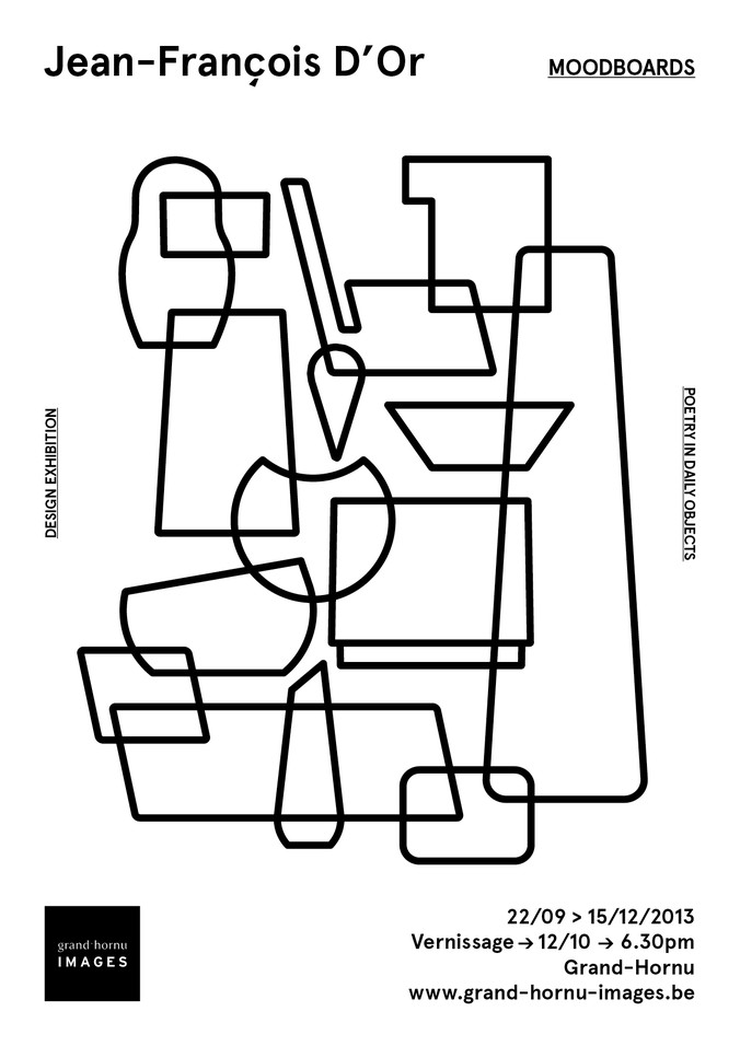
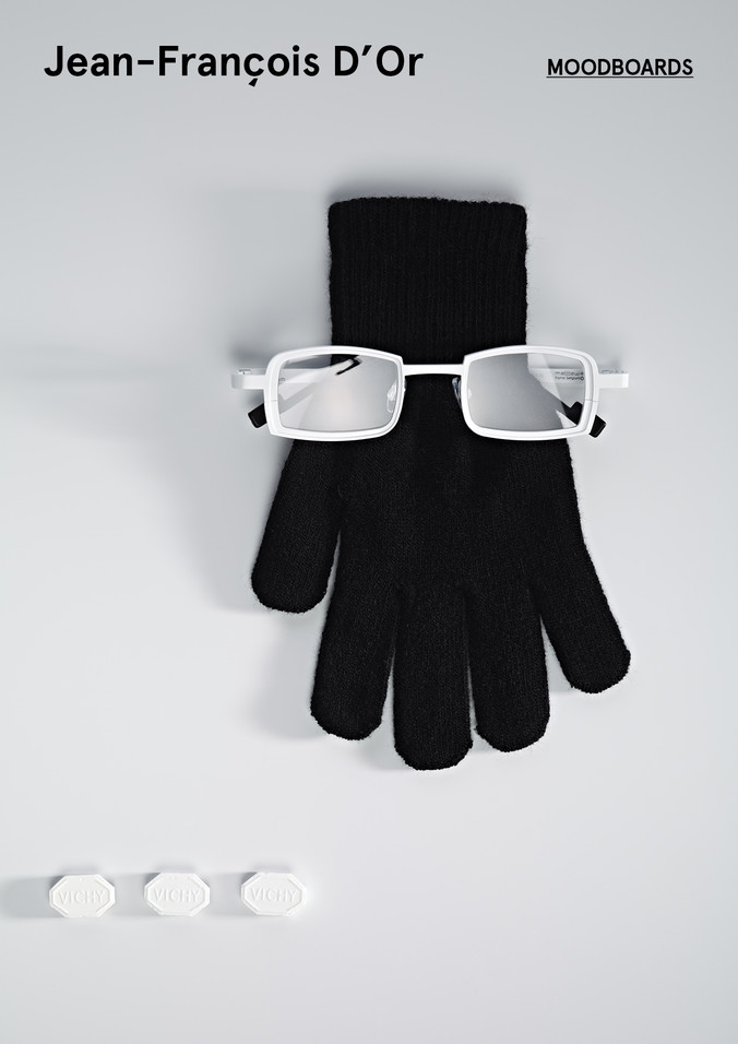
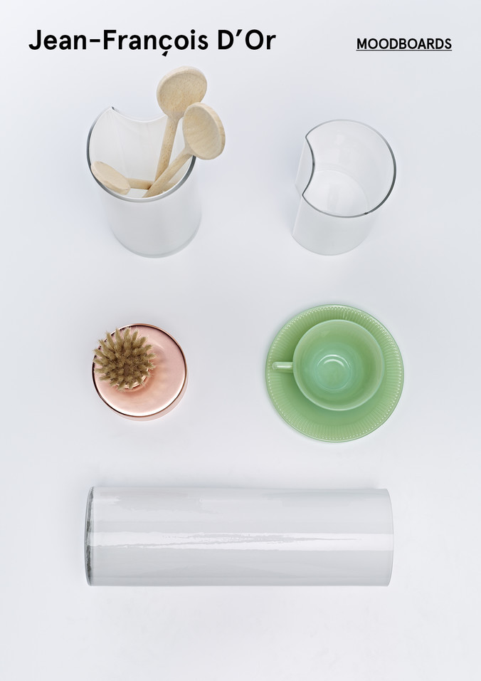
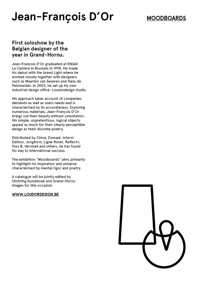
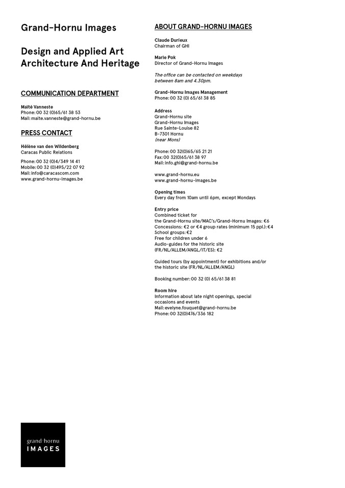
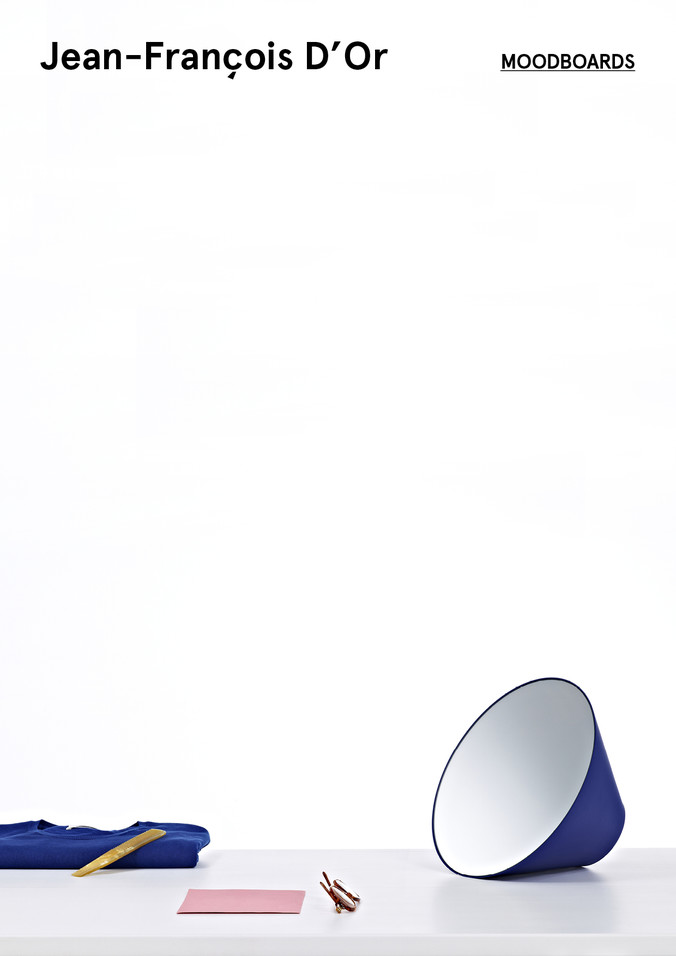
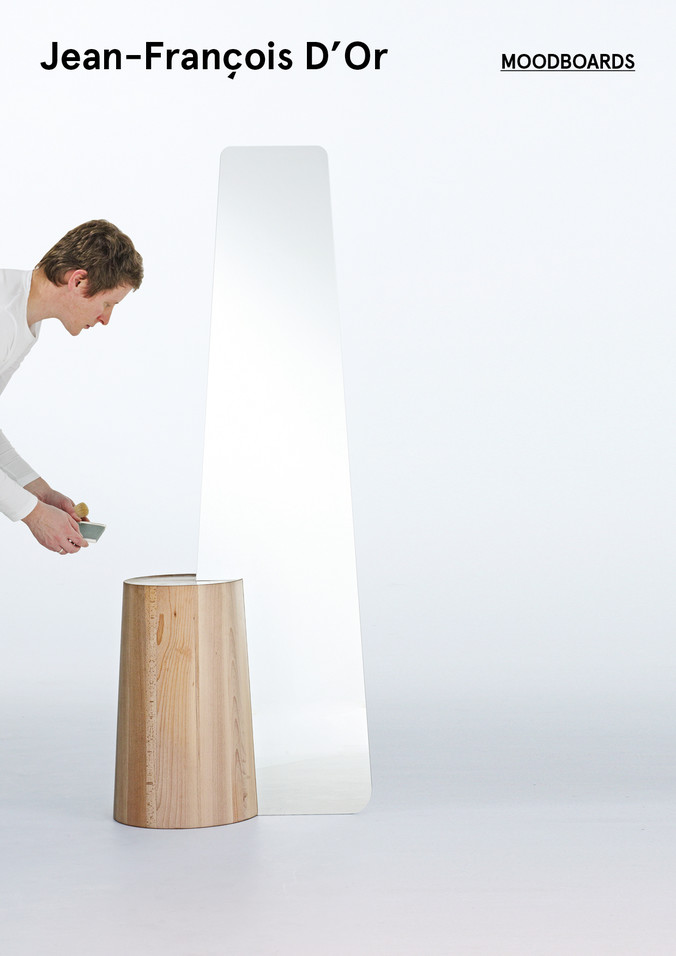
For the invitation, the flyers and the posters, we came up with some abstract and minimal shapes inspired by the designer's objects. It allowed us to highlight the little design twists that make his work so individual and smart. With the use of these graphical elements, we could then decide against using photos (too common for design shows) in the promotional material for this event.
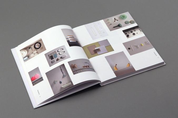
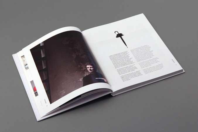
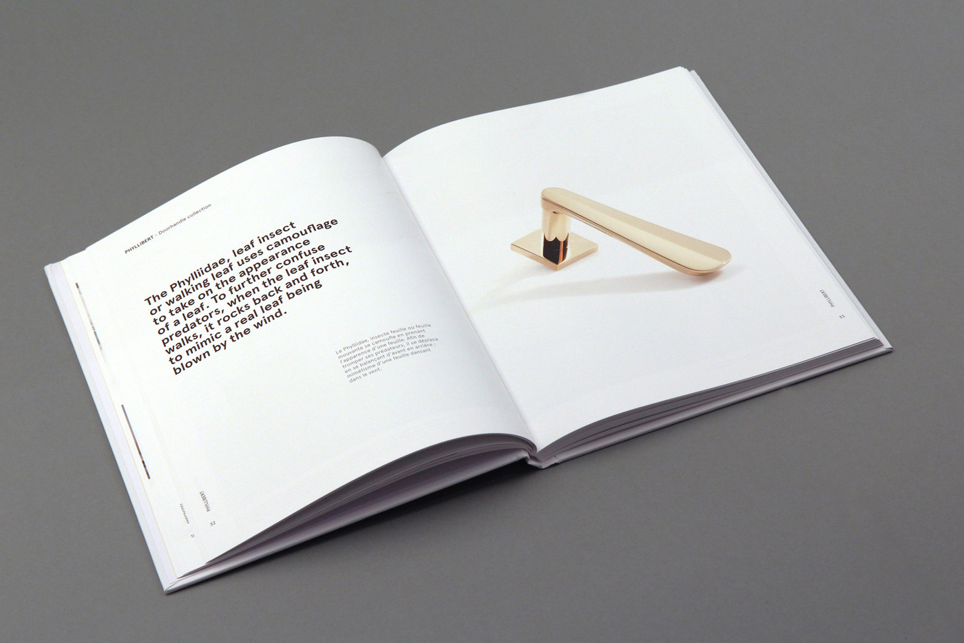
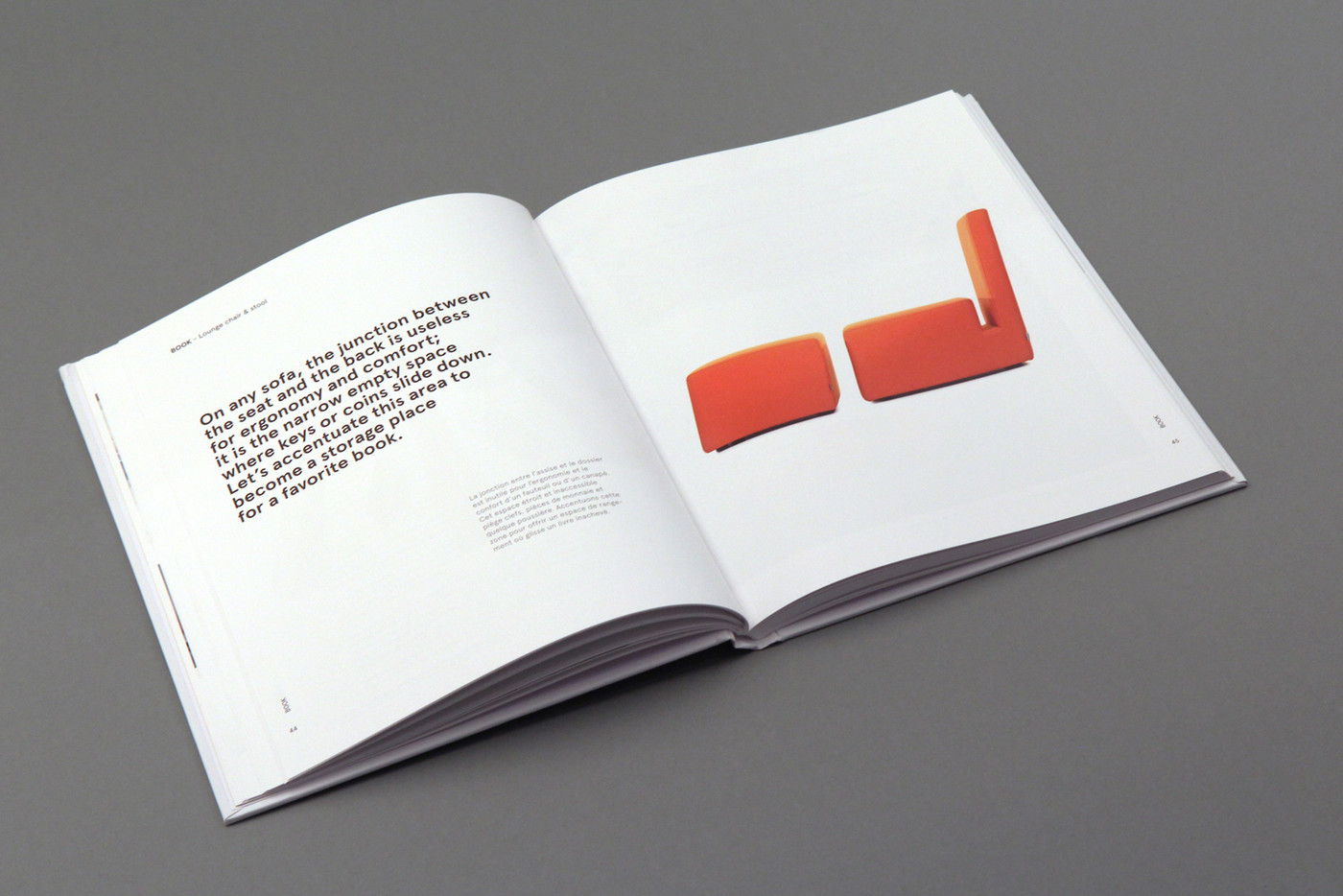
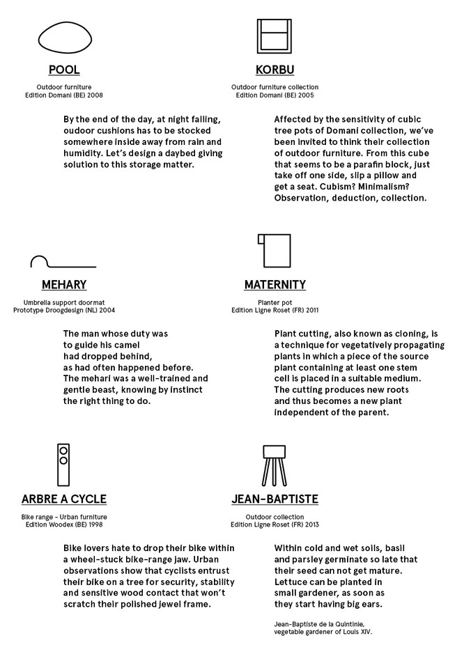
For the book accompanying the exhibition, we designed a light and elegant grid to present his work as a designer. Playing with this specifically chosen font in various sizes, the titles, the texts but especially the meaningful headings were given prominence and allowed to reflect the "moodboard" aspect of the entire project.
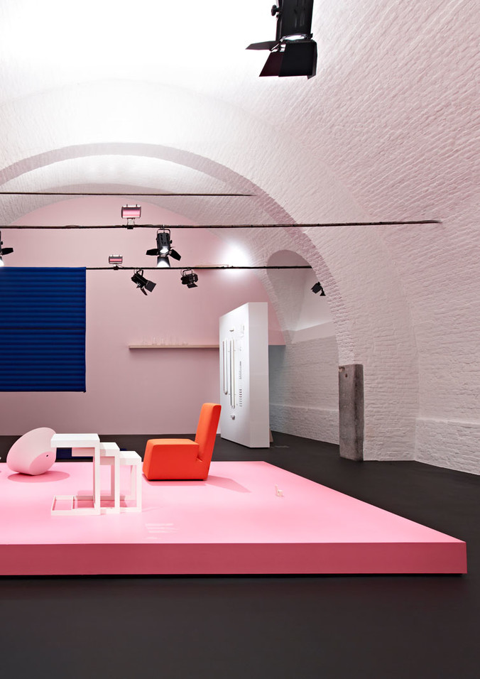
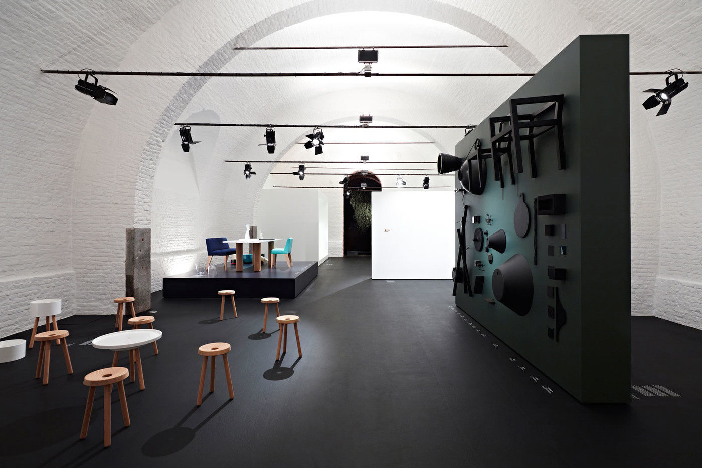
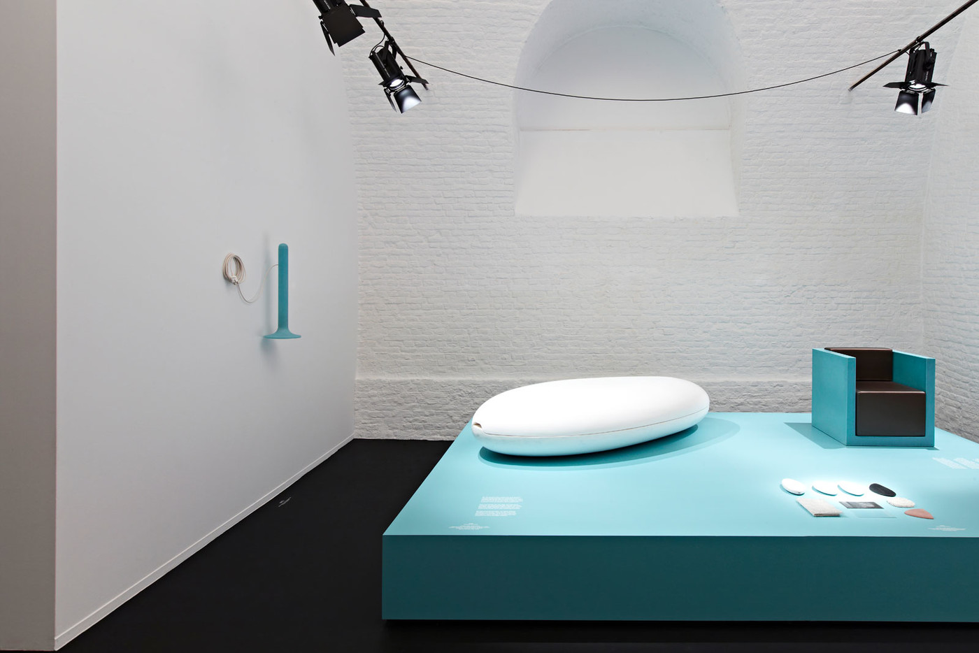
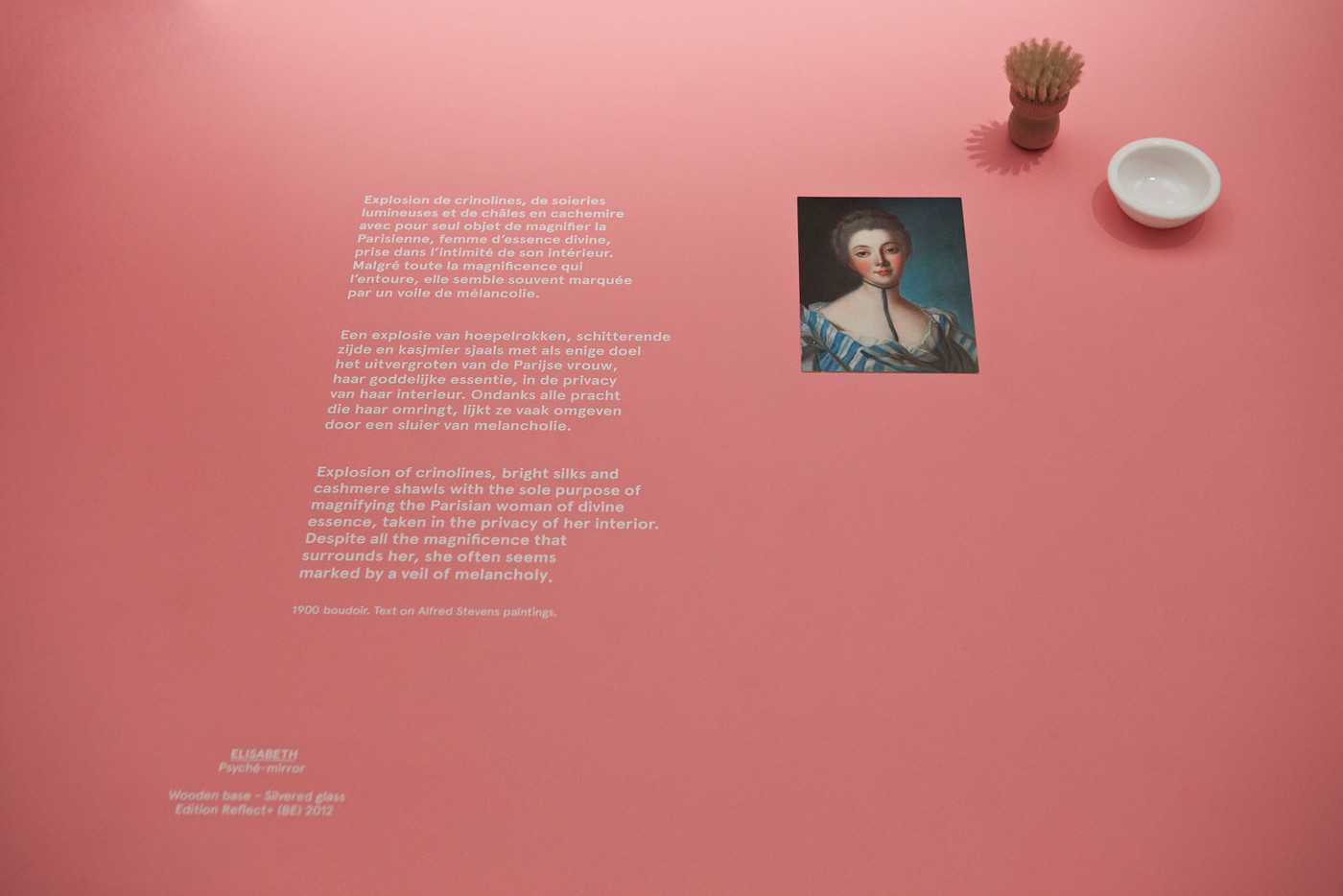
For the signage around the exhibition space, Jean-François chose some original "pastel" colour for the plinths. Wisely employing our typographic skills, we quietly displayed the information near the objects to highlight the smart "moodboards" sentences, further echoed by our abstract shapes.
Book guidelines: Kidnap Your Designer
Book final layout: Group Van Damme
Book published: Stichting Kunstboek
Photo : Lenzer Photographer
Designed for: Grand-Hornu Images
