InQlusion
commission
2019
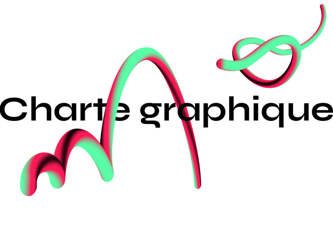
identity & website
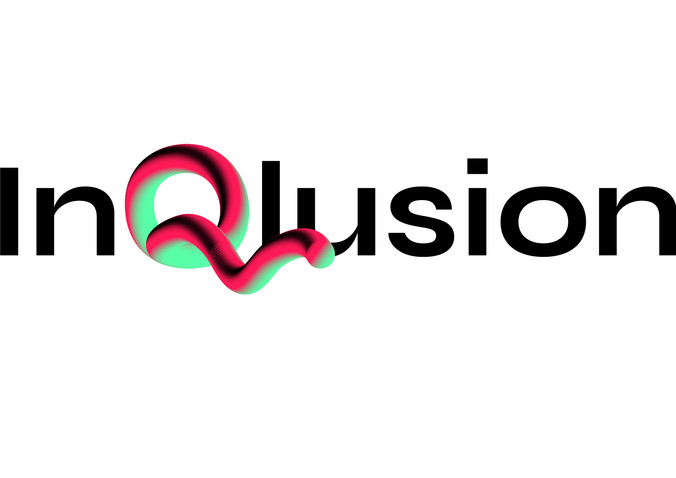
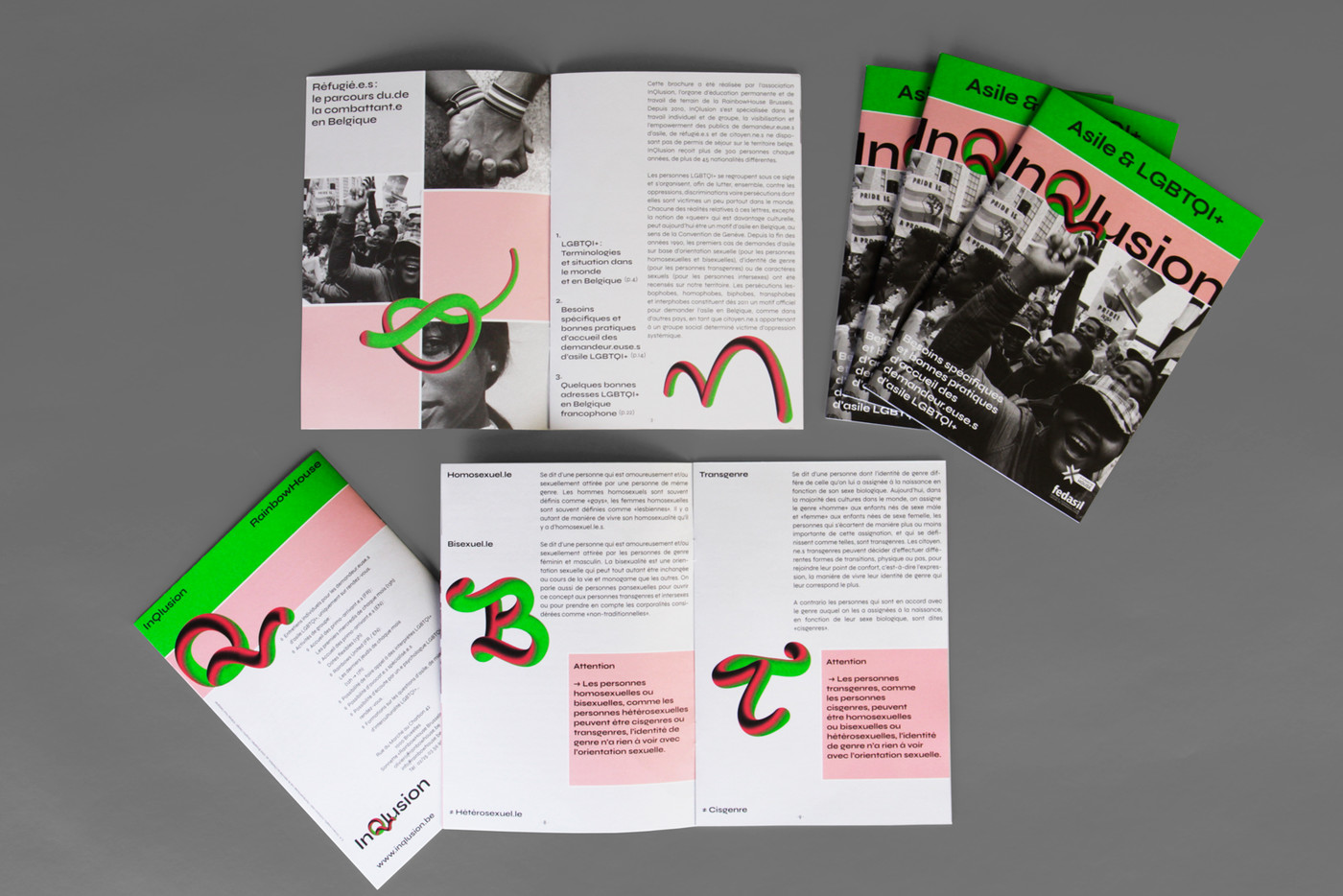
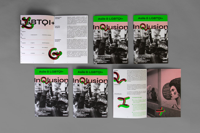
InQlusion specialises in raising awareness and the empowerment of asylum seekers, refugees and citizens without a residence permit on Belgian territory.
visual identity - website - brochure A5 / 1,000 copies

InQlusion
commission
2019
identity & website
InQlusion is an organisation which is part of the Rainbow House of Brussels. InQlusion specialises in raising awareness and the empowerment of asylum seekers, refugees and citizens without a residence permit on Belgian territory.
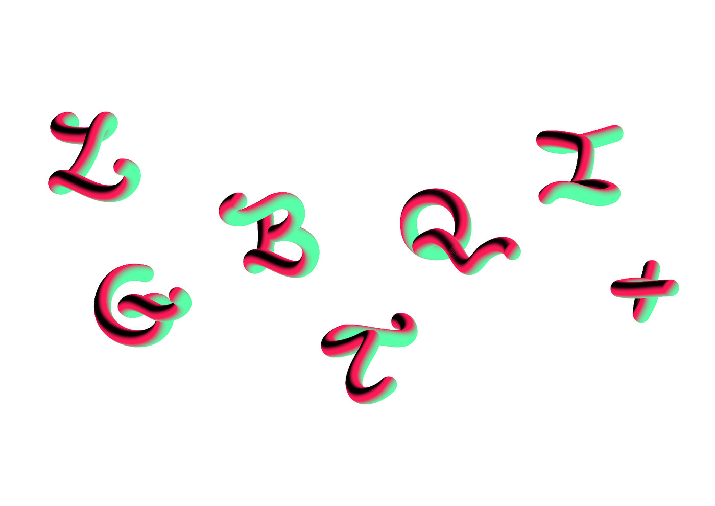
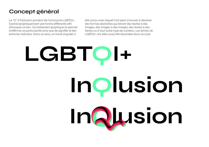
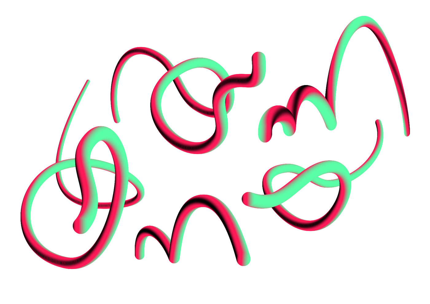
The ‘Q’ in InQlusion comes from the acronym LGBTQI+ standing for ‘Queer’. It graphically takes a different shape to evoke this semantical link. This graphic treatment allows it to assert its inner particularity and the rope shape is like the link between individuals. In this sense, this queer line has been designed to draw abstract shapes that will link texts to images, images to images, texts to texts, etc. Each letters of LGBTQI+ have also been designed in this script style.
website:
inqlusion.be
inqlusion.be
web developer:
geometry.be
geometry.be