Brussels Academy
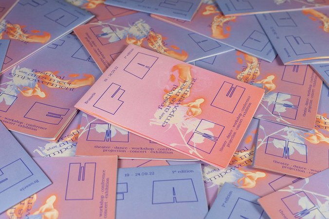
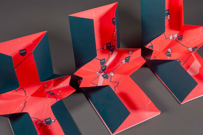
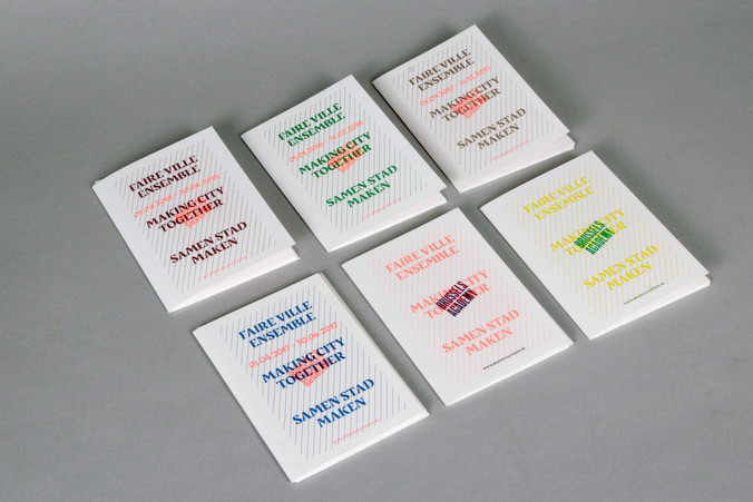
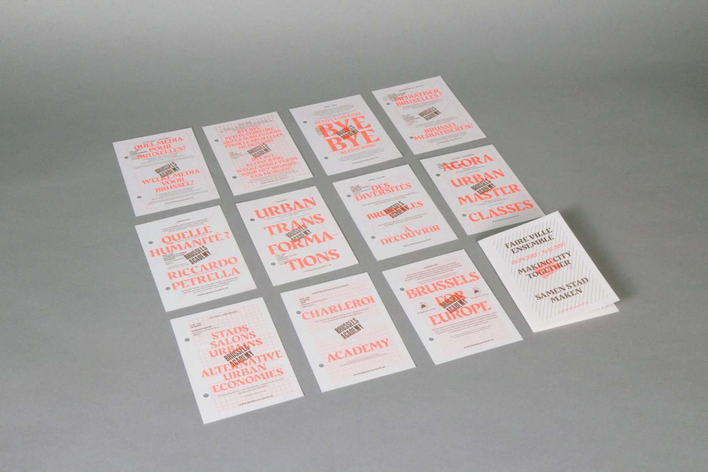
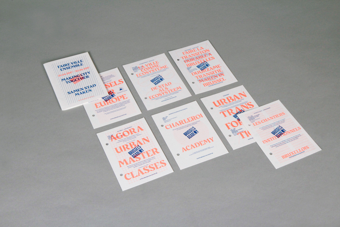
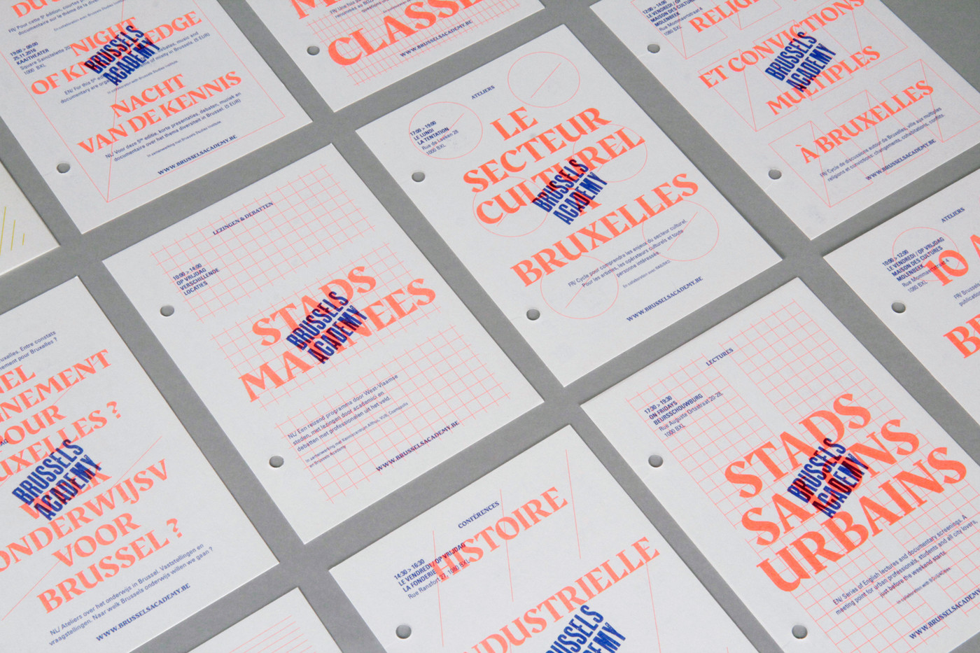
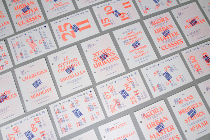
We separated each cycle onto a different flyer so it could be handed out alone if necessary. Nevertheless, a folder gathering them all is produced every season in the same duo tone colour of the flyers as all these are produced together on a funky Riso printer – a vintage colour copy machine.
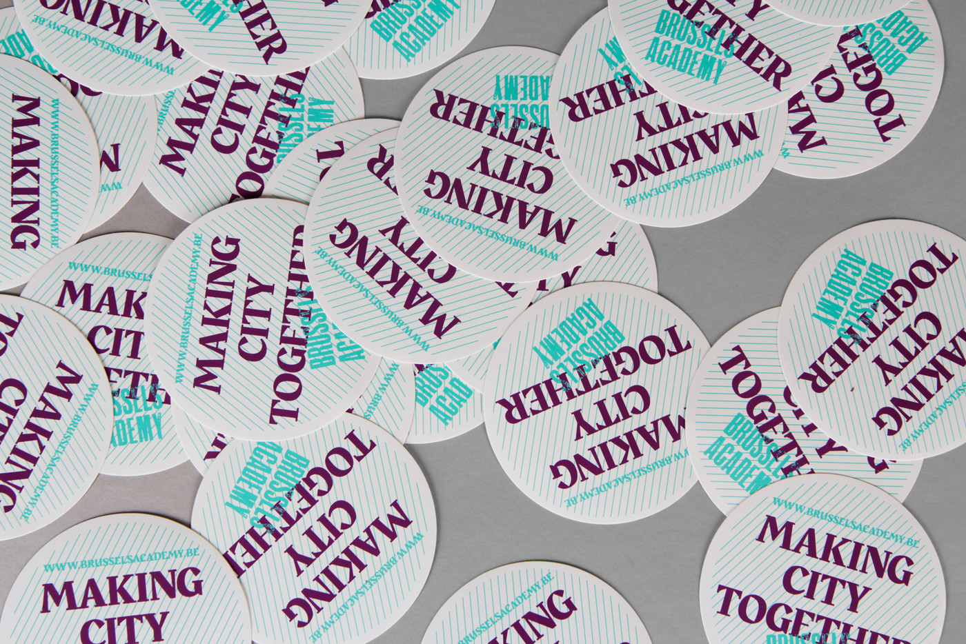
A6 card with folder / Munken Print 150gr / 2 colors Riso printing / 200 copies each - sticker - website guidelines
Brussels Academy
The Brussels Academy is an urban and citizen university. It is the meeting point for everyone who is interested in Brussels and wants to know more about the city. In this context, a number of professors and urban experts share their knowledge of Brussels with civil society. In order to achieve this, a wide range of activities are organised: courses, seminars, tours and visits, masterclasses, conferences, sessions on demand, consultancy, quick audit, …
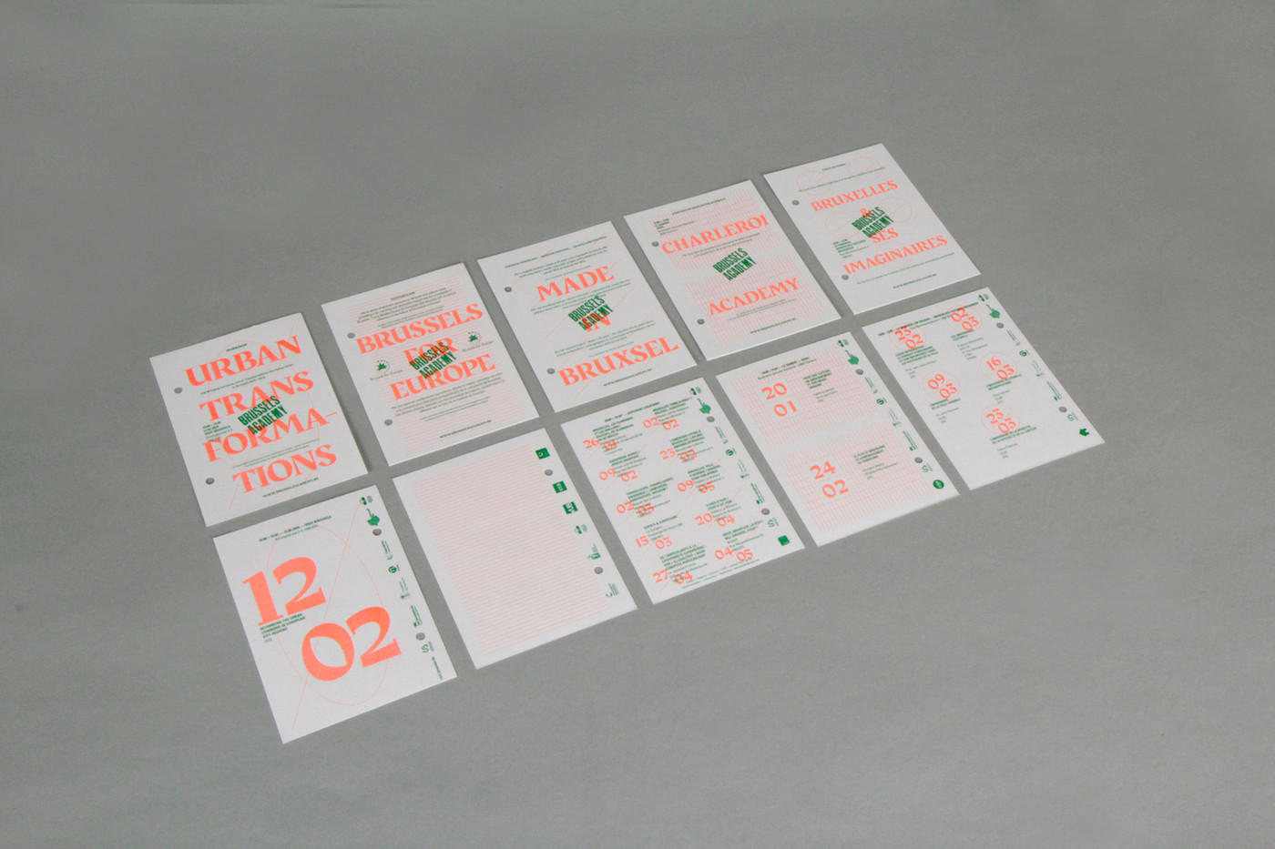
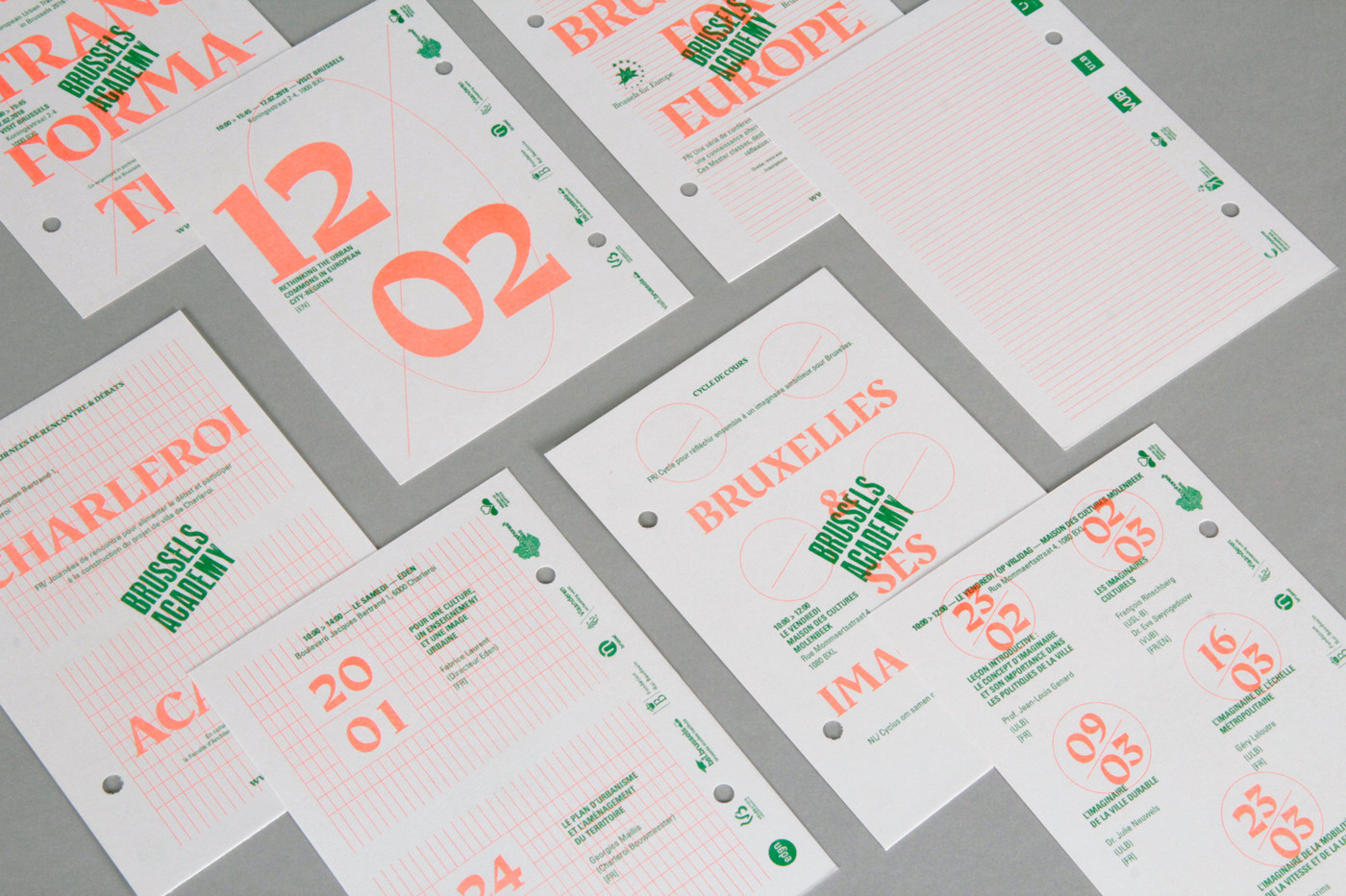
The challenge of this project was to make a printed programme presenting their different events which are cycles with a variable number of dates. The management of trilingualism (FR-NL-EN) being also variable, it was necessary to compose a graphical layout which is scalable according to these different variables. A real brain teaser (although we love those).
The design of the tiling combined with the underlying grid is therefore determined by the number of dates that make up the cycle. For instance, 6 dates leads to a grid of 6 elements. On the back the 6 actual dates are laid out with their practical information while on the front the main title of the cycle can be found as well as a reminder of these 6 elements.
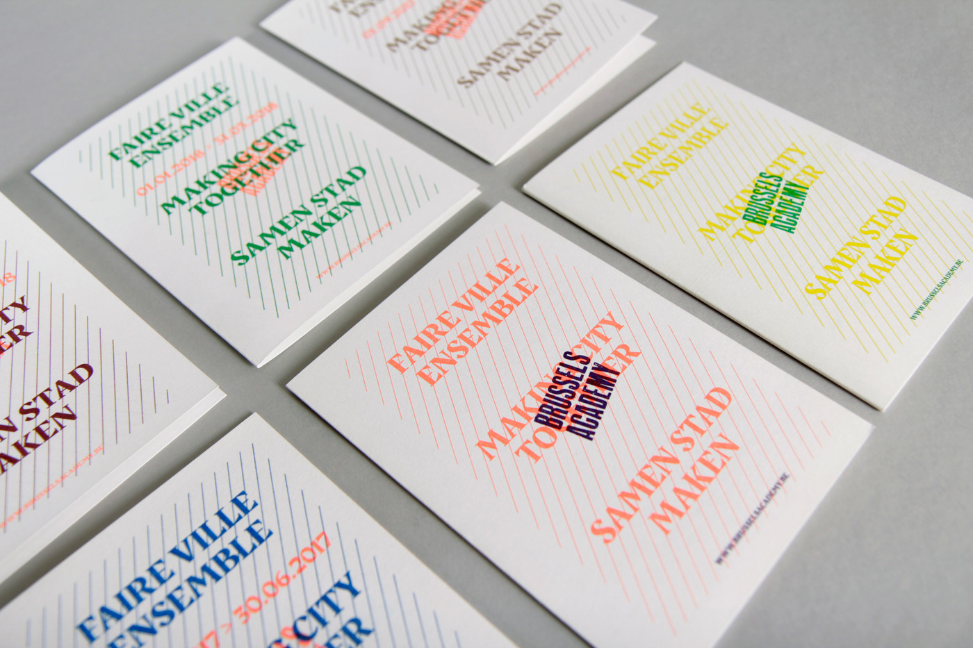
We separated each cycle onto a different flyer so it could be handed out alone if necessary. Nevertheless, a folder gathering them all is produced every season in the same duo tone colour of the flyers as all these are produced together on a funky Riso printer – a vintage colour copy machine.
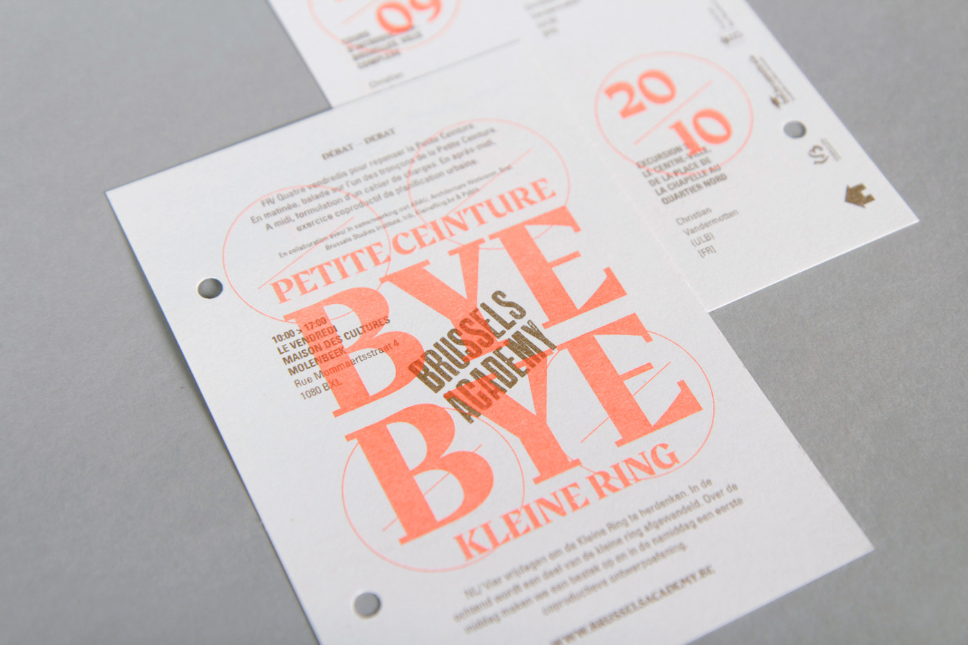
We decided to keep the existing logotype with a stamp effect – to keep the costs low – but to place it with an angle in the middle of the composition like an actual stamp would do. Finally, like the duo tone contrast we chose to use a font duo also in contrast. A legible, condensed time proofed font for the detailed information (Univers) and a bold, expressive font (Rakkas). Could we say contrast typical of our city?
website
Brussels Academy
webdevelopper
Cobéa
