Ateliers Médicis
commission
2020
communication
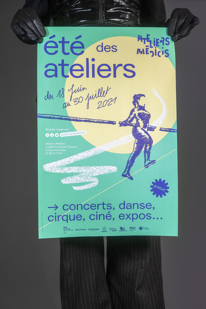
Ateliers Médicis is a national cultural centre in the Parisian region (France) which is firmly situated in the suburbs away from the famous city monuments. The centre has national goals and hosts artists of all disciplines and supports artistic creation in connection with the territories and local residents. We are proud to be associated graphic designers from 2020.
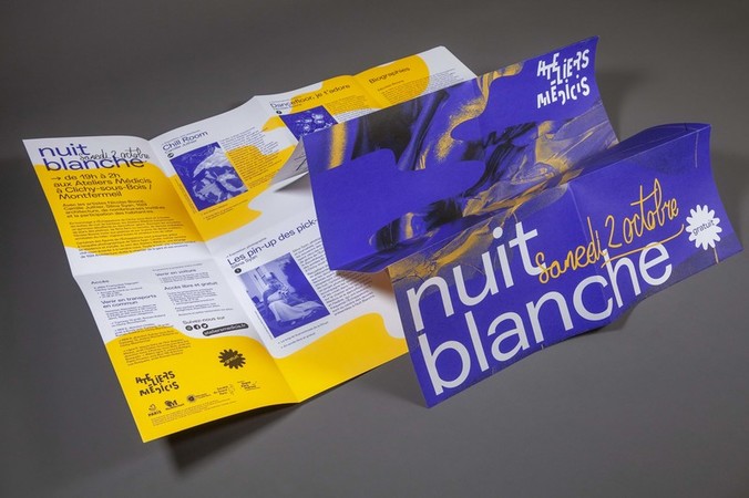
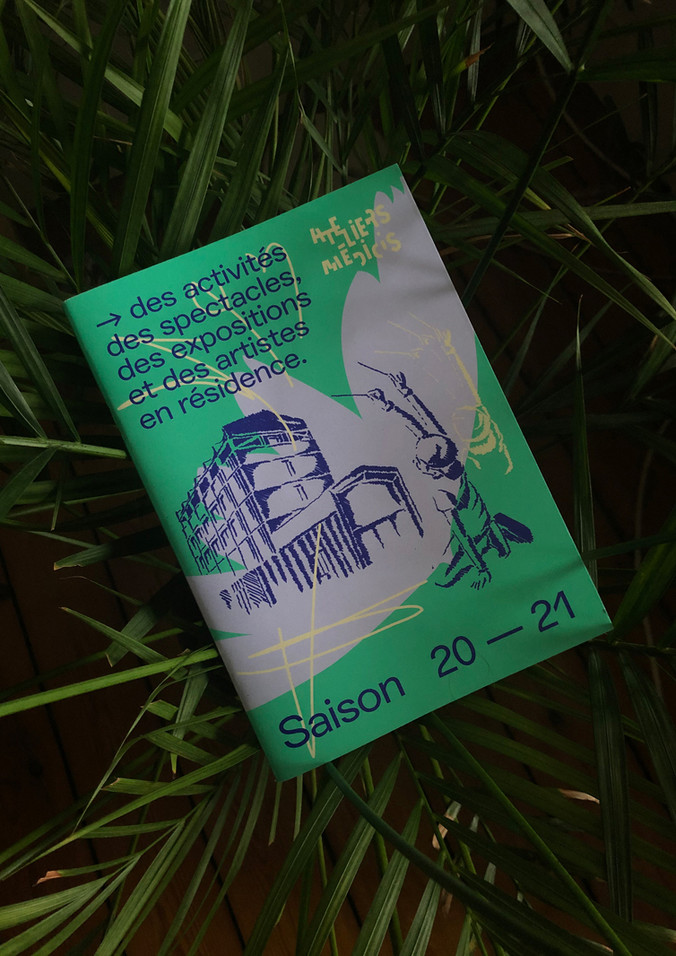
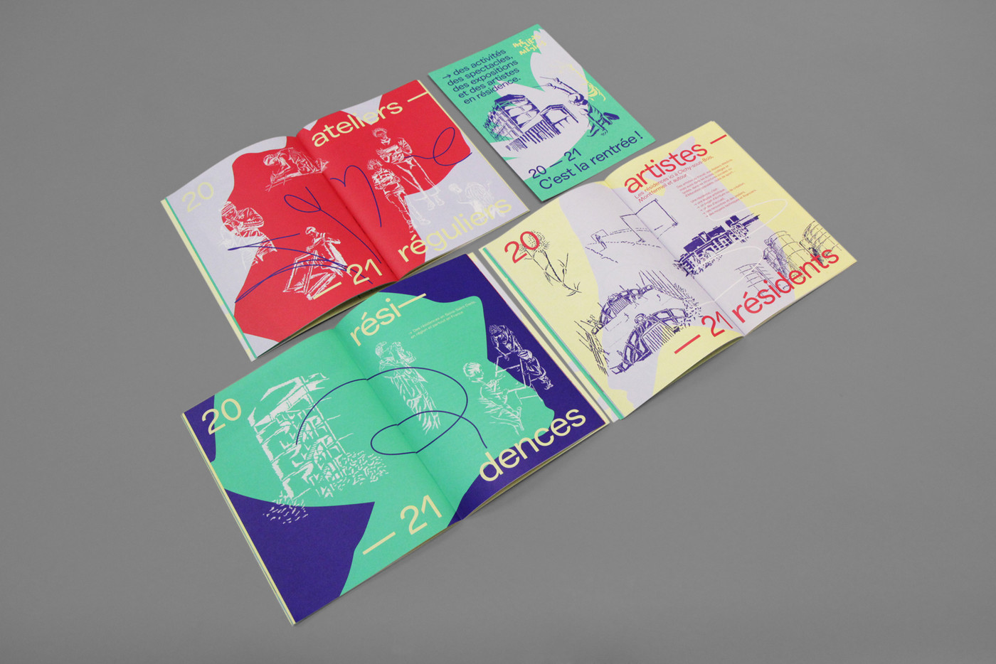
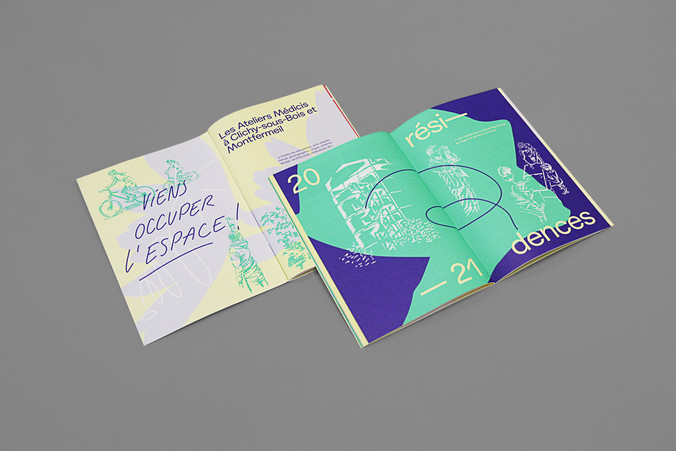
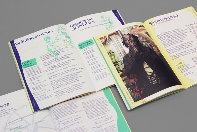
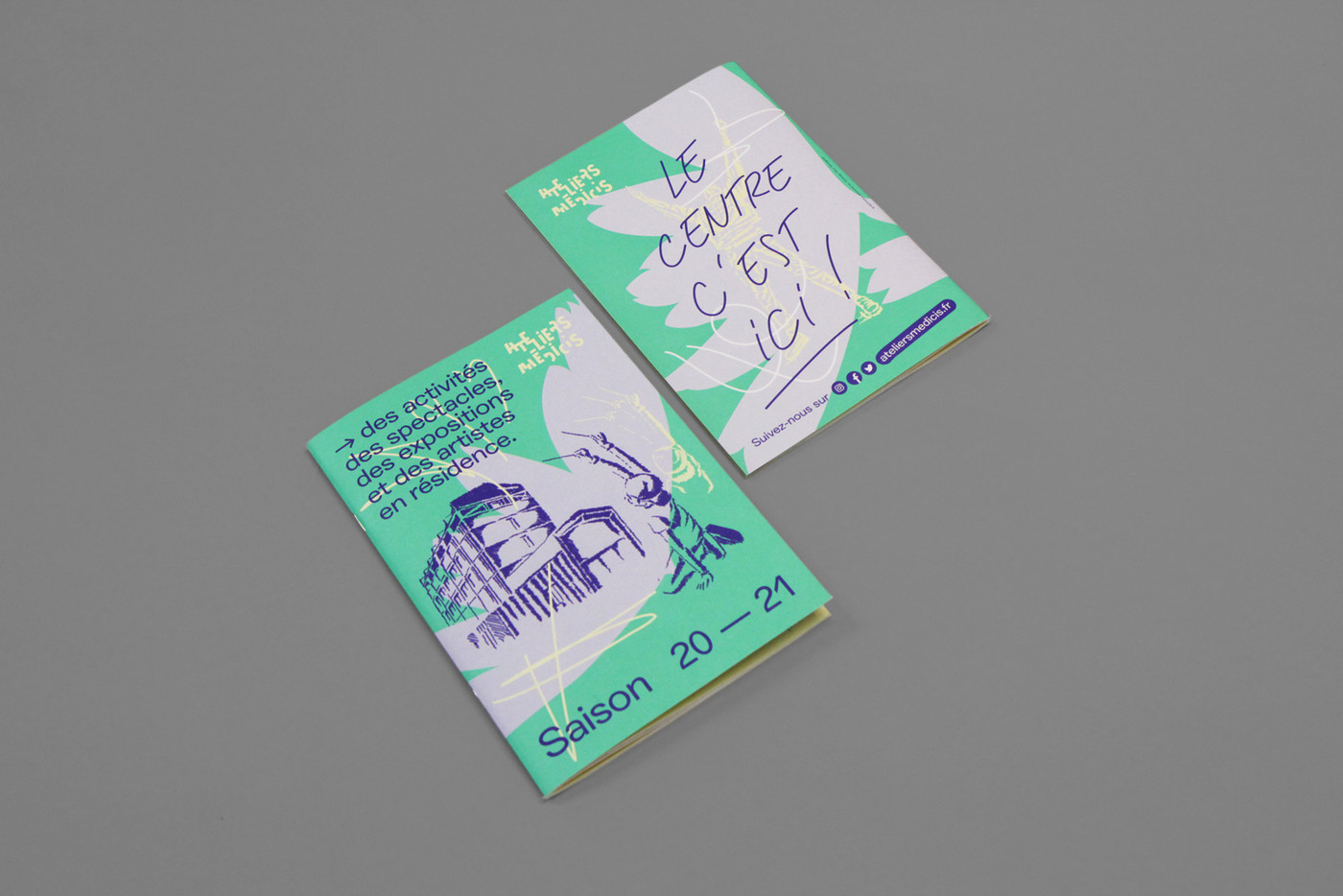
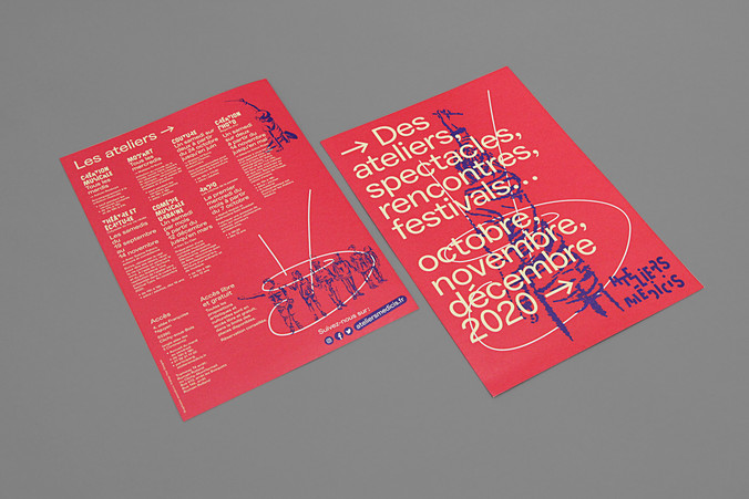
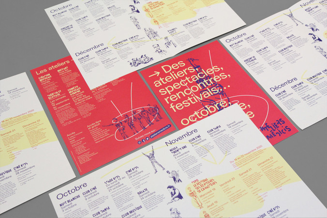
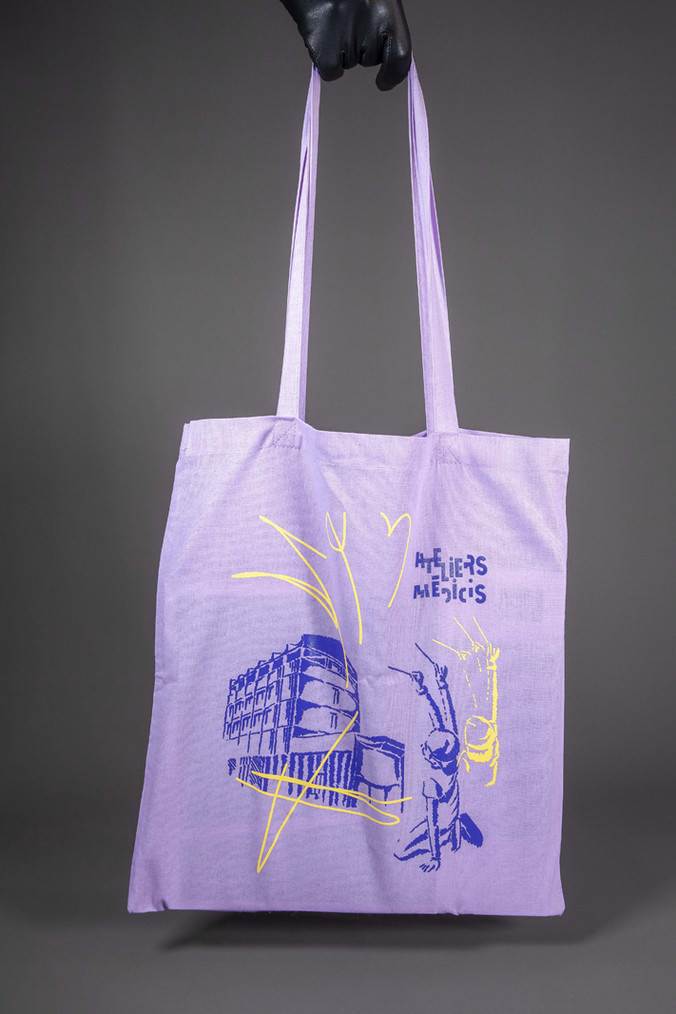
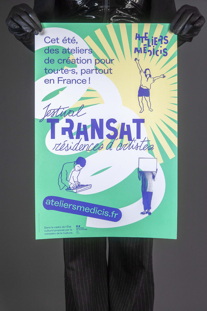
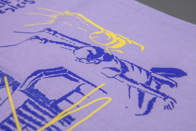
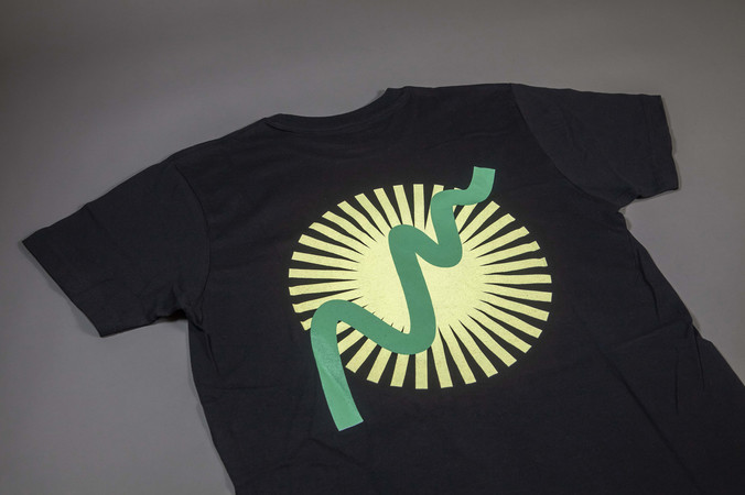
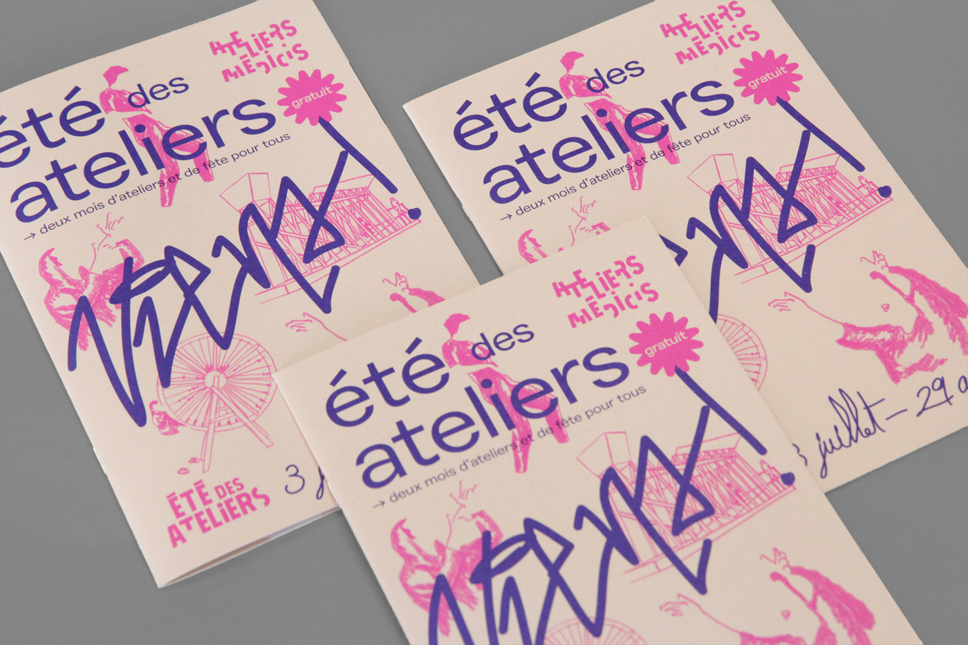
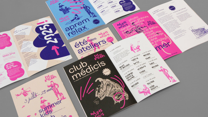
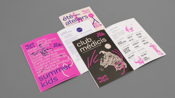
visual identity - guidelines - templates - illustrations - posters A2 / A0 - booklets 56p / A5 / CMYK + 2PMS - social media mixed formats - building canvas billboard


Ateliers Médicis
commission
2020
communication
Ateliers Médicis is a national cultural centre in the Parisian region (France) which is firmly situated in the suburbs away from the famous city monuments. The centre has national goals and hosts artists of all disciplines and supports artistic creation in connection with the territories. The centre encourages and organises encounters between artists and local residents.
The cultural centre is based in Clichy-sous-Bois and Montfermeil in the department of Seine-Saint Denis (93) and currently occupies a temporary prefab building designed by Encore Heureux. A large-scale building is planned for 2025 to reaffirm artistic creation in left-behind suburbs.
We are proud to be associated graphic designers from 2020.
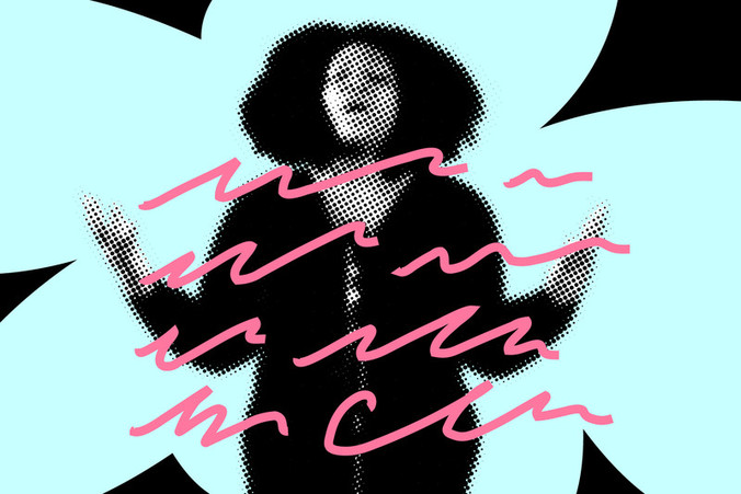
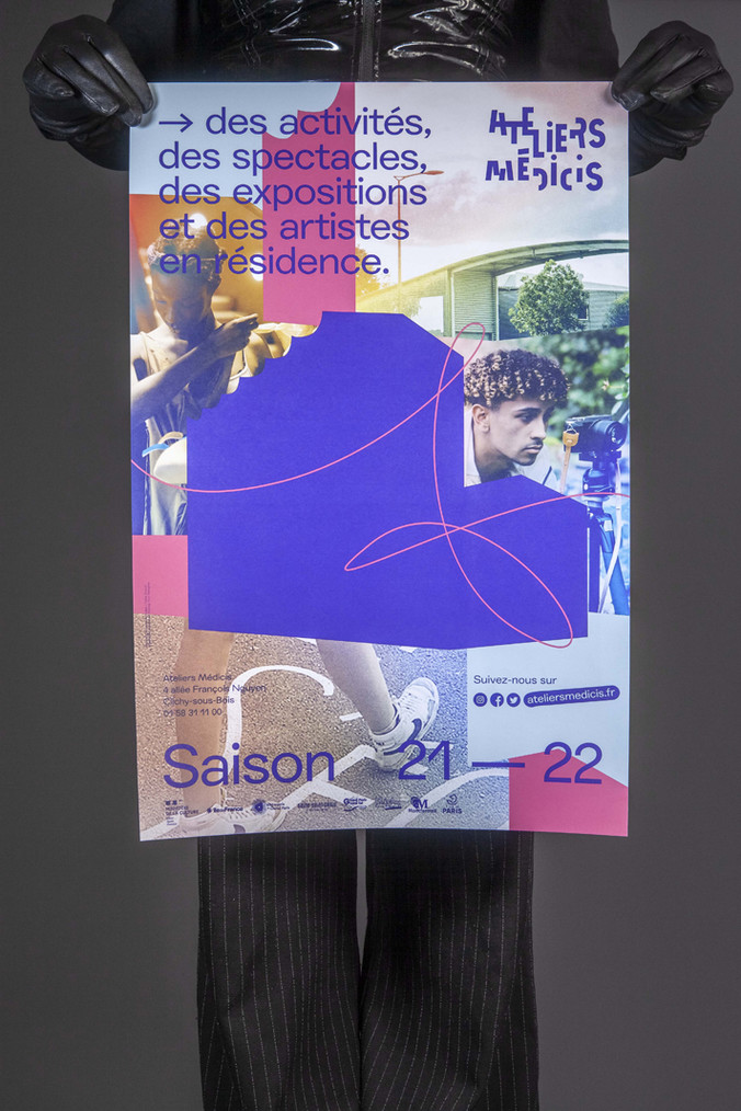
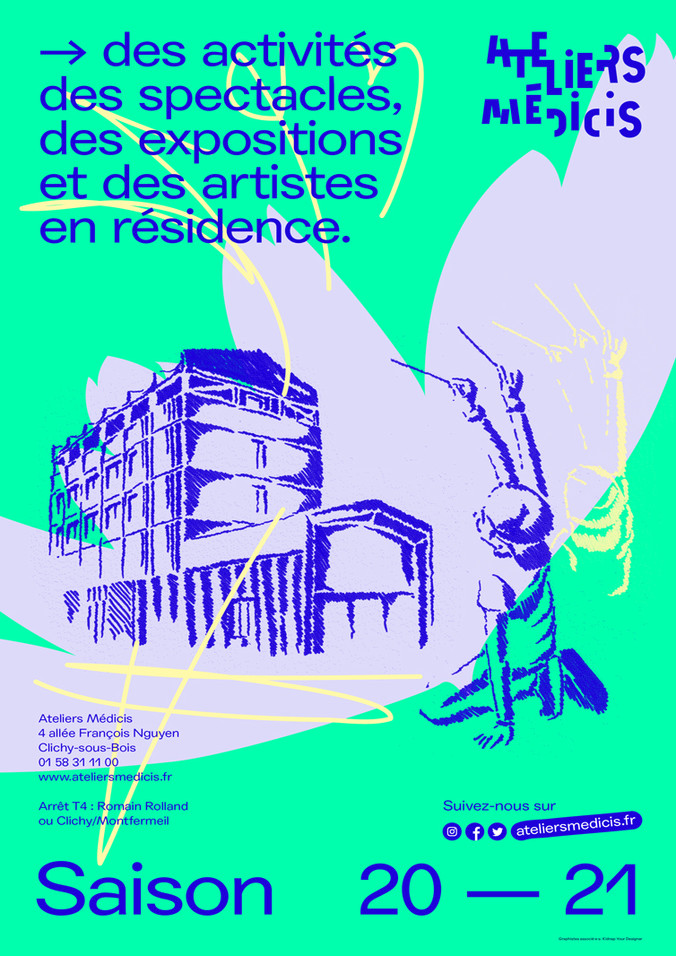
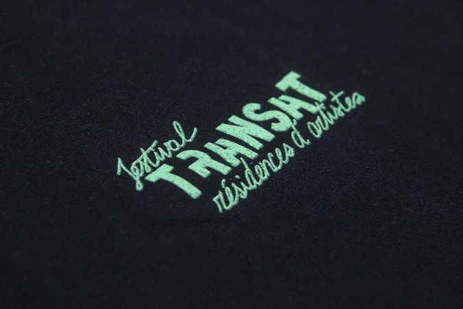
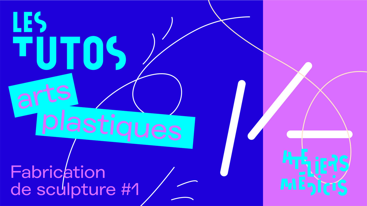
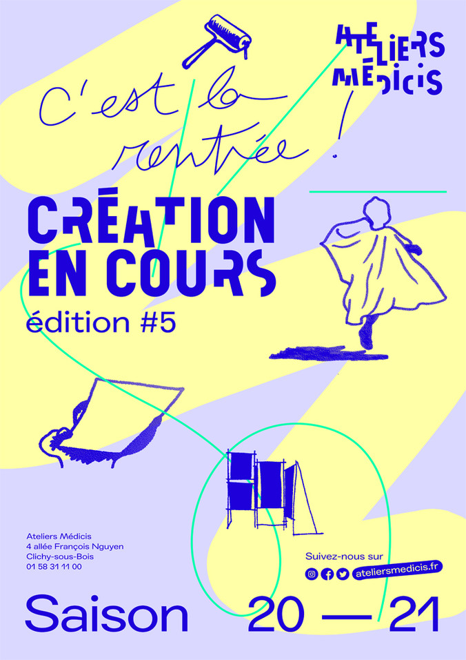
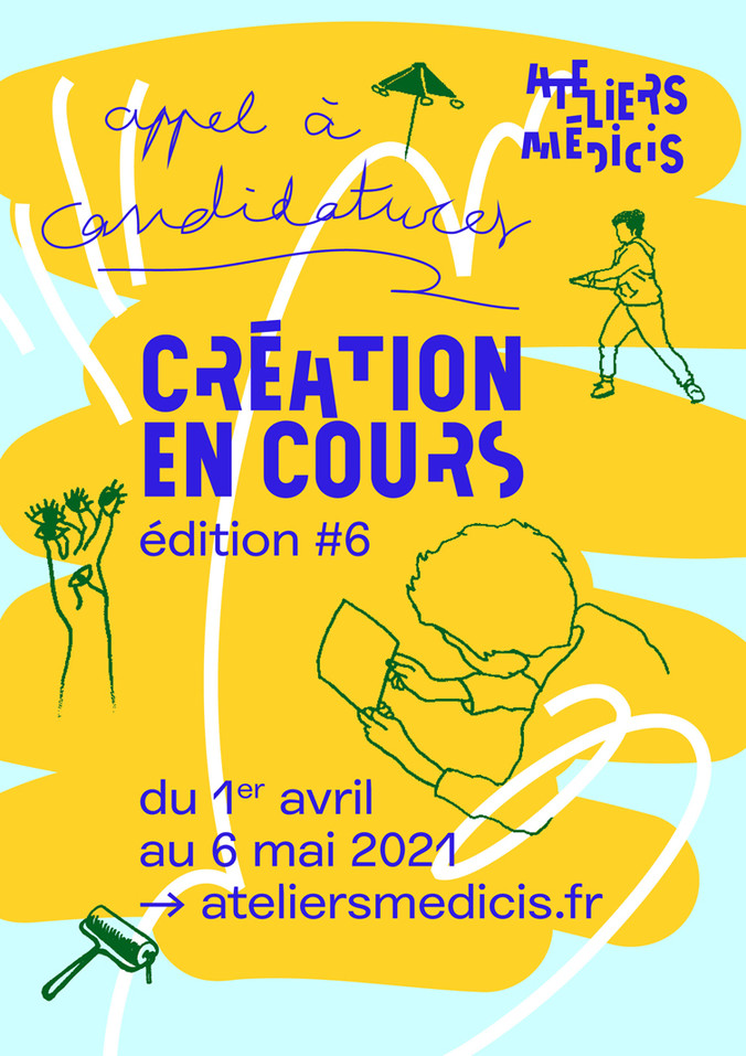
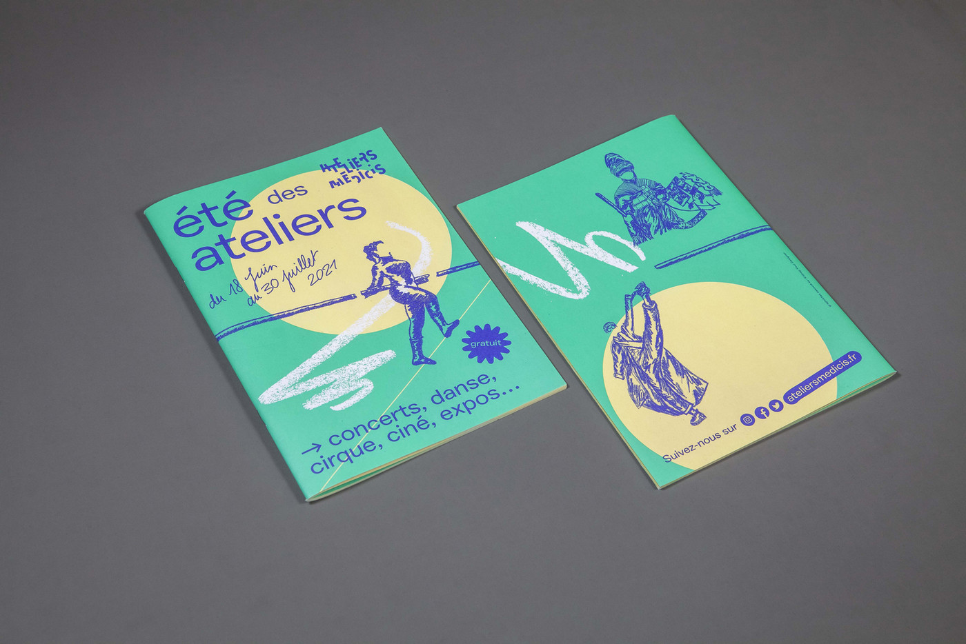
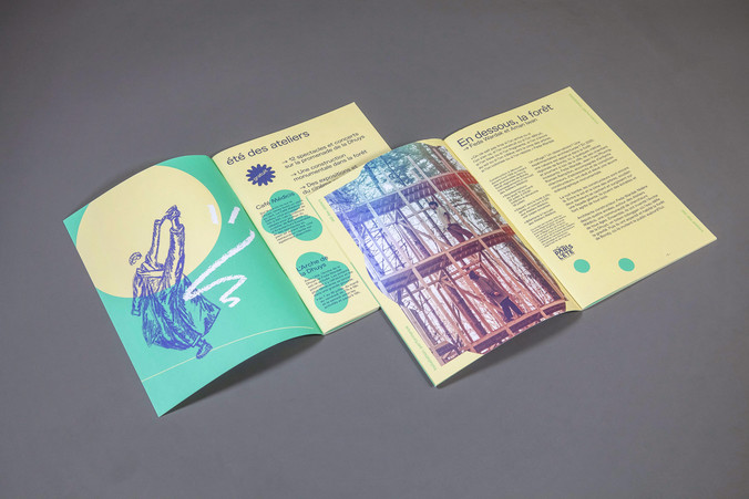
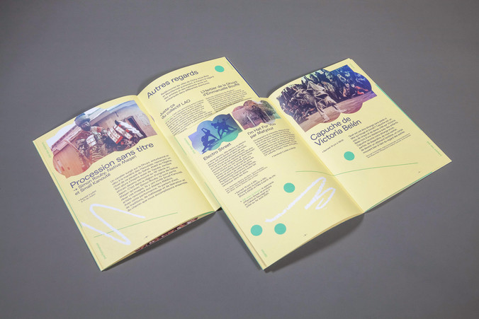
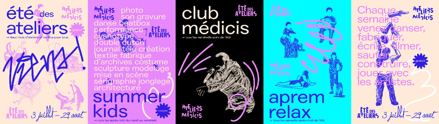
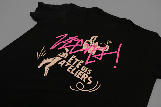
To create the communication for the events proposed by the cultural centre which are aimed at a variety of publics, we have put in place graphic design elements to mix and match depending on the topic. One rule remains throughout these elements; they are all inspired by observation, hearings, photos, videos collected by ourselves during our annual residency or by others on site. From these are created: drawings, sentences, half-toned photos, movement paths or abstract shapes.
The visual identity (logotype and ‘Atelier Sans’ typeface designed by BETC) was put in place at the time of the opening and has been retained. To sharpen the local and national recognition of the place, a series of typographical and layout choices have been settled and fixed, giving extra freedom to the visual elements. The attributes of liveliness, impact and welcome are key factors in the different creations produced. Finally, to infuse more human warmth to the communication, the working text typeface ‘Agipo Regular Extended’ designed by Radim Peško is put forward but in lowercase as headlines and catchphrases.